Color scheme
In color theory, a color scheme is the choice of colors used in various artistic and design contexts. For example, the "Achromatic" use of a white background with black text is an example of a basic and commonly default color scheme in web design.
Color schemes are used to create style and appeal. Colors that create an aesthetic feeling when used together will commonly accompany each other in color schemes. A basic color scheme will use two colors that look appealing together. More advanced color schemes involve several related colors in "Analogous" combination, for example, text with such colors as red, yellow, and orange arranged together on a black background in a magazine article. The addition of light blue creates an "Accented Analogous" color scheme.
Use of the phrase color scheme may also and commonly does refer to choice and use of colors used outside typical aesthetic media and context, although may still be used for purely aesthetic effect as well as for purely practical reasons. This most typically refers to color patterns and designs as seen on vehicles, particularly those used in the military when concerning color patterns and designs used for identification of friend or foe, identification of specific military units, or as camouflage. In hotel room designs, the relationship between preferences of color schemes and gender was detected. Male guests tend to prefer masculine color schemes, while female guests favor feminine color schemes.[1]
A color scheme in marketing is referred to as a trade dress and can sometimes be protected by trademark or trade dress laws, as is the pink color of Owens Corning fiberglass.[2]
Color schemes are often described in terms of logical combinations of colors on a color wheel. Different types of schemes, like monochromatic or complementary, are used.[3][4][5]
Types[]
Monochromatic[]
Monochromatic colors are all the colors (tints, tones, and shades) of a single hue. Monochromatic color schemes are derived from a single base hue, and extended using its shades, tones and tints (that is, a hue modified by the addition of black, gray (black + white) and white. As a result, the energy is more subtle and peaceful due to a lack of contrast of hue.
Complementary[]
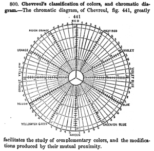
For the mixing of colored light, Newton's color wheel is often used to describe complementary colors, which are colors that cancel each other's hue to produce an achromatic (white, gray or black) light mixture. Newton offered as a conjecture that colors exactly opposite one another on the hue circle cancel out each other's hue; this concept was demonstrated more thoroughly in the 19th century.[citation needed]
A key assumption in Newton's hue circle was that the "fiery" or maximum saturated hues are located on the outer circumference of the circle, while achromatic white is at the center. Then the saturation of the mixture of two spectral hues was predicted by the straight line between them; the mixture of three colors was predicted by the "center of gravity" or centroid of three triangle points, and so on.
Split-complementary[]
The split-complementary (also called compound harmony) color scheme is a three-color combination consisting of base color and two colors that are 150 degrees and 210 degrees apart from the base color. The split-complementary color scheme has the same sharp visual contrast as the complementary color scheme but has less pressure.
Achromatic[]
Any color that lacks strong chromatic content is said to be unsaturated, achromatic, or near neutral. Pure achromatic colors include black, white, all grays and beiges; near neutrals include browns, tans, pastels, and darker colors. Near neutrals can be of any hue or lightness.
Neutrals are obtained by mixing pure colors with white, black or gray, or by mixing two complementary colors. In color theory, neutral colors are colors easily modified by adjacent more saturated colors and they appear to take on the hue complementary to the saturated color. Next to a bright red couch, a gray wall will appear distinctly greenish.
Black and white have long been known to combine well with almost any other colors; black decreases the apparent saturation or brightness of colors paired with it, and white shows off all hues to equal effect.[6]
Analogous[]

Analogous color schemes (also called dominance harmony) are groups of colors that are adjacent to each other on the color wheel, with one being the dominant color, which tends to be a primary or secondary color, and two on either side complementing, which tend to be tertiary.
The term analogous refers to having an analogy or corresponding to something in particular. An analogous color scheme creates a rich, monochromatic look. It’s best used with either warm or cool colors, creating a look that has a certain temperature as well as proper color harmony. While this is true, the scheme also lacks contrast and is less vibrant than complementary schemes.[citation needed]
Red, reddish-orange, orange, yellow-orange is one example of a set of analogous colors.
Accented analogous[]
An accented analogous complementary scheme utilizes related hues lying adjacent on the color wheel with a hue directly opposite to these. This direct complement becomes the accent color, used to create a dominant color grouping of three similar colors accented with the direct complement (or the near complement) of one of them. The complementary accent color creates an interesting contrast against the dominant color grouping. This scheme is frequently used to put a warm accent color with a cool analogous color palette, or a cool accent color with a warm palette.
Triadic[]
This section needs expansion. You can help by . (April 2014) |

The triadic color scheme is a three-color combination consisting of base color and two colors that are 120 degrees and 240 degrees apart from the base color.[8] Triadic color schemes tend to be quite vibrant. Even when using pale or unsaturated versions of hues, it offers a higher degree of contrast while also retaining the color harmony. This scheme is trendy among artists because it provides sharp visual contrast while maintaining balance, and color richness. The triadic scheme is not as contrasting as the complementary scheme, but it is easier to accomplish balance and harmony with these colors.
Tetradic[]
This section needs expansion. You can help by . (April 2014) |
The tetradic (also called double complementary) color scheme is considered the richest because it uses four colors arranged into two complementary color pairs. This scheme is hard to harmonize and requires a color to dominate or subdue the colors; if all four colors are used in equal amounts, the color scheme may look unbalanced.
Rectangle (tetradic)[]
The rectangle color scheme is a four-color combination consisting of a base color and three colors that are 60 degrees, 180 degrees, and 240 degrees apart from the base color.[9] Rectangle color schemes work best when one color is dominant.
Square (tetradic)[]
The square color scheme is a four-color combination consisting of a base color and three colors that are 90 degrees apart from the base color.[10] Square color schemes are rich in color and offer variations.
Polychromatic[]
The term polychromatic means having several colors.
It is used to describe light that exhibits more than one color, which also means that it contains radiation of more than one wavelength. The study of polychromatic is particularly useful in the production of diffraction gratings.
In maps and data visualization[]
Thematic maps, charts, data science, spreadsheets, and other tools use graphical means to visualize quantitative data. Color is often used as one of these graphical tools, due to its aesthetic appeal, its intuitive contrast (i.e., people can instantly differentiate a large number of colors), and its multidimensional richness, which allows variations in color to carry a great deal of meaning.
A variety of color schemes for representing quantitative variation have been developed by cartographers to represent quantitative variable ranges intuitively, especially for choropleth maps. These have generally been adopted for other forms of visualization as well, such as the Heat map. These can be categorised into different classes of color schemes to represent specific sets of data more intuitively:[11]
- Sequential schemes use color value to represent quantitative or ordinal values. It is commonly assumed that the darkest shade intuitively represents the largest value, but on a dark background, a light shade may be more intuitive because it contrasts more. Two subtypes exist, depending on how hue may also be used:
- Monochrome schemes use tints of a single hue or shades of gray. Studies have shown that while humans are capable of seeing hundreds of shades of most colors, they can only distinguish 5–8 for practical use (i.e., matching shade on the map to the corresponding shade in the legend).[12]
- Part-spectral schemes use a range of hues in addition to value, generally incorporating a partial segment of the color wheel, such as a light yellow to dark green, or a light orange to a dark red. The advantage of this approach is that the hue differences add contrast, enabling users to distinguish a larger number of distinct colors, up to 12–15.
- Divergent schemes use two sequential schemes (monochrome or part spectral), sharing a common (usually the lightest) color in the center and the darkest at the two ends. Their primary use is to emphasize (by the principles of visual hierarchy) the extreme values at both the high and low ends.
- Spectral schemes use a large segment or even the full range of hue to represent the range of quantitative values, with no variation in value. This can be difficult to interpret with most data because hues do not naturally look like "more" or "less" than other hues. It can be useful, however, for representing cyclical variables, which can map directly onto a Color wheel, such as the terrain aspect, wind direction, or Seasonality.
- Bivariate or trivariate schemes use two or three orthogonal monochrome sequential schemes to represent separate (but usually related) variables, with the various blended colors representing different combinations of values. This scheme tends to work best when the hues for each axis are primary colors: RGB on a black background, CMY on a white background, so that the mixed colors are as clear as possible. When crafted well, and with advantageous geography (in which the variables tend to have broadly consistent patterns), these color schemes are very effective at visualizing correlations and other patterns between the variables. In other situations, they can produce a seemingly random confusion of color.[13]
- Cyclic schemes use colors gradients that have neither a beginning nor an end. They are useful to display periodic data sets like angular data or data from Synthetic Aperture Radar (SAR) interferometry, which is used to display Earth’s surface displacement. The cyclic color schemes are divergent color schemes with matching ends.
For the above classes of color schemes, there are different types to represent a given set of data more clearly:[11]
- Continuous: Color schemes that have a smooth color gradient. Continuous color schemes are intended to display sets of continuous, ordered data points and can represent both small and large data variations. Continuous color schemes generally use more than a hundred individual color values. A continuous color map is also the most versatile type, and the other types (discrete and categorical) can be constructed from it.
- Discrete: Color schemes that feature only a certain subset of all color values of a continuous color schemes, that are clearly distinguishable from each other. Color schemes in discrete form are intended to visualise a set or range of discrete data points, but are also often used with continuous datasets. Discrete color schemes are used with ordered data.
- Categorical: Color schemes that contain multiple unordered unique color values. They are intended to color multiple individual data points or entire graphs to make them distinguishable from each other. Categorical color schemes can be applied to almost any type of graph, whether this is a scatter plot with multiple points, a line plot with multiple lines, a bar plot with multiple bars, or other types of graphs.
Overall, there are two fundamentally different categories of color schemes: the scientifically derived color schemes and the unscientific color schemes.[11] Unscientific color schemes, like the common rainbow color scheme, have no uniform color gradient as seen by the human eye and are not accessible for color-vision deficient and color-blind readers. Scientifically-derived color schemes (or scientific color maps) represent a uniform color gradient that can easily be ordered from one end to the other and contain colors that can be differentiated also by color-vision deficient readers. Scientific color map is a relatively new term, but its properties have been proposed as best practice over several decades.
While unscientific color schemes are widely available in a myriad of color combinations, scientifically-derived color schemes have become more widely available only during the last century. Cynthia Brewer performed a number of experiments on various color schemes for data visualization in maps, especially working with those with color blindness.[14][12] Eventually, this work led to a palette of several dozen color schemes designed to be reproducible on multiple devices and usable by the color-vision-impaired, which was collected into an interactive tool known as ColorBrewer[15][16] in 2002.[17][18] This palette quickly gained wide acceptance due to its reliable usability by non-experts, and has become a standard built into GIS and mapping software and other visualization tools.[19][20][21]
Other pre-made scientific color schemes that are distributed directly to users, but also frequently built into common visualisation toolboxes are:[11]
- MPL (Matplotlib) color maps developed by Stéfan van der Walt and Nathaniel Smith.[22]
- Cividis color map developed by Jamie R. Nuñez and colleagues.[23]
- CMOcean color maps developed by Kristen M. Thyng and colleagues.[24]
- CET color maps developed by Peter Kovesi.[25]
- Scientific color maps developed by Fabio Crameri.[26][27]
See also[]
- Color gradient
- Light-on-dark color scheme
- Color tool
- Monochromatic color
- Complementary color
- Analogous colors
- Achromatic colors
- Palette (computing)
- Palette (painting)
References[]
- ^ Bogicevic, Vanja; Bujisic, Milos; Cobanoglu, Cihan; Feinstein, Andrew Hale (12 February 2018). "Gender and age preferences of hotel room design". International Journal of Contemporary Hospitality Management. 30 (2): 874–899. doi:10.1108/IJCHM-08-2016-0450. ISSN 0959-6119.
- ^ Gordon V. Smith and Russell L. Parr (2005). Intellectual Property: Valuation, Exploitation, and Infringement Damages. John Wiley and Sons. ISBN 0-471-72433-5. Archived from the original on 2 January 2014.
- ^ Stephen Quiller (2002). Color Choices. Watson–Guptill. ISBN 0-8230-0697-2. Archived from the original on 24 December 2017.
- ^ Jackie Shaw (1994). The Big Book of Decorative Painting: How to paint if you don't know how – and how to improve if you do. Watson–Guptill. p. 49. ISBN 0-8230-0265-9.
monochromatic split-complementary analogous color-scheme.
- ^ Edith Anderson Feisner (2006). Colour: How to Use Colour in Art and Design. Laurence King Publishing. ISBN 1-85669-441-0. Archived from the original on 24 December 2017.
- ^ "Theory of Color". zedbi.com/. Archived from the original on 24 October 2014. Retrieved 23 October 2014.
- ^ designer, Jacci Howard Bear Writer A. graphic; writer; About, Artist Who Writes; Print, Teaches; Bear, web design our editorial process Jacci Howard. "What Are the Fundamentals of Contrasting Colors of the Color Wheel?". Lifewire. Retrieved 20 April 2020.
- ^ "Triadic Color Scheme". Tiger Color. Retrieved 30 July 2020.
- ^ "Rectangle (Tetradic) Color Scheme". Tiger Color. Retrieved 30 July 2020.
- ^ "Square Color Scheme". Tiger Color. Retrieved 30 July 2020.
- ^ Jump up to: a b c d Crameri, Fabio; Shephard, Grace E.; Heron, Philip J. (December 2020). "The misuse of colour in science communication". Nature Communications. 11 (1): 5444. doi:10.1038/s41467-020-19160-7. ISSN 2041-1723. PMC 7595127. PMID 33116149.
- ^ Jump up to: a b Brewer, Cynthia A.; MacEachren, Alan M.; Pickle, Linda W.; Herrmann, Douglas (1997). "Mapping Mortality: Evaluating Color Schemes for Choropleth Maps". Annals of the Association of American Geographers. 87 (3): 411–438. doi:10.1111/1467-8306.00061.
- ^ , Elmer, M.E. 2013. “Symbol Considerations for Bivariate Thematic Maps.” In Proceedings of the 26th International Cartography Conference. August 25-30, Dresden, Germany
- ^ Brewer, Cynthia A. (1996). "Guidelines for Selecting Colors for Diverging Schemes on Maps". The Cartographic Journal. 33 (2): 79–86. doi:10.1179/caj.1996.33.2.79.
- ^ "Cindy Brewer". www.personal.psu.edu. Retrieved 8 December 2020.
- ^ axismaps/colorbrewer, Axis Maps, 8 December 2020, retrieved 8 December 2020
- ^ Brewer, Cynthia A.; Hatchard, Geoffrey W.; Harrower, Mark A. (2003). "Color Brewer in Print: A Catalog of Color Schemes for Maps". Cartography and Geographic Information Science. 30: 5–32. doi:10.1559/152304003100010929. S2CID 129427665.
- ^ Harrower, Mark; Brewer, Cynthia A. (2003). "Color Brewer.org: An Online Tool for Selecting Colour Schemes for Maps". The Cartographic Journal. 40: 27–37. doi:10.1179/000870403235002042. S2CID 140173239.
- ^ Carto.com, Color in Map Design Part 2, Carto.com
- ^ Kenneth Field, Brewing a new color palette for ArcGIS Pro, ArcGIS Blog, esri, 2014
- ^ Jon Peltier, Create a Heat Map Using Excel's Conditional Formatting, Peltier Tech Blog, September 23, 2013
- ^ "matplotlib colormaps". bids.github.io. Retrieved 25 December 2020.
- ^ Nuñez, Jamie R.; Anderton, Christopher R.; Renslow, Ryan S. (1 August 2018). "Optimizing colormaps with consideration for color vision deficiency to enable accurate interpretation of scientific data". PLOS ONE. 13 (7): e0199239. doi:10.1371/journal.pone.0199239. ISSN 1932-6203. PMC 6070163. PMID 30067751.
- ^ Thyng, Kristen; Greene, Chad; Hetland, Robert; Zimmerle, Heather; DiMarco, Steven (1 September 2016). "True Colors of Oceanography: Guidelines for Effective and Accurate Colormap Selection". Oceanography. 29 (3): 9–13. doi:10.5670/oceanog.2016.66. ISSN 1042-8275.
- ^ Kovesi, Peter (December 2015). "Bad Colour Maps Hide Big Features and Create False Anomalies". ASEG Extended Abstracts. 2015 (1): 1–4. doi:10.1071/aseg2015ab107. ISSN 2202-0586.
- ^ Crameri, Fabio (6 January 2020), Scientific colour maps, doi:10.5281/zenodo.1243862, retrieved 25 December 2020
- ^ Crameri, Fabio (29 June 2018). "Geodynamic diagnostics, scientific visualisation and StagLab 3.0". Geoscientific Model Development. 11 (6): 2541–2562. doi:10.5194/gmd-11-2541-2018. ISSN 1991-9603.
External links[]
- Introduction to Color Theory (Color Schemes)
- ColorHexa.com - web-based color tool that supports several color schemes
- iColorpalette.com - web-based color tool offers create own color schemes
- Scientific colour maps - Knowledge resource for scientifically-derived, perceptual uniform and color-vision-deficiency friendly color schemes

| show Authority control |
|---|
- Color
- Color schemes