Deepdene (typeface)
 | |
| Category | Serif |
|---|---|
| Designer(s) | Frederic Goudy |
| Foundry | Lanston Monotype |
| Date released | 1927 onwards |
| Shown here | Linden Hill |
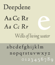
Deepdene is a serif typeface designed by Frederic Goudy from 1927–1933.[1] It belongs to the "old-style" of serif font design, with low contrast between strokes and an oblique axis. However, Deepdene has crisp serifs and a nearly upright italic, with much less of a slant than is normal for this style.[1]
Issued by the American branch of Lanston Monotype, Deepdene was popular on its release and often used for the body text of books.[2][3][4] Several digitisations have been created.
Deepdene is named after Goudy's home in Marlborough-on-Hudson.[3][5][6] This was itself named for the road on which he previously lived in Queens, New York.[7][8]
Design[]

Goudy described the design as loosely inspired by "a Dutch type which had just been introduced;" Goudy's friend Paul Bennett suggested in later life that this was Jan van Krimpen's Lutetia although Walter Tracy writes that the attribution cannot be certain.[9] He also later created a medium weight, bold and bold italic.[1]
Goudy's biographer D. J. R. Bruckner praised the design as "the type that brings together the most characteristics of Goudy types the best".[3]
Goudy later created a blackletter design, Deepdene Open Text and the derived Deepdene Text, which was intended to complement it for purposes such as initial capitals.[a] The designs are not related otherwise.[1]
The family in metal type included:
- Deepdene (1927, Continental, later rereleased by Lanston Monotype) Changes were made to fit Monotype's hot metal typesetting system, which placed restrictions on what widths characters could be.
- Deepdene Italic (1929), matrices cut by Goudy's wife Bertha.
- Deepdene Medium (1931), designed for Lanston Monotype but apparently never cast.
- Deepdene Bold + Bold Italic (c. 1933-4, Lanston Monotype)
Digitisations[]

Deepdene has been digitised and released by several organisations and software companies. P22's digitisation under their LTC imprint perhaps uniquely includes the swash capitals and small caps in italics.[10] The open-source "League of Movable Type" project has released an open-source digitisation, "Linden Hill", by Barry Schwartz, in regular and italic with swashes but without bold weights.[11]
References[]
- ^ a b c d Goudy, Frederic (1946). A Half-Century of Type Design and Typography, Volume 2. New York: The Typophiles. pp. 150–201. Retrieved 11 June 2016.
- ^ Updike, John. "A Bull in the Typography Shop: a review of Frederic Goudy by D. J. R. Bruckner". The New York Times. Retrieved 5 February 2016.
- ^ a b c Bruckner, D. J. R. (1990). Frederic Goudy. Masters of American Design.
- ^ "Deepdene Oldstyle". P22. Retrieved 11 June 2016.
- ^ "Guide to the Frederic Goudy Papers, 1903-1966". Catherine Pelton Durrell '25 Archives and Special Collections Library. Vassar College. Retrieved 11 June 2016.
- ^ "Deepdene, Goudy's Home on Old Post Road". Marlborough Local History (blog). Retrieved 11 June 2016.
- ^ Sloane, Eric (April 2006). Return to Taos: Eric Sloane's Sketchbook of Roadside Americana. Courier Corporation. pp. 8–9. ISBN 978-0-486-44773-5.
- ^ Emily Amodeo; Joanne Sagarese Pagnotta; James B. Cosgrove (2012). Marlborough. Arcadia Publishing. p. 8. ISBN 978-0-7385-9788-1.
- ^ Tracy, Walter (January 2003). Letters of Credit: A View of Type Design. D.R. Godine. p. 121. ISBN 978-1-56792-240-0.
- ^ "LTC Deepdene". MyFonts. LTC. Retrieved 27 August 2015.
- ^ Schwartz, Barry. "Linden Hill". League of Movable Type. Retrieved 27 August 2015.
Notes[]
- ^ Text means "textura", a term meaning blackletter. It does not in this context indicate a font intended for body text.
External links[]
- Swamp Press specimen, Ed Rayher (includes Deepdene in metal type on p. 32)
- Old style serif typefaces
- Typefaces designed by Frederic Goudy
- Monotype typefaces
- Letterpress typefaces