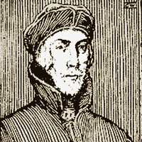
Nicolas Jenson
Nicholas Jenson | |
|---|---|
 | |
| Born | c. 1420 |
| Died | 1480 Venice, Venetian Republic |
| Nationality | French |
| Occupation | Typographer French engraver, type designer |
| Known for | Roman Typeface |
Notable work | creation of Roman typeface, made the final definitive break from blackletter style |
Nicholas Jenson (c. 1420 – 1480) was a French engraver, pioneer, printer and type designer who carried out most of his work in Venice, Italy. Jenson acted as Master of the French Royal Mint at Tours, and is credited with being the creator of one of the finest early Roman type faces.[1][2] Nicholas Jenson has been something of an iconic figure among students of early printing since the nineteenth century when the aesthete William Morris praised the beauty and perfection of his roman font. Jenson is an important figure in the early history of printing and a pivotal force in the emergence of Venice as one of the first great centers of the printing press.[3]
History[]

In October 1458, while acting as Master of the French Royal Mint, Jenson was sent to Mainz, by King Charles VII, to study the art of metal movable type. By the time Jenson arrived in Mainz, there were a number of established printers under which he could have been apprenticed. Jenson left Mainz in 1461.
Some hypothesize that Jenson studied under the tutelage of Johann Gutenberg, although there is no verifiable evidence of this.[4][5] By this time Gutenberg's first press had been seized by Johann Fust, and historians are unsure of his activities during this period.
In 1468 Jenson went to Venice, opening a printing shop in 1470, and, in the first work he produced, the printed roman lowercase letter took on the proportions, shapes, and arrangements that marked its transition from an imitation of handwriting to the style that has remained in use throughout subsequent centuries of printing. Jenson also designed Greek-style type and black-letter type.[6] The printer was prodigious in his publishing, eventually producing around 150 titles.[5]
By the end of his life Jenson was a wealthy man, producing liturgical, theological and legal texts in a variety of gothic fonts, the roman type left only for the odd commissioned work.[7]
Printing history[]
Working separately but concurrently with Johann and Wendelin of Speyer (de Spira), Nicholas Jenson is popularly thought to have made the final definitive break from blackletter style towards a fully evolved roman letterform.[8]
During the 1470s Nicholas Jenson’s technical skill and business acumen helped establish Venice as Italy’s publishing capital and in centuries since he has been celebrated for perfecting roman type, the rebirth of Latin inscription.[4]
In 1477 Jenson was able to run as many as twelve presses at the same time. To lower prices and force out less productive rivals, he cut cursive gothic type, enabling him to print text and gloss on the same page for the first time.
Jenson's printing[]


During the time of his arrival in Venice Jenson was quite successful as an artist but was financially successful as well. His early training as a gold smith allowed him even greater sensitivities to the sculptural nature of type; the letters Jenson employed were often beautiful capitals that could summon the spirit of Rome.
Jenson's highly legible and evenly colored typeface, based upon Humanistic scripts, has been reinterpreted through the centuries by numerous type designers, most notably William Morris. Jenson's fame as one of history's greatest typeface designers and punch cutters rests on the types first used in Eusebius's De praeparatione evangelica, which presents the full flowering of roman type design.[9][10]
Jenson’s letters are clearly borrowing their shapes from the calligraphic shapes that preceded them, called littera antica. These were in turn based on Carolingian minuscules, to which serifs, borrowed from the Imperial Roman capitals, were added. It was first in use in his 1470 edition of Eusebius. In 1471, a Greek typeface followed, which was used for quotations, and then in 1473 a Black Letter typeface, which he used in books on medicine and history.[citation needed]
In distinction to his contemporary printers, Jenson was able to expand his financial base. By 1477 he could run as many as twelve presses simultaneously.[11] He is also responsible for launching two book trading companies, first in 1475 and then in 1480, under the name of Johannes de Colonia, Nicolaus Jenson et socii.[12]
Following his death respective typefaces were employed by the Aldine Press, and have continued to be the basis for numerous fonts. Examples include William Morris' Golden Type, Bruce Rogers' "Centaur" in 1914, Morris Fuller Benton's "Cloister Old Style" in 1926, and Robert Slimbach's "Adobe Jenson" in 1996.[8]
Published works[]
- The Manual Of Linotype Typography, Published 1923 by Linotype Company
- A hardcover book containing 256 pages of type specimens and typographic recommendations. From the introduction: "This "Manual of Linotype Typography" places before . . . printers pages based on the best typographic standards of today, presented with the greatest possible variety in order to promote versatility, and accompanied by explanatory remarks. Thus the composing-room force has opportunity to copy something really good and do it with understanding." This page in the Manual shows Linotype's version of Jenson's type. Beautifully preserved production printed in black, green, and vermillion with a tipped-in frontis illustration and decorated endpapers.[13]
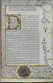
- Caesar, Julius. Works, 1471. Printed, in venice by Nicolas Jenson, 1471
- Nicolas Jenson printed one of the earliest and most beautiful editions of Caesar. We note here especially the remarkable clarity and simplicity of the printer's Roman typeface, which drew its inspiration from etchings on Roman monuments. On this opening page we are also treated to a wonderful illuminated initial and border.[14]
- VK 405, Bible in Latin, Nicolas Jenson, Venice, 1479
- The Bible was written by forty different human authors over a 1500-year period. While the original Autographs were "perfect", the process of hand copying resulted in derivations from the original texts. Of the French printers of the era from Nicolas Jenson came nearly a hundred of the finest books produced in the fifteenth century. This is the first Bible to be issued from Jenson’s press, of this Latin Bible, issued in 1479, Pope Sixtus IV conferred upon him the honorary title of Count Palatine.[15]
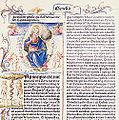
- Pliny, Natural History, 1476. Printed in Venice by Nicolas Jenson. 1,025 copies (1,000 paper, 25 vellum).
- The Pliny text was printed as a partnership venture between Jenson and the Strozzi family, who backed the venture financially. It is a vernacular text, with translation by Cristoforo Landino. "The Pliny text was printed (in a font closely simulating the modern humanist handwriting in which the manuscript of the work might have been written) with wide margins, without initial capital letters at the beginning of chapters, and with its titles isolated in a sea of blank paper on the frontispiece, crying out for illustration and decoration."[16]

The Manual Of Linotype Typography, Published 1923
VK 405, Bible in Latin, Nicholas Jenson, Venice, 1479

Julius Caesar Works, printer Nicolas Jenson, 1471
Pliny's Natural History, printer Nicolas Jenson, 1476


See also[]
- Bembo
- History of western typography
- Typeface
- Adobe Jenson
- Roman typeface
- William Morris
- Bruce Rogers (typographer)
References[]
- ^ Bullen, Henry Lewis. Nicolas Jenson, Printer of Venice: His famous type designs and some comment upon the printing types of earlier printers. San Francisco. Printed by John Henry Nash (1926).
- ^ Olocco, Riccardo. "Nicolas Jenson and the success of his roman type". Medium. University of Reading. Retrieved 7 May 2017.
- ^ Nicholas Jenson and the rise of Venetian publishing in Renaissance Europe / Martin Lowry.Oxford, UK ; Cambridge, Massachusetts, US : B. Blackwell, 1991. xvii, 286 p., [16] p. of plates : ill. ; 24 cm.
- ^ Jump up to: a b "Type, Typography and Fonts". www.graphic-design.com.
- ^ Jump up to: a b "Archived copy". Archived from the original on 2009-08-14. Retrieved 2011-12-08.CS1 maint: archived copy as title (link)
- ^ "Nicolas Jenson | French printer". Encyclopedia Britannica.
- ^ Nicholas Jenson and the rise of Venetian publishing in Renaissance Europe / Martin Lowry.
- ^ Jump up to: a b "Archived copy". Archived from the original on 2011-12-11. Retrieved 2011-12-08.CS1 maint: archived copy as title (link)
- ^ "William Morris – Printing". www.marxists.org.
- ^ "Nicolaus Jenson – Linotype Font Designer Gallery". www.linotype.com.
- ^ Type and Typography. Jim Martin. Encyclopedia of Journalism. Ed. Christopher H. Sterling. Vol. 4. Thousand Oaks, CA: Sage Reference, 2009. pp. 1405–1409.
- ^ "Columbia University Libraries Online Exhibitions | Type to Print: The Book & The Type Specimen Book". exhibitions.library.columbia.edu.
- ^ "Archived copy". Archived from the original on 2012-04-06. Retrieved 2011-11-30.CS1 maint: archived copy as title (link)
- ^ "Winter 2004 Volume 101 Issue 1 - Vassar, the Alumnae/i Quarterly". vq.vassar.edu.
- ^ "The Van Kampen Collection". www.solagroup.org.
- ^ Jardine, Lisa, Worldly Goods: A New History of the Renaissance, W.W. Norton & Company, Inc., 1998, pp. 144–7, ISBN 978-0-393-31866-1
Bibliography[]
- Lowry, Martin: Venetian Printing. The Rise of the Roman Letterform. With an Essay by George Abrams. Edited, introduced and translated into Danish by Poul Steen Larsen. Herning: Poul Kristensens Forlag, 1989. The first book to present the typeface Abrams Venetian, designed by George Abrams.
- v. Lieres, Dr. Vita. "Nicolaus Jenson." in: Schriftgießerei D. Stempel AG [ed.]: Altmeister der Druckschrift. Frankfurt am Main, 1940. (pp. 35–40). (In German)
Sources[]
- Meggs, Philip B., Purvis, Alston W. History of Graphic Design. Hoboken, N.J: Wiley, 2006.
- "Nicolas Jenson." Encyclopædia Britannica. Encyclopædia Britannica Online. Encyclopædia Britannica, 2011. Web. 12 Oct. 2011. Nicolas Jenson | French printer.
- Jenson, Nicolas, ca. 1420–1480. The last will and testament of the late Nicolas Jenson, printer, who departed this life at the city of Venice in the month of September, A.D. 1480. [Chicago, Ludlow typograph co., 1928] 15 p. 30 cm
- Jenson, Nicolas, ca. 1420–1480. Pliny the Elder: historia naturalis [S.l. : s.n. ; 19—] / Lowry, Martin.
- Nicholas Jenson and the rise of Venetian publishing in Renaissance Europe / Martin Lowry. Oxford, UK ; Cambridge, Massachusetts, US : B. Blackwell, 1991. xvii, 286 p., [16] p. of plates : ill. ; 24 cm.
- Gross, Hanns. "Nicholas Jenson and the Rise of Venetian Publishing in Renaissance Europe." January 1, 1993 Online
- Type and Typography. Jim Martin. Encyclopedia of Journalism. Ed. Christopher H. Sterling. Vol. 4. Thousand Oaks, CA: Sage Reference, 2009. pp 1405–1409.
- Book, the Printed. V. E. LEWIS. New Catholic Encyclopedia. Vol. 2. 2nd ed. Detroit: Gale, 2003. pp 520–524.
- Bullen, Henry Lewis. Nicolas Jenson, Printer of Venice: His famous type designs and some comment upon the printing types of earlier printers. San Francisco. Printed by John Henry Nash (1926); some typographic examples held at the Brooklyn Public Library under – Kurt H. Volk Inc. "Master Typographers of the Ages."
- An Encyclopedic Survey of Type Design and Techniques Throughout History by Friedrich Friedl, Nicolaus Ott (Editor), Bernard Stein, published by Könemann Verlagsgesellschaft mbH
External links[]
- The will of Nicolas Jenson (English translation)
- Examples of Nicolas Jenson's printing
- Nicolaus Jenson's Romans
| hide Authority control | |
|---|---|
| General | |
| National libraries | |
| Art research institutes | |
| Other |
|
- 1420 births
- 1480 deaths
- French typographers and type designers
- 15th-century French people
- French printers
- Printers of incunabula