Fraktur
show This article may be expanded with text translated from the corresponding article in German. (September 2019) Click [show] for important translation instructions. |
| Latin script (Fraktur hand) | |
|---|---|
 | |
| Script type | |
Time period | 16th century – 20th century |
| Direction | Left-to-right |
| Languages | German¹ and some other European languages |
| Related scripts | |
Parent systems | Blackletter
|
Child systems | Kurrentschrift, including Sütterlin |
Sister systems | See Blackletter |
| ISO 15924 | |
| ISO 15924 | Latf, 217 |
| Unicode | |
Unicode range | 0020–00FF² |
Fraktur (German: [fʁakˈtuːɐ̯] (![]() listen)) is a calligraphic hand of the Latin alphabet and any of several blackletter typefaces derived from this hand. The blackletter lines are broken up; that is, their forms contain many angles when compared to the curves of the Antiqua (common) typefaces modeled after antique Roman square capitals and Carolingian minuscule. From this, Fraktur is sometimes contrasted with the "Latin alphabet" in northern European texts, which is sometimes called the "German alphabet", simply being a typeface of the Latin alphabet. Similarly, the term "Fraktur" or "Gothic" is sometimes applied to all of the blackletter typefaces (known in German as Gebrochene Schrift, "Broken Script").
listen)) is a calligraphic hand of the Latin alphabet and any of several blackletter typefaces derived from this hand. The blackletter lines are broken up; that is, their forms contain many angles when compared to the curves of the Antiqua (common) typefaces modeled after antique Roman square capitals and Carolingian minuscule. From this, Fraktur is sometimes contrasted with the "Latin alphabet" in northern European texts, which is sometimes called the "German alphabet", simply being a typeface of the Latin alphabet. Similarly, the term "Fraktur" or "Gothic" is sometimes applied to all of the blackletter typefaces (known in German as Gebrochene Schrift, "Broken Script").
The word derives from Latin fractūra ("a break"), built from fractus, passive participle of frangere ("to break"), the same root as the English word "fracture".
Characteristics[]
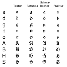
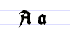
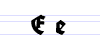
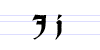
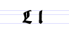
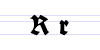
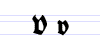
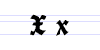
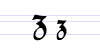
Besides the 26 letters of the ISO basic Latin alphabet,[1] Fraktur includes the ⟨ß⟩ (Eszett [ɛsˈtsɛt]), vowels with umlauts, and the ⟨ſ⟩ (long s). Some Fraktur typefaces also include a variant form of the letter r known as the r rotunda, and many a variety of ligatures which are left over from cursive handwriting and have rules for their use. Most older Fraktur typefaces make no distinction between the majuscules ⟨I⟩ and ⟨J⟩ (where the common shape is more suggestive of a ⟨J⟩), even though the minuscules ⟨i⟩ and ⟨j⟩ are differentiated.
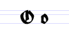
One difference between the Fraktur and other blackletter scripts is that in the lower case ⟨o⟩, the left part of the bow is broken, but the right part is not. In Danish texts composed in Fraktur, the letter ⟨ø⟩ was already preferred to the German and Swedish ⟨ö⟩ in the 16th century.[2]
In the Latvian variant of Fraktur, used mainly until the 1920s, there are additional characters used to denote Latvian letters with diacritical marks.[3] Stroked letters ⟨Ꞡ ꞡ⟩, ⟨Ꞣ ꞣ⟩, ⟨Ł ł⟩, ⟨Ꞥ ꞥ⟩, ⟨Ꞧ ꞧ⟩ are used for palatalized consonants (⟨Ģ ģ⟩, ⟨Ķ ķ⟩, ⟨Ļ ļ⟩, ⟨Ņ ņ⟩, ⟨Ŗ ŗ⟩) stroked variants of ⟨s⟩ and ⟨ſ⟩ distinguish voiced and unvoiced sibilants or affricates (⟨S ſ⟩ for voiced [z], ⟨Ꞩ ẜ⟩ for unvoiced [s], ⟨ſch⟩ [ž] / ⟨ẜch⟩ [š], ⟨dſch⟩ [dž] / ⟨tẜsch⟩ [č]), while accents (⟨⟩, ⟨â⟩, ⟨ê⟩, ⟨î⟩, ⟨ô⟩, ⟨û⟩) together with digraphs (⟨ah⟩, ⟨eh⟩ etc.) are used for long vowels (⟨Ā ā⟩, ⟨Ē ē⟩, ⟨Ī ī⟩, ⟨Ō ō⟩, ⟨Ū ū⟩). Stroked variants of ⟨s⟩ are also used in pre-1950 Sorbian orthography.[4]
Origin[]
The first Fraktur typeface arose in the early 16th century, when Emperor Maximilian I commissioned the design of the Triumphal Arch woodcut by Albrecht Dürer and had a new typeface created specifically for this purpose, designed by Hieronymus Andreae. Fraktur types for printing were established by the Augsburg publisher at the issuance of a series of Maximilian's works such as his Prayer Book (Gebetbuch, 1513) or the illustrated Theuerdank poem (1517).[5]
Fraktur quickly overtook the earlier Schwabacher and Textualis typefaces in popularity, and a wide variety of Fraktur fonts were carved and became common in the German-speaking world and areas under German influence (Scandinavia, the Baltic states, Central Europe). In the 18th century, the German Theuerdank Fraktur was further developed by the Leipzig typographer Johann Gottlob Immanuel Breitkopf to create the typeset Breitkopf Fraktur. While over the succeeding centuries, most Central Europeans switched to Antiqua, German speakers remained a notable holdout.
Use[]
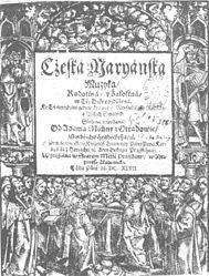
A Czech example of Fraktur: Title page of Česká mariánská muzika by Adam Václav Michna z Otradovic (1647) ("Cżeská maryánska muzyka" by old orthography)

Polish alphabet, 16th century


Typesetting in Fraktur was still very common in the early 20th century in all German-speaking countries and areas, as well as in Norway, Estonia, and Latvia, and was still used to a very small extent in Sweden, Finland and Denmark,[8] even though other countries typeset in Antiqua. Some books at that time used related blackletter fonts such as Schwabacher; however, the predominant typeface was the Normalfraktur, which came in slight variations.
From the late 18th century to the late 19th century, Fraktur was progressively replaced by Antiqua as a symbol of the classicist age and emerging cosmopolitanism in most of the countries in Europe that had previously used Fraktur. This move was hotly debated in Germany, where it was known as the Antiqua–Fraktur dispute. The shift affected mostly scientific writing in Germany, whereas most belletristic literature and newspapers continued to be printed in Fraktur.
The Fraktur typefaces remained in use in Nazi Germany, when they were initially represented as true German script; official Nazi documents and letterheads employed the font, and the cover of Hitler's Mein Kampf used a hand-drawn version of it.[9] However, more modernized fonts of the Gebrochene Grotesk type such as Tannenberg were in fact the most popular typefaces in Nazi Germany, especially for running text as opposed to decorative uses such as in titles. These fonts were designed in the early 20th century, mainly the 1930s, as grotesque versions of blackletter typefaces. The Nazis heavily used these fonts themselves, though the shift remained controversial; in fact, the press was at times scolded for its frequent use of "Roman characters" under "Jewish influence" and German émigrés were urged to use only "German script".[10] On January 3, 1941, the Nazi Party ended this controversy by switching to international scripts such as Antiqua. Martin Bormann issued a circular to all public offices which declared Fraktur (and its corollary, the Sütterlin-based handwriting) to be Judenlettern (Jewish letters) and prohibited their further use.[11] German historian Albert Kapr has speculated that the regime viewed Fraktur as inhibiting communication in the occupied territories during World War II.[12]
After 1941[]
Even with the abolition of Fraktur, some publications include elements of it in headlines. However, academic works occasionally continued to use Fraktur in the text itself.[citation needed] Notably, Joachim Jeremias's work "Die Briefe an Timotheus und Titus" (The Letters to Timothy and Titus) was published in 1963 using Fraktur. More often, some ligatures ch, ck from Fraktur were used in antiqua-typed editions up to the offset type period. Fraktur saw a brief resurgence after the war, but thereafter fell out of common use.
Fraktur is today used mostly for decorative typesetting: for example, a number of traditional German newspapers such as the Frankfurter Allgemeine, as well as the Norwegian Aftenposten, still print their name in Fraktur on the masthead (as indeed do some newspapers in other European countries and the U.S.) and it is also popular for pub signs and the like. In this modern decorative use, the traditional rules about the use of long s and short s and of ligatures are often disregarded.
Individual Fraktur letters are sometimes used in mathematics, which often denotes associated or parallel concepts by the same letter in different fonts. For example, a Lie group is often denoted by G, while its associated Lie algebra is . A ring ideal might be denoted by (or if a prime ideal) while an element is . The Fraktur is also sometimes used to denote the cardinality of the continuum, that is, the cardinality of the real line. In model theory, is used to denote an arbitrary model, with A as its universe. Fraktur is also used in other ways at the discretion of the author.


Fraktur is still used among traditional Anabaptists to print German texts, while Kurrent is used as hand writing for German texts. Groups that use both form of traditional German script are the Amish, Old Order Mennonites, Hutterites, and traditional German-speaking Mennonites from Russia who live mostly in Latin America today.
Typeface samples[]


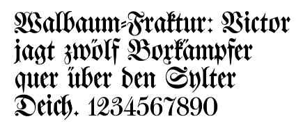
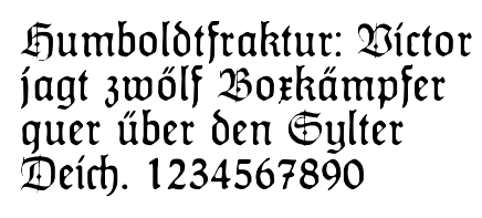
In the figures below, the German sentence that appears after the names of the fonts (Walbaum-Fraktur in Fig. 1 and Humboldtfraktur in Fig. 2 reads, Victor jagt zwölf Boxkämpfer quer über den Sylter Deich. It means "Victor chases twelve boxers across the Sylt dike" and contains all 26 letters of the alphabet plus the umlauted glyphs used in German, making it an example of a pangram.
Unicode[]
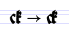
Unicode does not encode Fraktur as a separate script. Instead, Fraktur is considered a class of fonts of the Latin alphabet. Thus, the additional ligatures that are required for Fraktur fonts will not be encoded in Unicode,[13] and Unicode proposes to deal with these ligatures using technologies such as OpenType, AAT or Graphite. There are many Fraktur fonts that do not use smart-font technologies, but use their own legacy encoding instead that is not compliant with Unicode.
There are, however, two sets of "Fraktur" symbols in the Unicode blocks of Mathematical Alphanumeric Symbols, Letterlike Symbols, and Latin Extended-E. These are meant to be used only in mathematics and phonetics, so they are not suitable for typesetting German-language texts, and the long s and ß, is not encoded.[14]
The following set of Fraktur and bold Fraktur letters is intended for use as mathematical alphanumeric symbols: