Georgia (typeface)
 | |
| Category | Serif |
|---|---|
| Classification | Scotch Roman, Transitional, Didone PANOSE: 2263545234 |
| Designer(s) | Matthew Carter |
| Foundry | Microsoft Corporation |
| Date created | 1993 |
| Date released | 1996 |
Georgia is a serif typeface designed in 1993 by Matthew Carter and hinted by Tom Rickner for the Microsoft Corporation. It was intended as a serif typeface that would appear elegant but legible when printed small or on low-resolution screens. The typeface is inspired by Scotch Roman designs of the 19th century and was based on designs for a print typeface on which Carter was working when contacted by Microsoft; this would be released under the name Miller the following year.[1] The typeface's name referred to a tabloid headline, "Alien heads found in Georgia."[2]
Design[]
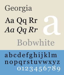
As a transitional serif design, Georgia shows a number of traditional features of "rational" serif typefaces from around the early 19th century, such as alternating thick and thin strokes, ball terminals and a vertical axis. Speaking in 2013 about the development of Georgia and Miller, Carter said: "I was familiar with Scotch Romans, puzzled by the fact that they were once so popular... and then they disappeared completely."[3] Its figure (numeral) designs are lower-case, or text figures, designed to blend into continuous text; this was at the time a rare feature in computer fonts.[4]
Closer inspection, however, shows how Georgia was designed for clarity on a computer monitor even at small sizes.[5] It features a large x-height (tall lower-case letters), and its thin strokes are thicker than would be common on a typeface designed for display use or the greater sharpness possible in print.[6][7] Its reduced contrast and thickened serifs make it somewhat resemble Clarendon designs from the 19th century.
Georgia's bold is also unusually bold, almost black. Carter noted that "Verdana and Georgia... were all about binary bitmaps: every pixel was on or off, black or white... The bold versions of Verdana and Georgia are bolder than most bolds, because on the screen, at the time we were doing this in the mid-1990s, if the stem wanted to be thicker than one pixel, it could only go to two pixels. That is a bigger jump in weight than is conventional in print series."[3] Given these unusual design decisions, Matthew Butterick, an expert on document design, recommended that organizations using Georgia for onscreen display license Miller to achieve a complementary, more balanced reading experience on paper.[8][9]
The Georgia typeface is similar to Times New Roman, another reimagination of transitional serif designs, but as a design for screen display it has a larger x-height and fewer fine details. The New York Times changed its standard font from Times New Roman to Georgia in 2007.[10]
Georgia is a "Scotch Roman", a style that originated in types sold by Scottish type foundries of Alexander Wilson and William Miller in the period of 1810–1820. According to Thomas Curson Hansard, these were cut by London-based punchcutter Richard Austin. Hansard was writing within Austin's lifetime, and this attribution is accepted by Austin's biographer Alastair Johnston, although historian James Mosley has expressed caution on the attribution.[11][12][13]
Releases[]

Microsoft publicly released the initial version of the font on 1 November 1996 as part of the core fonts for the Web collection, and later bundled it with the Internet Explorer 4.0 supplemental font pack: these releases made it available for installation on both Windows and Macintosh computers. This made it a popular choice for web designers, as pages specifying Georgia as a font choice would display identically on both types if users installed the core fonts package (or later Internet Explorer), simplifying development and testing. Its creators also produced Verdana at the same time, the first Microsoft sans-serif screen font, for the same purposes. Some early public releases of Georgia included number designs between upper- and lower-case, similar to those later released with Miller.[14][15] Carter was asked by Robert Norton, Microsoft's type director, to change these to text, a decision that Carter later considered an improvement.[16]
New versions of Georgia, along with its sister sans-serif font Verdana, were released in 2013.[17] The extension of the original font, named Georgia Pro, features a set of additional typefaces and designs, including:
- Additional weights, including condensed versions.
- Specialized small caps designs.
- Extensions to the character sets.
- Extensions to the kerning.
- OpenType typographic features such as ligatures.[a]
- Lining figures.
The expanded font was designed for organisations that had made extensive use of Georgia and Verdana because of their availability but that desired additional versions for specific uses.
Microsoft has commissioned a number of variants. Georgia Ref, a variant of Georgia consisting of a single weight, but with extra characters, was bundled with Microsoft Bookshelf 2000, Encarta Encyclopedia Deluxe 99 and Encarta Virtual Globe 99. MS Reference Serif, a derivative of Georgia Ref with a bold weight and italic, was also included in Microsoft Encarta. However, Microsoft's font manager Bill Hill wrote, "I for one never felt totally comfortable with it as a book face. There's something very dark and 'vertical' about the way it feels." He also noted that Microsoft had commissioned an alternative, versions of the existing typefaces Berling and Frutiger, for its Microsoft Reader e-book product.[18] Despite this, Georgia is included among the bundled book-reading fonts for several e-book applications.[19]
Awards[]
The Cyrillic font won an award at Kyrillitsa in 1999.[20]
On 26 May 2011, Matthew Carter received a Lifetime Achievement Award from the Smithsonian's Cooper-Hewitt National Design Museum in part for designing the Georgia font.
See also[]
References and footnotes[]
- ^ Connare, Vincent. "Comments on Typophile thread..." Typophile.
- ^ Typeface Descriptions & Histories. Archived 24 April 2015 at the Wayback Machine.
- ^ Jump up to: a b Middendorp, Jan. "Matthew Carter interview". MyFonts. Monotype. Retrieved 11 July 2015.
- ^ Daniels, Simon. "Forum thread". Typophile. Retrieved 12 December 2014.
- ^ Yan, Jack. "Set on the Web, part 2". Jack Yan & Associates. Retrieved 18 November 2017.
- ^ "Georgia & Verdana: Typefaces designed for the screen (finally)". Archived 2013-08-28 at the Wayback Machine, by Daniel Will-Harris, accessed 24 November 2005.
- ^ Friedl, Friedrich, Nicolaus Ott and Bernard Stein. Typography: An Encyclopedic Survey of Type Design and Techniques Throughout History. Black Dog & Leventhal: 1998. ISBN 1-57912-023-7.
- ^ Butterick, Matthew. "Miller". Archived from the original on 18 March 2015.
- ^ "Miller". Font Bureau. Retrieved 11 July 2015.
- ^ "What did you do to the font? FAQ". New York Times. 2007.
- ^ Lew, Kent (29 October 2009). "New Faces in Washington". Font Bureau. Retrieved 22 January 2011.
- ^ Mosley, James. "Scotch Roman". Type Foundry (blog). Retrieved 3 September 2016.
- ^ Johnston, Alastair (2014). Transitional Faces: The Lives & Work of Richard Austin, type-cutter, and Richard Turner Austin, wood-engraver. Berkeley: Poltroon Press. ISBN 978-0918395320. Retrieved 8 February 2017.
- ^ Trenholm, Sam. "Georgia with lining numbers". Retrieved 20 September 2015.
- ^ "Miller". Font Bureau. Retrieved 12 May 2015.
- ^ Rawsthorn, Alice. "Quirky serifs aside, Georgia fonts win on Web". New York Times. Retrieved 20 September 2015.
- ^ "Introducing Georgia Pro and Verdana Pro". Font Bureau. Retrieved 4 October 2013.
- ^ Hill, Bill. "Apple updates iBooks with new book fonts". Bill Hill 49 (blog). Retrieved 26 March 2016.
- ^ Peters, Yyves. "Version 1.5 Improves Typography in iBooks on iPad and iPhone". FontFeed. Retrieved 26 March 2016.
- ^ U&lc Online Issue: 25.4.1: The Winners.
- ^ Georgia's standard edition does include ligature designs, but they have to be inserted manually.
External links[]
- Georgia font information (Microsoft typography)
- Georgia Pro font information (Microsoft typography)
- Georgia Ref font information (Microsoft typography)
- Article by Daniel Will-Harris
| hide Microsoft Windows typefaces | |||||
|---|---|---|---|---|---|
| Latin, Greek, Cyrillic |
| ||||
| Hebrew |
| ||||
| Arabic |
| ||||
| Thai |
| ||||
| Chinese |
| ||||
| Korean |
| ||||
| Japanese |
| ||||
| Indic scripts | |||||
| Other | |||||
- Cyrillic typefaces
- Greek typefaces
- Latin-script typefaces
- Transitional serif typefaces
- Typefaces with text figures
- Microsoft typefaces
- Windows XP typefaces
- Typefaces and fonts introduced in 1993
- Typefaces designed by Matthew Carter