Minion (typeface)
 | |
| Category | Serif |
|---|---|
| Classification | Garalde old-style |
| Designer(s) | Robert Slimbach |
| Date released | 1990[1] |
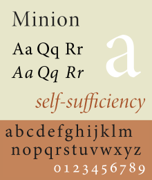
Minion is a serif typeface released in 1990 by Adobe Systems. Designed by Robert Slimbach, it is inspired by late Renaissance-era type and intended for body text and extended reading. Minion's name comes from the traditional naming system for type sizes, in which minion is between nonpareil and brevier, with the type body 7pt in height.[2][3][4] As the historically rooted name indicates, Minion was designed for body text in a classic style, although slightly condensed and with large apertures to increase legibility.[5] Slimbach described the design as having "a simplified structure and moderate proportions."[6][7] The design is slightly condensed, although Slimbach has said that this was intended not for commercial reasons so much as to achieve a good balance of the size of letters relative to the ascenders and descenders.[3]
Minion was developed into a large family using sophisticated interpolation or multiple master technology to create a range of weights and optical sizes suitable for different text sizes.[8][9][10] This automation of font creation was intended to create a seamless transition of styles from solid, chunky designs for caption-size small print to more graceful and slender designs for headings.[11][a] It is an early member of what became Adobe's Originals program, which created a set of type families primarily for book and print use, many like Minion in a deliberately historical, humanist style.[b]
Minion is a very large family of fonts, including Greek, Armenian and Cyrillic alphabets, optical sizes, condensed styles and stylistic alternates such as swash capitals.[14] As a standard font in many of Adobe's programs, it is one of the most popular serif typefaces used in books. One of the most famous uses of Minion is The Elements of Typographic Style, Robert Bringhurst's book about fine printing and page layout.[15][16]
Releases[]

Modern Minion releases are in the OpenType (otf) format, allowing a variety of stylistic alternates such as small caps and ligatures to be encoded in the same font. The original release used additional 'expert set' fonts for these features, and may remain used by designers using more primitive software such as Microsoft Office that has limited OpenType support. Like many Adobe fonts, Minion included a 'Th' ligature derived from traditional calligraphy.[17]
Minion[]
The original release. Minion Black does not have an italic counterpart. Minion Expert is a separate font package that include fonts containing small caps, ligatures, old style figures, and swash glyphs. There are also fonts for dingbats (Minion Ornaments), and a Black-weighted font (Minion Black Expert). Swash fonts are included for only the 2 lightest font weights. An 'expert set' font is used for older and simpler applications that cannot handle multiple text styles for the same letter (such as both lower-case letters and small caps) in the same font. Slimbach stated, "I saw it as being useful in text applications like newspapers, textbooks, and manuals, as well as signage and titles."[18]
Minion Cyrillic[]
Minion Cyrillic was designed in 1992 by Robert Slimbach and was conceived as a non-Latin counterpart to Slimbach’s Minion typeface family. There were no Display-sized fonts, expert fonts, or Black-weighted fonts in this family.
Minion MM[]
The Multi Master version of the original Minion family, released in 1992. Commonly used in Adobe Acrobat to replace unknown fonts.
Minion Std Black[]
An OpenType version of the Minion Black font, but includes features found in Expert versions of PostScript Minion Black fonts. In addition, character set was updated to support Adobe Western 2.
Minion Pro[]
An OpenType update of the original family, released in 2000. The update is based on Minion MM but features slight changes to the selection of instances and modifications of the font metrics.[19]
The family comes with 3 (later 4, which adds Medium) weights, each in roman and italic, 2 widths, and 4 optical sizes (not sold in all packages). The Black weight from Minion Black Expert was not included. Each font includes the expert glyphs and dingbats that were previously found in Minion Expert package (swashes available in italic fonts only), Cyrillic Glyphs from Minion Cyrillic. In addition, the font family supports Adobe CE, Adobe Western 2, Greek, Latin Extended, Vietnamese character sets.
Although any of the fonts may be used at any size, the intended point sizes for the designs of this family are:
| Optical sizes | Caption | Regular | Subhead | Display |
|---|---|---|---|---|
| Intended point sizes | 6–8.4 | 8.5–13.0 | 13.1–19.9 | 20+ |
Minion Pro won the bukva:raz! 2001 award under the Greek category.[21]
Minion Web[]
A TrueType version of Minion, designed for screen use. It supports ISO-Adobe character set. Version 1.00 of the font was distributed with Internet Explorer 4.0.
Minion Web Pro[]
An updated version of Minion Web, which supports Adobe CE and Adobe Western 2 character sets.
Minion Math and MnSymbol[]
Minion Math is a variant designed by Johannes Küster from typoma GmbH, for mathematical applications.[22][23] Minion Math family includes 20 fonts in 4 weights and 5 optical sizes each. An additional optical size 'Tiny' is added. The October 2011 version (1.020) contains about 2900 glyphs per font; it also added OpenType math features. Minion Math had a working title, typoma MnMath. The final form is expected to include all Unicode mathematical symbols and many additional symbols.
An older companion to Adobe's Minion Pro (rather than replacement) is Achim Blumensath's MnSymbol, typically (but not necessarily) used from TeX.[24] Although MnSymbol has a packaging as OpenType, it only provides TeX font metrics for math.
Minion 3 (2018)[]
A rerelease including Armenian, redesigned Greek characters and other modifications.[25][26][27][28]
Minion in other font families[]
The Latin Minion glyphs are also used in other Adobe font families, including Adobe Arabic (Arabic), Adobe Hebrew (Hebrew), Adobe Thai (Thai), and Adobe Song (simplified Chinese).
Reception[]
Minion has generally received praise for its effectiveness as a clean, neutral book face with a very comprehensive range of features and styles. Slimbach himself has described it as "an exercise in restraint", noting that his other old-style serif designs, Arno and Jenson, are more eccentric.[7]
Type designer Matthew Butterick mildly criticised it for being overused: "Minion is beautifully made—it’s balanced, it’s clean, it’s handsome, it’s conservative. It’s easy to like. And it’s been hugely successful as a book font, meaning you will not get fired for using Minion ... [but] Minion succeeds so well in being noncontroversially good-looking that I find it sort of dull."[29]
Usage[]
- In 2003, Brown University adopted Minion as the typeface for the University logo.[30]
- In 2008, Wake Forest University adopted Minion Pro as its primary serif typeface as part of its project to update the university's visual identity, noting that the font "… exhibits warmth and balance …".[31]
- Leiden University uses Minion Pro as its primary font, including in its logo.[32]
- Robert Bringhurst's The Elements of Typographic Style (Hartley & Marks, 2008) uses Minion as its body face.[33]
- University of Otago uses Minion as its serif typeface, including in its logo.[34]
- The logo of the Smithsonian is Minion Pro.[35]
- The Cambridge Grammar of the English Language is printed in Adobe Minion.[36]
- The logo of the Church of Jesus Christ of Latter-Day Saints is printed in Minion Pro, with capital letters.
- In 2019, the Daughters of the American Revolution adopted Minion as their primary font, especially for their logo.
References[]
- ^ Riggs, Tamye. "The Adobe Originals Silver Anniversary Story: Expanding the Originals". Typekit. Adobe Systems. Retrieved 27 February 2017.
- ^ Phinney, Thomas. "Point Size and the Em Square: Not What People Think". Phinney on Fonts.
- ^ Jump up to: a b Slimbach, Robert; Bringhurst, Robert. "A conversation between Robert Slimbach and Robert Bringhurst about Minion". Minion 3–Typekit. Adobe Systems. Retrieved 19 April 2018.
- ^ Slimbach, Robert. "Robert Slimbach on Minion's historical context: milestones in the evolution of old style roman typefaces". Minion 3. Typekit. Retrieved 19 June 2018.
- ^ "Minion". Typekit. Adobe. Retrieved 2 July 2015.
- ^ Slye, Christopher. "Coming to your desktop: fonts from Adobe". Typekit Blog. Adobe.
- ^ Jump up to: a b Twardoch, Slimbach, Sousa, Slye (2007). Arno Pro (PDF). San Jose: Adobe Systems. Retrieved 14 August 2015.CS1 maint: multiple names: authors list (link)
- ^ "DesigningMultiple Master Typefaces" (PDF). Adobe. Archived from the original (PDF) on 6 July 2015. Retrieved 2 July 2015.
- ^ Carter, Sebastian. "Typeface Review: Adobe Minion". Bulletin of the Printing Historical Society (35): 14–15, supplement issue 36 p. 15.
- ^ Lo Celso, Alejandro. "A discussion on Type Design Revivalism". PampaType. Retrieved 19 June 2018.
- ^ Riggs, Tamye. "The Adobe Originals Silver Anniversary Story". Typekit blog. Adobe. Retrieved 2 July 2015.
- ^ Phinney, Thomas. "Font Remix Tools (RMX) and Multiple Master Fonts in type design". Phinney. Retrieved 4 July 2015.
- ^ Phinney, Thomas. "TrueType, PostScript Type 1, & OpenType: What's the Difference?" (PDF). Adobe. Retrieved 4 July 2015.
- ^ "Adobe Typography Primer" (PDF). Adobe. Retrieved 2 July 2015.
- ^ Coles, Stephen. "Top Ten Typefaces Used by Book Design Winners". FontFeed (archived). Archived from the original on 28 February 2012. Retrieved 2 July 2015.
- ^ Bringhurst, Robert (1996). The elements of typographic style (2. ed.). Point Roberts: Hartley & Marks. p. 49. ISBN 0881791334.
- ^ Shaw, Paul (May 12, 2011). "Flawed Typefaces". Print. Retrieved February 16, 2019.
- ^ Shaw, Paul. "Classic Study: The Type Faces of Robert Slimbach". Print. 54 (5): 46.
- ^ Type 1 ("PostScript") to OpenType font conversion
- ^ Pro Opticals ReadMe.pdf "Minion Pro Opticals" Check
|url=value (help) (PDF). Retrieved 7 August 2019. - ^ Type Directors Club : News : bukva:raz! Results Archived 2008-09-18 at the Wayback Machine
- ^ Minion Math: the design of a new math font family
- ^ Notes from TUG2008 in Cork: Day 2
- ^ ftp://ftp.dante.de/tex-archive/fonts/mnsymbol/MnSymbol.pdf
- ^ Kerrigan, Sally. "A classic for 30 years, updated: Introducing Minion 3". Typekit Blog. Adobe. Retrieved 19 April 2018.
- ^ "Minion 3: Design". Typekit. Adobe Systems. Retrieved 19 April 2018.
- ^ Berry, John. "Minion 3: History". Typekit. Adobe Systems. Retrieved 19 April 2018.
- ^ "Minion 3: Usage". Typekit. Adobe Systems. Retrieved 19 April 2018.
- ^ Butterick, Matthew. "Minion". Typography for Lawyers. Archived from the original on 1 May 2015. Retrieved 15 August 2015.
- ^ "Brown University: Visual Identity and Graphic Standards - The New Logo". Retrieved 2009-12-15.
- ^ "Section 4: Typography" (PDF). Identity Standards, Standards Guide. Wake Forest University. p. 2. Retrieved 2008-09-03.
- ^ "House style guidelines: Fonts". Universiteit Leiden. Retrieved 2020-11-09.
- ^ Coles, Stephen. "The Elements of Typographic Style, 4th Edition by Robert Bringhurst". Fonts in Use. Retrieved 17 March 2018.
- ^ University of Otago Brand Guide
- ^ "Smithsonian Visual Identity Program - Logo Specifications". Archived from the original on 2013-08-19. Retrieved 2012-12-13.
- ^ The Cambridge Grammar of the English Language (CUP, 2002), p. iv.
- ^ The original goal was that this would be controllable from inside applications using text, so a user could fine-tune the font to the exact form they needed (thickness, optical size, level of condensation, etc.)[12] Making apps support this proved impractical, and so instead multiple master fonts have been released in a set of styles likely to be useful.[13]
- ^ This describes their original design goal: with the growth of webfonts and higher-resolution displays it has become more practical to use them for onscreen use as well.
External links[]
- Minion Pro at Fontspring - Adobe's preferred reseller
- Fonts in Use
- TUG2008 contains info on Minion Math
- MinionPro – LaTeX package
- Using Minion Pro with LaTeX
- Minion® Math
| Authority control |
|---|
- Cyrillic typefaces
- Greek typefaces
- Latin-script typefaces
- Old style serif typefaces
- Typefaces with text figures
- Mathematical OpenType typefaces
- Typefaces with optical sizes
- Adobe typefaces
- Digital typefaces
- Typefaces and fonts introduced in 1990
- Typefaces designed by Robert Slimbach