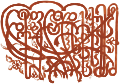
Calligraphy


 |
| Calligraphy |
|---|
Calligraphy (from Greek: καλλιγραφία) is a visual art related to writing. It is the design and execution of lettering with a pen, ink brush, or other writing instrument.[1]:17 A contemporary calligraphic practice can be defined as "the art of giving form to signs in an expressive, harmonious, and skillful manner".[1]:18
Modern calligraphy ranges from functional inscriptions and designs to fine-art pieces where the letters may or may not be readable.[1][page needed] Classical calligraphy differs from type design and non-classical hand-lettering, though a calligrapher may practice both.[2][3][4][5]
Calligraphy continues to flourish in the forms of wedding invitations and event invitations, font design and typography, original hand-lettered logo design, religious art, announcements, graphic design and commissioned calligraphic art, cut stone inscriptions, and memorial documents. It is also used for props and moving images for film and television, and also for testimonials, birth and death certificates, maps, and other written works.[6][7]
Tools[]
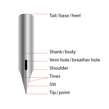
The principal tools for a calligrapher are the pen and the brush. Calligraphy pens write with nibs that may be flat, round, or pointed.[8][9][10] For some decorative purposes, multi-nibbed pens—steel brushes—can be used. However, works have also been created with felt-tip and ballpoint pens, although these works do not employ angled lines. There are some styles of calligraphy, such as Gothic script, that require a stub nib pen.
Writing ink is usually water-based and is much less viscous than the oil-based inks used in printing. Certain specialty paper with high ink absorption and constant texture enables cleaner lines,[11] although parchment or vellum is often used, as a knife can be used to erase imperfections and a light-box is not needed to allow lines to pass through it. Normally, light boxes and templates are used to achieve straight lines without pencil markings detracting from the work. Ruled paper, either for a light box or direct use, is most often ruled every quarter or half inch, although inch spaces are occasionally used. This is the case with litterea unciales (hence the name), and college-ruled paper often acts as a guideline well.[12]
Common calligraphy pens and brushes are:
- Quill
- Dip pen
- Ink brush
- Qalam
- Fountain pen
World traditions[]
East Asia and Vietnam[]
Chinese calligraphy is locally called shūfǎ or fǎshū (書法 or 法書 in Traditional Chinese, literally "the method or law of writing");[13] Japanese calligraphy is shodō (書道, literally "the way or principle of writing"); Korean calligraphy is called seoye (Korean: 서예/書藝, literally "the art of writing"); and Vietnamese calligraphy is called thư pháp (Vietnamese: Thư pháp/書法, literally "the way of letters or words"). The calligraphy of East Asian characters is an important and appreciated aspect of traditional East Asian culture.
History[]

In ancient China, the oldest known Chinese characters are oracle bone script (甲骨文), carved on ox scapulae and tortoise plastrons, because the rulers in the Shang Dynasty carved pits on such animals' bones and then baked them to gain auspice of military affairs, agricultural harvest, or even procreating and weather.[clarification needed] During the divination ceremony, after the cracks were made, the characters were written with a brush on the shell or bone to be later carved. (Keightley, 1978). With the development of Jīnwén (Bronzeware script) and Dàzhuàn (Large Seal Script)[14] "cursive" signs continued. Mao Gong Ding is one of the most famous and typical Bronzeware scripts in Chinese calligraphic history. It has 500 characters on the bronze which is the largest number of bronze inscription we have discovered so far.[clarification needed][15] Moreover, each archaic kingdom of current China had its own set of characters.
In Imperial China, the graphs on old steles—some dating from 200 BCE, and in Xiaozhuan style—are still accessible[clarify].
About 220 BCE, the emperor Qin Shi Huang, the first to conquer the entire Chinese basin, imposed several reforms, among them Li Si's character unification, which created a set of 3300 standardized Xiǎozhuàn (小篆) characters.[16] Despite the fact that the main writing implement of the time was already the brush, few papers survive from this period, and the main examples of this style are on steles.
The Lìshū style (隸書/隸书) (clerical script) which is more regularized, and in some ways similar to modern text, were also authorised under Qin Shi Huangdi.[17][self-published source?]
Between clerical script and traditional regular script, there is another transitional type of calligraphic work called . It started during the North and South dynasties (420 to 589 CE) and ended before the Tang Dynasty (618-907).[18]
Kǎishū style (traditional regular script)—still in use today—and attributed to Wang Xizhi (王羲之, 303–361) and his followers, is even more regularized.[17] Its spread was encouraged by Emperor Mingzong of Later Tang (926–933), who ordered the printing of the classics using new wooden blocks in Kaishu. Printing technologies here allowed a shape stabilization. The Kaishu shape of characters 1000 years ago was mostly similar to that at the end of Imperial China.[17] But small changes have been made, for example in the shape of 广 which is not absolutely the same in the Kangxi Dictionary of 1716 as in modern books. The Kangxi and current shapes have tiny differences, while stroke order is still the same, according to the old style.[19]
Styles which did not survive include Bāfēnshū, a mix of 80% Xiaozhuan style, and 20% Lishu style. [17] Some variant Chinese characters were unorthodox or locally used for centuries. They were generally understood but always rejected in official texts. Some of these unorthodox variants, in addition to some newly created characters, compose the Simplified Chinese character set.
Technique[]
Traditional East Asian writing uses the Four Treasures of the Study (文房四寶/文房四宝):[20] ink brushes known as máobǐ (毛筆/毛笔) , Chinese ink, paper, and inkstones to write Chinese characters. These instruments of writing are also known as the Four Friends of the Study (Korean: 문방사우/文房四友, romanized: Munbang sau) in Korea. Besides the traditional four tools, desk pads and paperweights are also used.
Many different parameters influence the final result of a calligrapher's work. Physical parameters include the shape, size, stretch, and hair type of the ink brush; the color, color density and water density of the ink; as well as the paper's water absorption speed and surface texture. The calligrapher's technique also influences the result, as the look of finished characters are influenced by the quantity of ink and water the calligraper lets the brush take and by the pressure, inclination, and direction of the brush. Changing these variables produces thinner or bolder strokes, and smooth or toothed borders. Eventually, the speed, accelerations and decelerations of a skilled calligrapher's movements aim to give "spirit" to the characters, greatly influencing their final shapes.
Styles[]
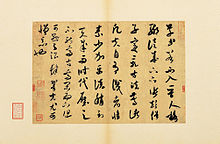
Cursive styles such as xíngshū (行書/行书)(semi-cursive or running script) and cǎoshū (草書/草书)(cursive, rough script, or grass script) are less constrained and faster, where more movements made by the writing implement are visible. These styles' stroke orders vary more, sometimes creating radically different forms. They are descended from Clerical script, in the same time as Regular script (Han Dynasty), but xíngshū and cǎoshū were used for personal notes only, and never used as a standard. The cǎoshū style was highly appreciated in Emperor Wu of Han reign (140–187 CE).[17]
Examples of modern printed styles are Song from the Song Dynasty's printing press, and sans-serif. These are not considered traditional styles, and are normally not written.
Influences[]


Both Japanese, Korean and Vietnamese calligraphy were greatly influenced by Chinese calligraphy. The Japanese, Korean and Vietnamese people have also developed their own specific sensibilities and styles of calligraphy while incorporating Chinese influences. For example, Japanese calligraphy go out of the set of CJK strokes to also include local alphabets such as hiragana and katakana, with specific problematics such as new curves and moves, and specific materials (Japanese paper, washi 和紙, and Japanese ink).[21] In the case of Korean calligraphy, the Hangeul and the existence of the circle required the creation of a new technique which usually confuses Chinese calligraphers. Vietnamese calligraphy is quite special, since Vietnam has abolished the Chữ Nôm, an old Vietnamese writing system based on Chinese characters and replaced it with the Latin alphabet. However, the calligraphic traditions continue to be preserved.
Temporary calligraphy is a practice of water-only calligraphy on the floor, which dries out within minutes. This practice is especially appreciated by the new generation of retired Chinese in public parks of China. These will often open studio-shops in tourist towns offering traditional Chinese calligraphy to tourists. Other than writing the clients name, they also sell fine brushes as souvenirs and limestone carved stamps.
Since late 1980s, a few Chinese artists have branched out traditional Chinese calligraphy to a new territory by mingling Chinese characters with English letters; notable new forms of calligraphy are Xu Bing's square calligraphy and DanNie's coolligraphy or cooligraphy.
Calligraphy has influenced ink and wash painting, which is accomplished using similar tools and techniques. Calligraphy has influenced most major art styles in East Asia, including ink and wash painting, a style of Chinese, Japanese, and Korean based entirely on calligraphy.
Mongolia[]
Mongolian calligraphy is also influenced by Chinese calligraphy, from tools to style.
Tibet[]

Tibetan calligraphy is central to Tibetan culture. The script is derived from Indic scripts. The nobles of Tibet, such as the High Lamas and inhabitants of the Potala Palace, were usually capable calligraphers. Tibet has been a center of Buddhism for several centuries, and that religion places a great deal of significance on written word. This does not provide for a large body of secular pieces, although they do exist (but are usually related in some way to Tibetan Buddhism). Almost all high religious writing involved calligraphy, including letters sent by the Dalai Lama and other religious and secular authority. Calligraphy is particularly evident on their prayer wheels, although this calligraphy was forged rather than scribed, much like Arab and Roman calligraphy is often found on buildings. Although originally done with a reed, Tibetan calligraphers now use chisel tipped pens and markers as well.
Southeast Asia (except Vietnam)[]
Philippines[]


The Philippines has numerous ancient and indigenous scripts collectively called as Suyat scripts. Various ethno-linguistic groups in the Philippines prior to Spanish colonization in the 16th century up to the independence era in the 21st century have used the scripts with various mediums. By the end of colonialism, only four of the suyat scripts survived and continue to be used by certain communities in everyday life. These four scripts are Hanunó'o/Hanunoo of the Hanuno'o Mangyan people, Buhid/Buid of the Buhid Mangyan people, Tagbanwa script of the Tagbanwa people, and Palaw'an/Pala'wan of the Palaw'an people. All four scripts were inscribed in the UNESCO Memory of the World Programme, under the name Philippine Paleographs (Hanunoo, Buid, Tagbanua and Pala’wan), in 1999.[22]

Due to dissent from colonialism, many artists and cultural experts have revived the usage of suyat scripts that went extinct due to Spanish persecution. These scripts being revived include the Kulitan script of the Kapampangan people, the badlit script of various Visayan ethnic groups, the Iniskaya script of the Eskaya people, the Baybayin script of the Tagalog people, and the Kur-itan script of the Ilocano people, among many others.[23][24][25] Due to the diversity of suyat scripts, all calligraphy written in suyat scripts are collectively called as Filipino suyat calligraphy, although each are distinct from each other.[26][27] Calligraphy using the Western alphabet and the Arabic alphabet are also prevalent in the Philippines due to its colonial past, but the Western alphabet and the Arabic alphabet are not considered as suyat, and therefore Western-alphabet and Arabic calligraphy are not considered as suyat calligraphy.[28][29]
South Asia[]
India[]
Religious texts are the most frequent purpose for Indian calligraphy. Monastic Buddhist communities had members trained in calligraphy and shared responsibility for duplicating sacred scriptures.[30] Jaina traders incorporated illustrated manuscripts celebrating Jaina saints. These manuscripts were produced using inexpensive material, like palm leave and birch, with fine calligraphy.[31]
Nepal[]
Nepalese calligraphy is primarily created using the Ranjana script. The script itself, along with its derivatives (like Lantsa, Phagpa, Kutila) are used in Nepal, Tibet, Bhutan, Leh, Mongolia, coastal Japan, and Korea to write "Om mani padme hum" and other sacred Buddhist texts, mainly those derived from Sanskrit and Pali.
Africa[]
Egypt[]
Egyptian hieroglyphs were the formal writing system used in Ancient Egypt. Hieroglyphs combined logographic, syllabic and alphabetic elements, with a total of some 1,000 distinct characters.
Ethiopia/Abyssinia[]
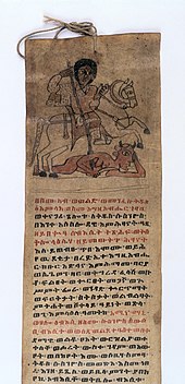
Ethiopian (Abyssinian) calligraphy began with the Ge'ez script, which replaced Epigraphic South Arabian in the Kingdom of Aksum, that was developed specifically for Ethiopian Semitic languages. In those languages that use it, such as Amharic and Tigrinya, the script is called Fidäl, which means script or alphabet. The Epigraphic South Arabian letters were used for a few inscriptions into the 8th century, though not any South Arabian language since Dʿmt.
Early inscriptions in Ge'ez and Ge'ez script have been dated to as early as the 5th century BCE, and in a sort of proto-Ge'ez written in ESA since the 9th century BCE. Ge'ez literature begins with the Christianization of Ethiopia (and the civilization of Axum) in the 4th century, during the reign of Ezana of Axum.
The Ge'ez script is read from left to right and has been adapted to write other languages, usually ones that are also Semitic. The most widespread use is for Amharic in Ethiopia and Tigrinya in Eritrea and Ethiopia.
Europe[]
History[]
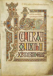
British Library, London.
Western calligraphy is recognizable by the use of the Latin script. The Latin alphabet appeared about 600 BCE, in Rome, and by the first century[clarification needed] developed into Roman imperial capitals carved on stones, Rustic capitals painted on walls, and Roman cursive for daily use. In the second and third centuries the uncial lettering style developed. As writing withdrew to monasteries, uncial script was found more suitable for copying the Bible and other religious texts. It was the monasteries which preserved calligraphic traditions during the fourth and fifth centuries, when the Roman Empire fell and Europe entered the Dark Ages.[32]
At the height of the Empire, its power reached as far as Great Britain; when the empire fell, its literary influence remained. The Semi-uncial generated the Irish Semi-uncial, the small Anglo-Saxon.[33] Each region developed its own standards following the main monastery of the region (i.e. Merovingian script, Laon script, Luxeuil script, Visigothic script, Beneventan script), which are mostly cursive and hardly readable.

Christian churches promoted the development of writing through the prolific copying of the Bible, the Breviary, and other sacred texts.[34] Two distinct styles of writing known as uncial and half-uncial (from the Latin "uncia", or "inch") developed from a variety of Roman bookhands.[35] The 7th–9th centuries in northern Europe were the heyday of Celtic illuminated manuscripts, such as the Book of Durrow, Lindisfarne Gospels and the Book of Kells.[36]
Charlemagne's devotion to improved scholarship resulted in the recruiting of "a crowd of scribes", according to Alcuin, the Abbot of York.[37] Alcuin developed the style known as the Caroline or Carolingian minuscule. The first manuscript in this hand was the Godescalc Evangelistary (finished 783)—a Gospel book written by the scribe Godescalc.[38] Carolingian remains the one progenitor hand from which modern booktype descends.[39]
In the eleventh century, the Caroline evolved into the Gothic script, which was more compact and made it possible to fit more text on a page.[40]:72 The Gothic calligraphy styles became dominant throughout Europe; and in 1454, when Johannes Gutenberg developed the first printing press in Mainz, Germany, he adopted the Gothic style, making it the first typeface.[40]:141
In the 15th century, the rediscovery of old Carolingian texts encouraged the creation of the humanist minuscule or littera antiqua. The 17th century saw the Batarde script from France, and the 18th century saw the English script spread across Europe and world through their books.
In the mid-1600s French officials, flooded with documents written in various hands and varied levels of skill, complained that many such documents were beyond their ability to decipher. The Office of the Financier thereupon restricted all legal documents to three hands, namely the Coulee, the Rhonde, (known as Round hand in English) and a Speed Hand sometimes simply called the Bastarda.[41]
While there were many great French masters at the time, the most influential in proposing these hands was Louis Barbedor, who published Les Ecritures Financière Et Italienne Bastarde Dans Leur Naturel circa 1650.[41]
With the destruction of the Camera Apostolica during the sack of Rome (1527), the capitol for writing masters moved to Southern France. By 1600, the Italic Cursiva began to be replaced by a technological refinement, the Italic Chancery Circumflessa, which in turn fathered the Rhonde and later English Roundhand.[41]
In England, Ayres and Banson popularized the Round Hand while Snell is noted for his reaction to them, and warnings of restraint and proportionality. Still Edward Crocker began publishing his copybooks 40 years before the aforementioned.[41]
Style[]

Sacred Western calligraphy has some unique features, such as the illumination of the first letter of each book or chapter in medieval times. A decorative "carpet page" may precede the literature, filled with ornate, geometrical depictions of bold-hued animals. The Lindisfarne Gospels (715–720 CE) are an early example.[42]
As with Chinese or Islamic calligraphy, Western calligraphic script employed the use of strict rules and shapes. Quality writing had a rhythm and regularity to the letters, with a "geometrical" order of the lines on the page. Each character had, and often still has, a precise stroke order.
Unlike a typeface, irregularity in the characters' size, style, and colors increases aesthetic value,[dubious ] though the content may be illegible. Many of the themes and variations of today's contemporary Western calligraphy are found in the pages of The Saint John's Bible. A particularly modern example is Timothy Botts' illustrated edition of the Bible, with 360 calligraphic images as well as a calligraphy typeface.[43]
Influences[]
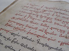
Several other Western styles use the same tools and practices, but differ by character set and stylistic preferences. For Slavonic lettering, the history of the Slavonic and consequently Russian writing systems differs fundamentally from the one of the Latin language. It evolved from the 10th century to today.
Islamic world[]

Islamic calligraphy (calligraphy in Arabic is khatt ul-yad خط اليد) has evolved alongside Islam and the Arabic language. As it is based on Arabic letters, some call it "Arabic calligraphy". However the term "Islamic calligraphy" is a more appropriate term as it comprises all works of calligraphy by Muslim calligraphers of different national cultures, like Persian or Ottoman calligraphy, from Al-Andalus in medieval Spain to China.
Islamic calligraphy is associated with geometric Islamic art (arabesque) on the walls and ceilings of mosques as well as on the page or other materials. Contemporary artists in the Islamic world may draw on the heritage of calligraphy to create modern calligraphic inscriptions, like corporate logos, or abstractions.
Instead of recalling something related to the spoken word, calligraphy for Muslims is a visible expression of the highest art of all, the art of the spiritual world. Calligraphy has arguably become the most venerated form of Islamic art because it provides a link between the languages of the Muslims with the religion of Islam. The Qur'an has played an important role in the development and evolution of the Arabic language, and by extension, calligraphy in the Arabic alphabet. Proverbs and passages from the Qur'an are still sources for Islamic calligraphy.
During the Ottoman civilization, Islamic calligraphy attained special prominence. The city of Istanbul is an open exhibition hall for all kinds and varieties of calligraphy, from inscriptions in mosques to fountains, schools, houses, etc.
Mayan civilization[]
Mayan calligraphy was expressed via Mayan hieroglyphs; modern Mayan calligraphy is mainly used on seals and monuments in the Yucatán Peninsula in Mexico. Mayan hieroglyphs are rarely used in government offices; however in Campeche, Yucatán and Quintana Roo, calligraphy in Mayan languages is written in Latin script rather than hieroglyphs. Some commercial companies in southern Mexico use Mayan hieroglyphs as symbols of their business. Some community associations and modern Mayan brotherhoods use Mayan hieroglyphs as symbols of their groups.
Most of the archaeological sites in Mexico such as Chichen Itza, Labna, Uxmal, Edzna, Calakmul, etc. have glyphs in their structures. Carved stone monuments known as stele are common sources of ancient Mayan calligraphy.
Persia[]
Persian calligraphy has been present in the Persian region before Islamisation. In Zoroastrianism, beautiful and clear writings were always praised.
It is believed that ancient Persian script was invented by about 600–500 BCE to provide monument inscriptions for the Achaemenid kings. These scripts consisted of horizontal, vertical, and diagonal nail-shape letters, which is why it is called "script of nails/cuneiform script" (khat-e-mikhi) in Persian. Centuries later, other scripts such as "Pahlavi" and "Avestan" scripts were used in ancient Persia. Pahlavi was a middle Persian script developed from the Aramaic script and became the official script of the Sassanian empire (224-651 CE). The Persian-Avestan alphabet (alefbâ Pârsi Avestâyi) was created by Lourenço Menezes D'Almeida and is an alternative script for writing the Persian and Avestan languages.
Contemporary scripts[]
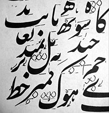
The Nasta'liq style is the most popular contemporary style among classical Persian calligraphy scripts; Persian calligraphers call it the "bride of calligraphy scripts". This calligraphy style has been based on such a strong structure that it has changed very little since. Mir Ali Tabrizi had found the optimum composition of the letters and graphical rules so it has just been fine-tuned during the past seven centuries. It has very strict rules for graphical shape of the letters and for combination of the letters, words, and composition of the whole calligraphy piece.
Modern calligraphy[]
Revival[]

After printing became ubiquitous from the 15th century onward, the production of illuminated manuscripts began to decline.[44] However, the rise of printing did not mean the end of calligraphy.[45]
The modern revival of calligraphy began at the end of the 19th century, influenced by the aesthetics and philosophy of William Morris and the Arts and Crafts movement. Edward Johnston is regarded as being the father of modern calligraphy.[46][47][48] After studying published copies of manuscripts by architect William Harrison Cowlishaw, he was introduced to William Lethaby in 1898, principal of the Central School of Arts and Crafts, who advised him to study manuscripts at the British Museum.[49]
This triggered Johnston's interest in the art of calligraphy with the use of a broad-edged pen. He began a teaching course in calligraphy at the Central School in Southampton Row, London from September 1899, where he influenced the typeface designer and sculptor Eric Gill. He was commissioned by Frank Pick to design a new typeface for London Underground, still used today (with minor modifications).[50]
He has been credited for reviving the art of modern penmanship and lettering single-handedly through his books and teachings – his handbook on the subject, Writing & Illuminating, & Lettering (1906) was particularly influential on a generation of British typographers and calligraphers, including Graily Hewitt, Stanley Morison, Eric Gill, Alfred Fairbank and Anna Simons. Johnston also devised the simply crafted round calligraphic handwriting style, written with a broad pen, known today as the Foundational hand. Johnston initially taught his students an uncial hand using a flat pen angle, but later taught his hand using a slanted pen angle.[51] He first referred to this hand as "Foundational Hand" in his 1909 publication, Manuscript & Inscription Letters for Schools and Classes and for the Use of Craftsmen.[52]
Subsequent developments[]
Graily Hewitt taught at the Central School of Arts and Crafts and published together with Johnston throughout the early part of the century. Hewitt was central to the revival of gilding in calligraphy, and his prolific output on type design also appeared between 1915 and 1943. He is attributed with the revival of gilding with gesso and gold leaf on vellum. Hewitt helped to found the Society of Scribes & Illuminators (SSI) in 1921, probably the world's foremost calligraphy society.

Hewitt is not without both critics[53] and supporters[54] in his rendering of Cennino Cennini's medieval gesso recipes.[55] Donald Jackson, a British calligrapher, has sourced his gesso recipes from earlier centuries a number of which are not presently in English translation.[56] Graily Hewitt created the patent announcing the award to Prince Philip of the title of Duke of Edinburgh on November 19, 1947, the day before his marriage to Queen Elizabeth.[57]
Johnston’s pupil, Anna Simons, was instrumental in sparking off interest in calligraphy in Germany with her German translation of Writing and Illuminating, and Lettering in 1910.[46] Austrian Rudolf Larisch, a teacher of lettering at the Vienna School of Art, published six lettering books that greatly influenced German-speaking calligraphers. Because German-speaking countries had not abandoned the Gothic hand in printing, Gothic also had a powerful effect on their styles.
Rudolf Koch was a friend and younger contemporary of Larisch. Koch's books, type designs, and teaching made him one of the most influential calligraphers of the 20th century in northern Europe and later in the U.S. Larisch and Koch taught and inspired many European calligraphers, notably Karlgeorg Hoefer, and Hermann Zapf.[58]
Contemporary typefaces used by computers, from word processors like Microsoft Word or Apple Pages to professional design software packages like Adobe InDesign, owe a considerable debt to the past and to a small number of professional typeface designers today.[1][4][59]
Unicode provides "Script" and "Fraktur" Latin alphabets that can be used for calligraphy. See Mathematical Alphanumeric Symbols.
See also[]
- Asemic writing
- Bastarda
- Blackletter
- Book hand
- Brāhmī script
- Calligraffiti
- Chancery hand
- Concrete poetry
- Court hand
- Cursive
- Hand (writing style)
- Handwriting
- History of writing
- Italic script
- List of calligraphers
- Mathematical Alphanumeric Symbols
- Micrography
- Palaeography
- Penmanship
- Ronde script (calligraphy)
- Rotunda (script)
- Round hand
- Secretary hand
- Siyah mashq
- Sofer
Notes[]
- ^ Jump up to: a b c d Mediaville, Claude (1996). Calligraphy: From Calligraphy to Abstract Painting. Belgium: Scirpus-Publications. ISBN 978-90-803325-1-5.
- ^ Pott, G. (2006). Kalligrafie: Intensiv Training [Calligraphy: Intensive Training] (in German). Verlag Hermann Schmidt. ISBN 978-3-87439-700-1.
- ^ Pott, G. (2005). Kalligrafie: Erste Hilfe und Schrift-Training mit Muster-Alphabeten (in German). Verlag Hermann Schmidt. ISBN 978-3-87439-675-2.
- ^ Jump up to: a b Zapf, H. (2007). Alphabet Stories: A Chronicle of technical developments. Rochester, NY: Cary Graphic Arts Press. ISBN 978-1-933360-22-5.
- ^ Zapf, H. (2006). The world of Alphabets: A kaleidoscope of drawings and letterforms. CD-ROM
- ^ Propfe, J. (2005). SchreibKunstRaume: Kalligraphie im Raum Verlag (in German). Munich: Callwey Verlag. ISBN 978-3-7667-1630-9.
- ^ Geddes, A.; Dion, C. (2004). Miracle: a celebration of new life. Auckland: Photogenique Publishers. ISBN 978-0-7407-4696-3.
- ^ Reaves, M.; Schulte, E. (2006). Brush Lettering: An instructional manual in Western brush calligraphy (Revised ed.). New York: Design Books.
- ^ Child, H., ed. (1985). The Calligrapher's Handbook. Taplinger Publishing Co.
- ^ Lamb, C.M., ed. (1976) [1956]. Calligrapher's Handbook. Pentalic.
- ^ "Paper Properties in Arabic calligraphy". calligraphyfonts.info. Archived from the original on 2017-03-13. Retrieved 2007-06-01.
- ^ "Calligraphy Islamic website". Calligraphyislamic.com. Archived from the original on 2012-06-08. Retrieved 2012-06-18.
- ^ 書 (Taiwanese) being here used as in 楷书 (Cantonese) or 楷書 (Taiwanese), meaning "writing style",[clarification needed]
- ^ Categories of Calligraphy – Seal Script. (n.d.). Retrieved May 30, 2018, from http://www.cityu.edu.hk/lib/about/event/ch_calligraphy/seal_eng.htm
- ^ The Bell and Cauldron Inscriptions-A Feast of Chinese Characters: The Origin and Development_Mao Gong Ding. (n.d.). Retrieved May 30, 2018, from https://www.npm.gov.tw/exh99/bell/3_en.htm
- ^ Fazzioli, Edoardo (1987). Chinese Calligraphy: From Pictograph to Ideogram: The History Of 214 Essential Chinese/Japanese Characters. Calligraphy by Rebecca Hon Ko. New York: Abbeville Press. p. 13. ISBN 978-0-89659-774-7.
And so the first Chinese dictionary was born, the Sān Chāng, containing 3,300 characters
- ^ Jump up to: a b c d e R. B. Blakney (2007). A Course in the Analysis of Chinese Characters. Lulu.com. p. 6. ISBN 978-1-897367-11-7.[self-published source]
- ^ Z. (n.d.). Chinese Calligraphy. Retrieved May 30, 2018, from http://www.ebeijing.gov.cn/Culture/Culture_Recommendation/t1068241_2.htm
- ^ 康熙字典 [Kangxi Zidian] (in Chinese). 1716. p. 41.. See, for example, the radicals 卩, 厂, or 广. The 2007 common shape for those characters does not clearly show the stroke order, but old versions, visible on p. 41, clearly allow the stroke order to be determined.
- ^ Li, J. (Ed.). (n.d.). "Four treasures of Study" tour. Retrieved May 30, 2018, from http://www.chinadaily.com.cn/m/anhui/travel/2010-06/02/content_9948922.htm
- ^ Suzuki, Yuuko (2005). An introduction to Japanese calligraphy. Tunbridge Wells: Search. ISBN 978-1-84448-057-9.
- ^ "Philippine Paleographs (Hanunoo, Buid, Tagbanua and Pala'wan) – United Nations Educational, Scientific and Cultural Organization". www.unesco.org.
- ^ "'Educate first': Filipinos react to Baybayin as national writing system".
- ^ "House panel approves Baybayin as national writing system". 24 April 2018.
- ^ News, ABS-CBN. "5 things to know about PH's pre-Hispanic writing system".
- ^ "A primer on Baybayin". gmanetwork.com.
- ^ "The Baybayin bill and the never ending search for 'Filipino-ness'".
- ^ "10 Perfectly Awesome Calligraphers You Need To Check Out". brideandbreakfast.ph. 12 August 2015.
- ^ "How to ace in script lettering". philstar.com.
- ^ Salomon, Richard (1998). Indian Epigraphy: A Guide to the Study of Inscriptions in Sanskrit, Prakrit, and the Other Indo-Aryan Languages. Oxford, New York: Oxford University Press. ISBN 978-0195099843.
- ^ Mitter, Partha (2001). Indian Art. Oxford, New York: Oxford University Press. p. 100.
- ^ Sabard, V.; Geneslay, V.; Rébéna, L. (2004). Calligraphie latine: Initiation [Latin calligraphy: Introduction] (in French) (7th ed.). Paris. pp. 8–11. ISBN 978-2-215-02130-8.
- ^ Insular Manuscripts: Paleography Section 6: Language on the Page in Insular Manuscripts Layout and Legibility. (n.d.). Retrieved May 30, 2018, from https://www.vhmml.org/school/lesson/insular-paleography/layout
- ^ de Hamel 2001a
- ^ Knight 1998: 10
- ^ Trinity College Library Dublin 2006; Walther & Wolf 2005; Brown & Lovett 1999: 40; Backhouse 1981
- ^ Jackson 1981: 64
- ^ Walther & Wolf 2005; de Hamel 1994: 46–48
- ^ de Hamel 1994: 46
- ^ Jump up to: a b Lovett, Patricia (2000). Calligraphy and Illumination: A History and Practical Guide. Harry N. Abrams. ISBN 978-0-8109-4119-9.
- ^ Jump up to: a b c d Joyce Irene Whalley (c. 1980). The Art of Calligraphy, Western Europe & America.
- ^ Brown, M.P. (2004). Painted Labyrinth: The World of the Lindisfarne Gospel (Revised ed.). British Library.
- ^ The Bible: New Living Translation. Tyndale House Publishers. 2000.
- ^ de Hamel 2001a; de Hamel 1986
- ^ Zapf 2007; de Hamel 2001a; Gilderdale 1999; Gray 1971
- ^ Jump up to: a b "The Legacy of Edward Johnston". The Edward Johnston Foundation.
- ^ Cockerell 1945; Morris 1882
- ^ "Font Designer — Edward Johnston". Linotype GmbH. Retrieved 5 November 2007.
- ^ such as the Ramsey Psalter, BL, Harley MS 2904
- ^ The Eric Gill Society: Associates of the Guild: Edward Johnston
- ^ Gilderdale 1999
- ^ Baines & Dixon 2003: 81
- ^ Tresser 2006
- ^ Whitley 2000: 90
- ^ Herringham 1899
- ^ Jackson 1981: 81
- ^ Hewitt 1944-1953
- ^ Cinamon 2001; Kapr 1991
- ^ Henning, W.E. (2002). Melzer, P. (ed.). An Elegant Hand: The Golden Age of American Penmanship and Calligraphy. New Castle, Delaware: Oak Knoll Press. ISBN 978-1-58456-067-8.
References[]
- (1954), Three classics of Italian Calligraphy, an unabridged reissue of the writing books of Arrighi, Giovanni Antonio Tagliente & Palatino, with an introduction, Dover publications inc. New York, USA
- John Howard Benson & (1940), The Elements of Lettering, John Stevens, Newport, Rhode Island, printed by: D. B. Updike at , Boston
- John Howard Benson (1955), The first writing book, an English translation & fascimile text of Arrighi's Operina, the first Manual of the chancery hand, London Oxford University press, Geoffrey Cumberlege New Haven Yale University Press.
- Berthold Wolpe (1959), A newe writing booke of copies, 1574, A fascimile of a unique Elisabethan Writing book in the Bodleian Library Oxford, Lion and Unicorn Press, London
- Diringer, D. (1968). The Alphabet: A Key to the History of Mankind. 1 (3rd ed.). London: Hutchinson & Co. p. 441.
- Fairbank, Alfred, (1975). Augustino Da Siena, the 1568 edition of his writing book in fascimile, David R. Godine (Boston) & The Merrion Press, (London), ISBN 0-87923-128-9
- (editor), Calligraphy and Paleography, Essays presented to Alfred Fairbank on his 70th birthday, October House Inc. New York, 1965.
- Fraser, M.; Kwiatowski, W. (2006). Ink and Gold: Islamic Calligraphy. London: Sam Fogg Ltd.
- Gaze, T. & Jacobson, M. (editors), (2013). An Anthology Of Asemic Handwriting. Uitgeverij. ISBN 978-90-817091-7-0
- Johnston, E. (1909). "Plate 6". Manuscript & Inscription Letters: For schools and classes and for the use of craftsmen. San Vito Press & Double Elephant Press. 10th Impression
- Marns, F.A (2002) Various, copperplate and form, London
- Mediavilla, Claude (2006). Histoire de la calligraphie française (in French). Paris: Michel. ISBN 978-2-226-17283-9.
- Shepherd, Margaret (2013). Learn World Calligraphy: Discover African, Arabic, Chinese, Ethiopic, Greek, Hebrew, Indian, Japanese, Korean, Mongolian, Russian, Thai, Tibetan Calligraphy, and Beyond. Crown Publishing Group. p. 192. ISBN 978-0-8230-8230-8.
- Annemarie Schimmel, Calligraphy and Islamic Culture. New York University Press. 1984. ISBN 978-0-8147-7830-2.
- Wolfgang Kosack: Islamische Schriftkunst des Kufischen Geometrisches Kufi in 593 Schriftbeispielen. Deutsch – Kufi – Arabisch. 380 Seiten. Verlag Christoph Brunner, Basel 2014, ISBN 978-3-906206-10-3.
External links[]
 Definitions from Wiktionary
 Media from Wikimedia Commons
 Data from Wikidata
- Calligraphy alphabets, a list of major historical scripts (simplified version) at Lettering Daily
- Calligraphy at Curlie
- French Renaissance Paleography This is a scholarly maintained site that presents over 100 carefully selected French manuscripts from 1300 to 1700, with tools to decipher and transcribe them.
| show Typography |
|---|
| show Authority control |
|---|
- Calligraphy
- Book arts
- Penmanship
- Typesetting
- Intangible Cultural Heritage of Humanity