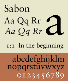
Sabon
 | |
| Category | Serif |
|---|---|
| Classification | Old-style |
| Designer(s) | Jan Tschichold |
| Foundry | Monotype, Linotype, Stempel |
Sabon is an old-style serif typeface designed by the German-born typographer and designer Jan Tschichold (1902–1974) in the period 1964–1967.[1] It was released jointly by the Linotype, Monotype, and Stempel type foundries in 1967.[2] The design of the roman is based on types by Claude Garamond (c. 1480–1561), particularly a specimen printed by the Frankfurt printer Konrad Berner. Berner had married the widow of a fellow printer Jacques Sabon, the source of the face's name, who had bought some of Garamond's type after his death. The italics are based on types designed by a contemporary of Garamond's, Robert Granjon. It is effectively a Garamond revival, though a different name was chosen as many other modern typefaces already carry this name.
A classic typeface for body text, Sabon's longstanding popularity has transcended its origin as a commission to fit a tight set of business requirements. Tschichold was commissioned by a coalition of German printers to create a typeface that could be printed identically on Linotype, Monotype or letterpress equipment, simplifying the process of planning lines and pagination when printing a book. The italic and bold styles were to take up exactly as much space as the roman, a feature imposed by the duplexing system of Linotype hot metal typesetting machines of the period.[3][4][5] Finally, the new font was to be five per cent narrower than their existing Monotype Garamond, in order to save space and money.[6] Sabon's name was therefore considered appropriate: a Frenchman who had moved to Frankfurt, he had played a role in bringing Garamond's type into use in German printing four hundred years before.
History[]

Sabon was developed in the early 1960s for a group of German printers who sought a "harmonized" or uniform font that would look the same whether set by hand or on a Monotype or Linotype hot metal typesetting machine.[7] They were quite specific about the sort of font that might fit the bill, rejecting the modern and fashionable in favour of solid 16th century tradition - something modelled on the work sixteenth-century engravers Claude Garamond and Robert Granjon. The requirement that all weights have the same width was influenced by the 'duplex' system of lead casting on the Linotype system: each Linotype-matrix can cast two different characters: roman or italic, roman or bold, which must have the same width. It also meant that the typeface then only required one set of copyfitting data (rather than three) when compositors had to estimate the length of a text prior to actual typesetting (a common practice before computer-assisted typesetting).[8][9][10] Another hint of the design's origins in hot-metal typesetting technology is the narrow 'f', since Linotype machines cannot cast an 'f' that kerns, or extends beyond the letter's body.[11][12]
Tschichold was well known as an eminent book designer in his own right, having promoted the now-popular ragged right style of book layout. A modernist, after the war, from 1947 to 1949, he played a hugely significant role in British book design, creating a unified, simple and inexpensive layout design for Penguin Books, a publisher which specialised in issuing cheap paperbacks. In his early life, he had lived in Leipzig and in the 1920s had devised a "universal alphabet" for German, improving its non-phonetic spellings and promoting the replacement of the jumble of fonts with a simple sans serif. Tschichold had become more interested in classical book design as his career progressed, and Sabon is a relatively faithful, organic book typeface strongly rooted in tradition.[13] The name "Sabon" was proposed by Stanley Morison, an influential British Monotype artistic advisor and historian of printing.[14] Different drawings were used for machining the larger sizes.[15] Tschichold used an specimen sheet from 1592 to provide initial models to work from, choosing a Garamond face for the roman letters and a Granjon face for the italics.[2]
An early first use of Sabon was the setting of the Washburn College Bible in 1973 by the American graphic designer Bradbury Thompson. All books of the King James biblical text were set by hand in a process called thought-unit typography, where Thompson broke the lines at their spoken syntactical breaks.
Sabon was also used as the typeface in the 1979 Book of Common Prayer of the Episcopal Church (United States), as well as all of that church's secondary liturgical texts (such as the Book of Occasional Services and Lesser Feasts and Fasts).
Sabon was used in the 2000s as the official logo typeface of Stanford University until 2012.[16] It is also used by Örebro University, together with the typeface Trade Gothic.[17] Vogue and Esquire use a slightly modified version of it for headlines.[18] Since 2010, First Things has used Sabon for the page text in its print edition.
A variety of digital releases of Sabon exist with different prices and licensing, sold by both Adobe and Linotype. Fontsite released a version under the name Savoy, while Bitstream released a less faithful version under the name of Classical Garamond.[19][20]
Sabon Next[]

Jean-François Porchez designed the revival of Sabon known as Sabon Next. Sabon Next is based upon Tschichold's 1967 Sabon design for the Stempel foundry and Porchez' study of original Garamond and Le Bé models.[21][1] The family consists of 6 weights, without Greek and Cyrillic support. It supports ISO Adobe 2, Adobe CE, Latin Extended characters. Unlike in the original Sabon, Porchez rejected the approach of a matching-width italic for a more traditional design, narrower than the roman style, and chose to take advantage of digital typesetting technology to include a wide 'f' in the sixteenth-century style.
OpenType features include Small caps (except in Black weight), Ligatures, Special ligatures, Alternates, Caps figures, Oldstyle figures, Tabular figures, Fractions, Superiors, Ornaments, Swash, Proportional Lining figures.
Sabon Next Display[]
A variant of Regular weight Sabon Next designed for 20pt or above.
Sabon Next Ornaments[]
A collection of printers' ornaments and dingbats. The glyphs can also be found in the OpenType Sabon Next (except in Black weights) fonts.
Sabon eText (2013)[]
Sabon eText is a version of Sabon optimized for screen use, designed by Steve Matteson.[22] Changes include increased x-heights, heavier hairline and serifs, wider inter-character spacing, more open counters, adjusted thicks to thins ratio.[23]
The family includes four fonts in two weights (regular, bold), with complementary italics. OpenType features include case-sensitive forms, fractions, ligatures, lining/old style figures, ordinals, superscript, small capitals.
References[]
- ^ Jump up to: a b Ronneberger, Volke (2002). "Die Sabon von Jan Tschichold" (PDF). Publishing Praxis. Retrieved 13 December 2015.
- ^ Jump up to: a b McNeil, Paul (November 9, 2017). The Visual History of Type (print). London: Laurence King. p. 378–379. ISBN 9781780679761. OCLC 1004655550.
- ^ Haralambous, Yannis (2007). Fonts & Encodings (1st ed.). Sebastopol, Calif.: O'Reilly Media. pp. 377–381. ISBN 978-0-596-10242-5. Retrieved 13 December 2015.
- ^ Shaw, Paul. "Flawed Typefaces". Print magazine. Retrieved 30 June 2015.
- ^ Haslam, Andrew; Baines, Phil (2005). Type & typography (2nd ed.). London: Laurence King. p. 99. ISBN 978-1-85669-437-7.
- ^ Cf. S. Garfield, Just My Type, p.251.
- ^ One Hundred Years Of Type Making, 1897-1997. Monotype. 1997. pp. 24–25.
- ^ Cf. A. Bartram, Typeforms: A History, British Library & Oak Knoll Press, London (2007), s.v. Sabon.
- ^ Berry, John D. "The Next Sabon". Creative Pro. Retrieved 22 April 2016.
- ^ Dreyfus, John (1994). "Jan Tschichold's Sabon: The First Harmonised Type". Into Print: selected writings on printing history, typography and book production. London: British Library. pp. 190–4. ISBN 9780712303439.
- ^ Beier, Sofie (2009). Typeface Legibility: Towards defining familiarity. London: Royal College of Art (PhD thesis). pp. 76–77. Retrieved 17 May 2018.
- ^ Mosley, James. "Type held in the hand". Typefoundry (blog). Retrieved 19 May 2018.
- ^ "Just what makes a Garamond a Garamond?". Linotype. Retrieved 11 December 2015.
- ^ Moran, James (1971). Stanley Morison: his typographic achievement. pp. 149-150.
- ^ Kelly, Jerry (2001). "Adobe Garamond (from Printing History 13:2, 1991)". In Heller, Steven (ed.). Texts on Type: Critical Writings on Typography. New York: Allworth Press. pp. 54–63. ISBN 9781581150827.
- ^ Stanford University Identity Toolkit, [1]. Retrieved 2012-11-15.
- ^ Örebro University Design Guidelines, "Archived copy". Archived from the original on 2012-11-05. Retrieved 2012-05-29.CS1 maint: archived copy as title (link). Retrieved 2012-05-29.
- ^ Cf. S. Garfield, Just My Type, p.253; B. Willen & N. Strals, Lettering & Type, Princeton Architectural Press, New York City (2009), Sabon and Its Current Usage.
- ^ "Classical Garamond". MyFonts. Monotype. Retrieved 19 April 2015.
- ^ "Savoy". FontSpring. Retrieved 19 April 2015.
- ^ Burke, Christopher; Porchez, Jean François (2009). Sabon Next specimen. issuu. Linotype GmbH. pp. 18–21.
- ^ Matteson, Steve. "Type Q&A: Steve Matteson from Monotype". Typecast. Monotype. Retrieved 27 March 2016.
- ^ eText Typefaces: Typefaces for High-Quality e-Reading Experiences
Bibliography[]
- Friedl, Friederich, Nicholas Ott and Bernard Stein. Typography: An encyclopedic survey of type design and techniques through history. Black Dog & Leventhal: 1998. ISBN 1-57912-023-7.
- Lawson, Alexander S., Anatomy of a Typeface. Godine: 1990. ISBN 978-0-87923-333-4.
- Meggs, Philip B. and Rob Carter.Typographic Specimens: The Great Typefaces. Wiley: 1993. ISBN 0-471-28429-7.
- Meggs, Philip B. and McKelvey, Roy.Revival of the Fittest: Digital Versions of Classic Typefaces. RC Publications: 2000. ISBN 1-883915-08-2.
- Meggs, Philip B. History of Graphic Design. John Wiley & Sons: 1998. ISBN 0-470-04265-6.
- Perfect, Christopher & Rookledge, Gordon. Rookledge's Classic International Typefinder. Laurence King Publishing: 2004. ISBN 978-1-85669-406-3.
External links[]
| Wikimedia Commons has media related to Sabon (typeface). |
- Sabon Next on MyFonts
- Linotype updates a classic: Sabon Next – new life for an old font
- 1969 advertisement comparing type set in Sabon on the three release versions
| hide Monotype typefaces | |
|---|---|
| 1900s |
|
| 1910s | |
| 1920s |
|
| 1930s |
|
| 1940s |
|
| 1950s |
|
| 1960s |
|
| 1970s |
|
| 1980s | |
| 1990s |
|
| 2000s |
|
| 2010s |
|
| Authority control |
|---|
- Old style serif typefaces
- Typefaces with text figures
- Typefaces with infant variants
- Linotype typefaces
- Monotype typefaces
- Stempel typefaces
- Typefaces and fonts introduced in 1967
- Typefaces with optical sizes