Visual communication
This article needs additional citations for verification. (August 2013) |
Visual communication is the use of visual elements to convey ideas and information[1] which include but are not limited to, signs, typography, drawing, graphic design, illustration, industrial design, advertising, animation, and electronic resources.[2] Humans have used visual communication since prehistoric times.[3] Within modern culture, there are several types of characteristics when it comes to visual elements, they consist of objects, models, graphs, diagrams, maps and photographs.[1] Outside the different types of characteristics and elements , there are seven components of visual communication: Color, Shape, Tones, Texture, Figure-Ground, Balance, and Hierarchy.[1]
Each of these characteristics, elements, and components play an important role in daily lives. Visual communication holds a specific purpose in aspects such as Social Media, Culture, Politics, Economics, and Science. In considering these different aspects, visual elements present various uses and how they convey information.[4] Whether it is advertisements, teaching and learning, or speeches and presentations, they all involve visual aids that communicate a message.[5] In reference to the visual aids, the following are the most common: Chalkboard or Whiteboard, Poster Board, Handouts, Video Excerpts, Projection Equipment, and Computer-Assisted Presentations.[6]
Overview[]
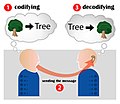
The debate about the nature of visual communication dates back thousands of years. Visual communication relies on a collection of activities, communicating ideas, attitudes, and values via visual resources, i.e. text, graphics, or video.[citation needed] The evaluation of a good visual communication design is mainly based on measuring comprehension by the audience, not on personal aesthetic and/or artistic preference as there are no universally agreed-upon principles of aesthetics.[7] Visual communication by e-mail, a textual medium, is commonly expressed with ASCII art, emoticons, and embedded digital images. Visual communication has become one of the most important approaches using which people communicate and share information.[8]
The term 'visual presentation' is used to refer to the actual presentation of information through a visible medium such as text or images. Recent research in the field has focused on web design and graphically-oriented usability.[9]
Important figures[]
Aldous Huxley is regarded as one of the most prominent explorers of visual communication and sight-related theories.[10] Becoming near-blind in his teen years as the result of an illness set the stage for what would make him one of the most intellectual people to have ever explored visual communication. His work includes important novels on the dehumanizing aspects of scientific progress, most famously Brave New World and The Art of Seeing. He described "seeing" as being the sum of sensing, selecting, and perceiving. One of his most famous quotes is "The more you see, the more you know."
Max Wertheimer is said to be the father of Gestalt psychology. Gestalt means form or shape in German, and the study of Gestalt psychology show emphasis in simplicity, as its properties group visuals by similarity in shape or color, continuity and proximity. Additional laws include closure and figure-ground principles in studied images is also intensively taught.[citation needed]
Image analysis[]
Visual communication contains image aspects. The interpretation of images is subjective and to understand the depth of meaning, or multiple meanings, communicated in an image requires image analysis. Images can be analyzed though many perspectives, for example these six major perspectives presented by Paul Martin Lester: Personal, Historical, Technical, Ethical, Cultural, and Critical.[11]
- Personal Perspective: When a viewer has an opinion about an image based on their personal thoughts. Personal response depends on the viewer's thoughts and values, individually. However,This might be sometimes in conflict with cultural values. Also when a viewer has viewed an image with a personal perspective, it is hard to change the view of the image on the viewer, even though the image can be seen in other ways.[11]
- Historical perspective: An image's view can be arising from the history of the use of media. Through times sort images have been changed, because the use of different (new) media. For example: The result of using the computer to edit images (e.g. Photoshop) is quite different when comparing images that are made and edited by craft.[11]
- Technical perspective: When the view of an image is influenced by the use of lights, position and the presentation of the image. The right use of light, position and presentation of the image can improve the view of the image. It makes the image looks better than the reality.[11]
- Ethical perspective: From this perspective, the maker of the image, the viewer and the image itself must be responsible morally and ethically to the image. This perspective is also categorized in six categories: categorical imperative, utilitarianism, hedonism, golden mean, golden rule and veil of ignorance.[11]
- Cultural perspective: Symbolization is an important definition for this perspective. Cultural perspective involves identity of symbols. The uses of words that are related with the image, the use of heroes in the image, etc. are the symbolization of the image. The cultural perspective can also be seen as the semiotic perspective.[11]
- Critical perspective: The view of images in the critical perspective is when the viewers criticize the images, but the critics have been made in interests of the society, although an individual makes the critics. This way this perspective differs from the personal perspective.[11]
Visual Aid Media: Simple to Advanced[]
- Chalkboard or whiteboard: Chalkboards and whiteboards are very useful visual aids, particularly when more advanced types of media are unavailable. They are cheap and also allow for much flexibility.[12] The use of chalkboards or whiteboards is convenient, but they are not a perfect visual aid. Often, using this medium as an aid can create confusion or boredom. Particularly if a student who is not familiar with how to properly use visual aids attempts to draw on a board while they are speaking, they detract time and attention from their actual speech.[12]
- Poster board: A poster is a very simple and easy visual aid. Posters can display charts, graphs, pictures, or illustrations. The biggest drawback of using a poster as a visual aid is that often a poster can appear unprofessional. Since a poster board paper is relatively flimsy, often the paper will bend or fall over. The best way to present a poster is to hang it up or tape it to a wall.[12]
- Handouts: Handouts can also display charts, graphs, pictures, or illustrations. An important aspect of the use of a handout is that a person can keep a handout with them long after the presentation is over. This can help the person better remember what was discussed. Passing out handouts, however, can be extremely distracting. Once a handout is given out, it might potentially be difficult to bring back your audience's attention. The person who receives the handout might be tempted to read what is on the paper, which will keep them from listening to what the speaker is saying. If using a handout, the speaker distributes the hand out right before you reference it.[13] Distributing handouts is acceptable in a lecture that is an hour or two, but in a short lecture of five to ten minutes, a handout should not be used.[12]
- Video excerpts: A video can be a great visual aid and attention grabber, however, a video is not a replacement for an actual speech. There are several potential drawbacks to playing a video during a speech or lecture. First, if a video is playing that includes audio, the speaker will not be able to talk. Also, if the video is very exciting and interesting, it can make what the speaker is saying appear boring and uninteresting. The key to showing a video during a presentation is to make sure to transition smoothly into the video and to only show very short clips.[12]
- Projection equipment: There are several types of projectors. These include slide projectors, PowerPoint presentations, overhead projectors, and computer projectors. Slide projectors are the oldest form of projector, and are no longer used. PowerPoint presentations are very popular and are used often. Overhead projectors are still used but are somewhat inconvenient to use. In order to use an overhead projector, a transparency must be made of whatever is being projected onto the screen. This takes time and costs money. Computer projectors are the most technologically advanced projectors. When using a computer projector, pictures and slides are easily taken right from a computer either online or from a saved file and are blown up and shown on a large screen. Though computer projectors are technologically advanced, they are not always completely reliable because technological breakdowns are not uncommon of the computers of today.[12]
- Computer-assisted presentations: PowerPoint presentations can be an extremely useful visual aid, especially for longer presentations. For five- to ten-minute presentations, it is probably not worth the time or effort to put together a PowerPoint. For longer presentations, however, PowerPoints can be a great way to keep the audience engaged and keep the speaker on track. A potential drawback of using a PowerPoint is that it usually takes a lot of time and energy to put together. There is also the possibility of a computer malfunction, which can mess up the flow of a presentation.[12]
Components[]
Components of visualization make communicating information more intriguing and compelling. The following components are the foundation for communicating visually. Hierarchy is an important principle because it assists the audience in processing the information by allowing them to follow through the visuals piece by piece. When having a focal point on a visual aid (i.e. Website, Social Media, Poster, etc...), it can serve as a starting point for the audience to guide them. In order to achieve hierarchy, we must take into account the other components: Color, Shape, Tones, Texture, Figure-Ground, Balance.[14]
Colors is the first and most important component when communicating through visuals. Colors displays an in-depth connection between emotions and experiences. Additive and subtractive color models help in visually communicating aesthetically please information.[14] Additive color model, also known as RGB color (Red, Green, Blue) goes from dark to light colors, while subtractive color model is the opposite. The subtractive color model includes the primary CMYK colors (Cyan, Magenta, Yellow, Black) which go from light to dark.[15] Shape is the next fundamental component that assists in creating a symbol that builds a connection with the audience. There are two categories that shapes can fall under: Organic or Biomorphic shapes, and Geometric or Rectilinear shapes. Organic or biomorphic shapes are shapes that depict natural materials (which include curvy lines), while Geometric or Rectilinear shapes are shapes that are created by man (including triangles, rectangles, ovals, and circles).[14]
Tone refers to the difference of color intensity, meaning more light or dark. The purpose of achieving a certain tone is to put a spotlight on a graphical presentation and emphasize the information. Similarly, texture can enhance the viewers optics and creates a more personal feel compared to a corporate feel. Texture refers to the surface of an object, whether is it 2-D or 3-D, that can amplify a user's content.[14]
Figure-ground is the relationship between a figure and the background. In other words, it is the relationship between shapes, objects, types, etc. and the space it is in. We can look at figure as the positive space, and ground as the negative space. In comparison, positive space is the objects that hold dominance visually, while negative space (as mentioned previously) is the background. In addition to creating a strong contrast in color, texture, and tone, figure-ground can highlight different figures. As for balance, it is important to have symmetrical or asymmetrical balance in visual communication. Symmetrical balance holds a stable composition and is proper in conveying informative visual communication. As for asymmetrical balance, the balance of visuals is weighted more to one side. For instance, color is more weighted to one color than the other, while in a symmetrical balance all colors are equally weighted.[14]
Importance and Purpose[]
Social Media[]
Social media is one of the most effective ways to communicate. The incorporation of text and images deliver messages quicker and more simplistic through social media platforms. A potential drawback can be there is limited access due to the internet access requirement and certain limitations to the number of characters and image size.[16] Despite the potential drawback, there has been a shift towards more visual images with the rise of YouTube, Instagram, and Snapchat. In the rise of these platforms, Facebook and Twitter, have followed suit and integrated more visual images into their platform outside the use of written posts.[17] It can be stated that visual images are used in two ways: as additional clarification for spoken or written text, or to create individual meaning (usually incorporating ambiguous meanings). These meanings can assist in creating casual friendships through interactions and either show or fabricate reality. These major platforms are becoming focused on visual images by growing a multimodal platform with users having the ability to edit or adjust their pictures or videos these platforms.[17] When analyzing the relationship between visual communication and social media, four themes arise:
- Emerging genres and practices: The sharing of various visual elements allow for the creation of genres, or new arrangements of socially accepted visual elements(i.e. photographs or GIFs) based on the platforms. These emerging genres are used as self-expression of identity, to feel a sense of belonging of different sub-group of the online community.[18]
- Identity Construction: Similar to genres, users will use visuals through social media to express their identities. Visual elements can change in meaning over a period of time by the person who shared it, which means that visual elements can be dynamic. This makes visuals uncontrollable since the person may not identify as that specific identity, but rather someone who has evolved.[18]
- Everyday Public/Private Vernacular Practices: This theme presents the difficulty of deciphering what is considered public, or private. Users can post the privacy from their own home, however, their post is interacting with users from the online public.[18]
- Transmedia Circulation, Appropriation, and Control: Transmedia circulation refers to visual elements being circulated through different types of media. Visual elements, such as images can be taken from one platform, edited, and posted to another platform without recognizing where it originally came from. The concept of appropriation and ownership can be brought into question, making aware the idea that if a user can appropriate another person work, then that user's work can appropriated, as well.[18]
Culture[]
Members of different cultures can participate in the exchange of visual imagery based on the idea of universal understandings. The term visual culture allows for all cultures to feel equal, making it the inclusive aspect of every life.[19] When considering visual culture in communication, it is shaped by the values amongst all cultures, especially regarding the concepts of high and low-context. Cultures that are generally more high-context will rely heavily on visual elements that have an implied and implicit meaning. However, cultures that are low-context will rely on visual elements that have a direct meaning and rely more on the textual explanations.[20]
Politics[]
Visual communication in politics have become a primary sense of communication, while dialogue and text have become a secondary sense. This is due to the fact as more people turn towards their televisions, they become more dependent on visuals. Sound bite has become a popular and perfected art among all political figures. Despite it being a favored mode of showcasing a political figure's agenda, it has shown that 25.1% of news coverage displayed image bites - instead of voices, there are images and short videos. Visuals are deemed an essential function in political communication, and behind these visuals are 10 functions for why political figures use them. These functions include:[21]
- Argument Function: Although images do not indicate any words being said, this function conveys the idea that images can have an association between objects or ideas. Visuals in politics can make arguments about the different aspects of a political figure's character or intentions. When introducing visual imagery with sound, the targeted audience can clarify ambiguous messages that a political figure has said in interviews or news stories.[21]
- Agenda Setting Function: Under this function, it is important that political figures produce newsworthy pictures that will allow for their message to gain coverage. The reason for this is due to the agenda-setting theory, where importance of public agenda is taken into consideration when the media determines the importance of a certain story or issue.[21] With that said, if politicians do not provide an interesting and attention-grabbing picture, there will likely be no news coverage. A way for a politician to gain news coverage, is to provide exclusivity for what the media can capture from a certain event. Despite not having the ability to control whether they receive coverage, they can control if the media gets an interesting and eye-catching visual.[21]
- Dramatization Function: Similar to agenda setting, the dramatization function targets a specific policy that a political figure wants to advocate for. This function can be seen when Michelle Obama promoted nutrition by hosting a media event of her planting a vegetable garden, or Martin Luther King Jr. producing visuals from his 1963 campaign for racial injustice. In some cases, these images are used as icons for social movements.[21]
- Emotional Function: Visuals can be used as a way to provoke an emotional response. A study that was performed found that motion pictures and video has more of an emotional impact than still images.[22] On the other hand, research has suggested that the logic and rationality of a viewer is not barred by emotion.[23] In fact, logic and emotion are interrelated meaning that images not only can have emotional arousal, but also influence viewers to think logically.[24]
- Image-Building Function: Imagery gives a viewer a first impression of a candidate when they are running for office. These visuals give voters a sense of who they will be voting for during the elections, regarding their background, personality, or demeanor. They can create their image by appearing be family-oriented, religiously involved, or showing a commonality with the disadvantaged community.[21]
- Identification Function: Through the identification function, visuals can create an identification between political figures and audiences. In other words, the audience may perceive a type of similarity with the political figure. When a voter finds a similarity with a candidate they are more likely to vote for them. This is the same when a voter notices a candidate who does not have any perceived similarities, then they are less likely to vote for them.[21]
- Documentation Function: Similar to a stamp on a passport that indicated you have been to a certain country, photographs of a political figure can document that an event had happened and they were there. By documenting an event that occurred, there is evidence and proof for argumentative claims. If a political figure claims one thing, then there is evidence to either back it up or disprove it.[21]
- Societal Symbol Function: This function is used in visuals when political figures use iconic symbols to draw on emotional power. For instance, political figures will stand with American flags, be photographed with military personnel, or even attending a sport. These three areas of societal symbols hold a strong sense of patriotism. In comparison, congressional candidates may be pictured with former or current presidents to gain an implied endorsement. Many places like the Statue of Liberty, Mount Rushmore, or the Tomb of the Unknown Soldier can be seen and iconic, societal symbols that hold a sense of emotional power.[21]
- Transportation Function: The transportation function of using visuals is to transporter the viewer to a different time or place. Visuals can figuratively bring viewers to the past or to an idealized future. Political figures will use this tactic as a way to appeal to the emotional side of their audience and get them to visually relate to the argument that is at hand.[21]
- Ambiguity Function: Visuals can be used to interpret different meanings without having to add any words. By not adding any words, visuals are normally used for controversial arguments. On the basis that visual claims can be controversial, they are held to a less strict standard compared to other symbols.[21]
Economic[]
Economics has been built on the foundation of visual elements, such as graphs and charts.[25] Similar to the other aspects of why visual elements are used, graphs are used by economists to clarify complex ideas. Graphs simplify the process of visualizing trends that happen over time. Along the same lines, graphs are able to assist in determining a relationship between two or more variables. The relationship can determine if there is a positive correlation or negative correlation between the variables.[26] A graph that economists rely heavily on is a time-series graph, which measures a particular variable over a period of time. The graph includes time being on the X-axis, while a changing variable is on the Y-axis.[27]
Science and medicine[]
Science and medicine has shown a need for visual communication to assist in explaining to non-scientific readers. From Bohr's atomic model to NASA's photographs of Earth, these visual elements have served as tools in furthering the understand of science and medicine.[4] More specifically, elements like graphs and slides portray both data and scientific concepts. Patterns that are revealed by those graphs are then used in association with the data to determine a meaningful correlation. As for photographs, they can be useful for physicians to rely on in figuring out visible signs of diseases and illnesses.[28]
However, using visual elements can have negative effect on the understanding of information. Two major obstacles for non-scientific readers is: 1.) the lack of integration of visual elements in every day scientific language, and 2.) incorrectly identifying the targeted audience and not adjusting to their level of understanding.[4] To tackle these obstacles, one solution is for science communicators must place the user at the center of the design, which is called User-Centered Design. This design focuses on strictly the user and how they can interact with the visual element with minimum stress, but maximum level of efficiency.[28] Another solution could be implemented at the source, which is university-based programs. In these programs, universities need to introduce visual literacy to those in science communication, helping in producing graduates who can accurately interpret, analyze, evaluate, and design visual elements that further the understanding of science and medicine.[28]
See also[]
- Advertising
- Art director
- Graphic design
- Illustration
- Models of communication
- Optical communication
- Photography
- Sign industry
- Telepresence
- Typography
- Videoconference
- Visual Communication (journal)
- Visual culture
- Visual design
- Visual language
- Visual rhetoric
- Visual sociology
References[]
| Library resources about Visual Communication |
- ^ Jump up to: a b c "7 Paramount Components of Visual Communication". Infographic Design Team - Infographics Design - Data Visualization. Retrieved 2021-01-27. https://www.infographicdesignteam.com/blog/components-of-visual-communication/
- ^ "Subject Week". www.aubg.edu. November 21, 2020. Retrieved 2021-01-28.
- ^ Eddy, Matthew Daniel. "Diagrams". in Anthony Grafton, Ann Blair and Anja Sylvia Goeing (Eds.), A Companion to the History of Information (Princeton: Princeton University Press, 2020), 397-401. Cite journal requires
|journal=(help) - ^ Jump up to: a b c Bordley, Robert F. (May 2009). "The Hippocratic Oath, Effect Size, and Utility Theory" (PDF). Medical Decision Making. 29 (3): 377–379. doi:10.1177/0272989X09333128. PMID 19380886. S2CID 45802325.
- ^ "benefits of visual communication".
- ^ Rothwell, J. Dan (2010). In the company of others : an introduction to communication (3rd ed.). New York: Oxford University Press. ISBN 978-0-19-533630-6.[page needed]
- ^ Jorge Frascara (2004). Communication design: principles, methods, and practice. p.68
- ^ "Why Visual Communication is So Important in Content Marketing".[self-published source?]
- ^ Ruzaimi Mat Rani, author, illustrator. (2015-09-15). A guide to visual presentation. ISBN 978-1-63159-103-7. OCLC 900012442.CS1 maint: multiple names: authors list (link)[page needed]
- ^ Ryan, Lindy (2016). The Visual Imperative: Creating a Visual Culture of Data Discovery. Morgan Kaufmann. p. 116. ISBN 978-0128038444.
- ^ Jump up to: a b c d e f g Paul Martin Lester. Visual Communication: Images with Messages. Belmont, CA: Thomson Wadsworth, 2006. ISBN 978-0-534-63720-0.[page needed]
- ^ Jump up to: a b c d e f g Rothwell, J. Dan (2010). In the company of others : an introduction to communication (3rd ed.). New York: Oxford University Press. ISBN 978-0-19-533630-6.[page needed]
- ^ Kumu, Ka. "Using Visual Aids Effectively". University of Hawaii Maui College Speech Department. Retrieved 19 March 2012.
- ^ Jump up to: a b c d e Ruzaimi Mat Rani, author, illustrator. (2015-09-15). A guide to visual presentation. ISBN 978-1-63159-103-7. OCLC 900012442.CS1 maint: multiple names: authors list (link)[page needed]
- ^ "Color Theory: Additive and Subtractive Colors". The Paper. Retrieved 11 February 2021.
- ^ Rothwell, J. Dan (2010). In the company of others : an introduction to communication (3rd ed.). New York: Oxford University Press. ISBN 978-0-19-533630-6.[page needed]
- ^ Jump up to: a b Russmann, Uta; Svensson, Jakob (21 December 2017). "Introduction to Visual Communication in the Age of Social Media: Conceptual, Theoretical and Methodological Challenges". Media and Communication. 5 (4): 1–5. doi:10.17645/mac.v5i4.1263.
- ^ Jump up to: a b c d Adami, Elisabetta; Jewitt, Carey (August 2016). "Special Issue: Social media and the visual". Visual Communication. 15 (3): 263–270. doi:10.1177/1470357216644153. S2CID 147808318.
- ^ "The Cultural Functions Of Visual Communication Media Essay". UKEssays.[unreliable source?]
- ^ Brumberger, Eva (2014). "Toward A Framework for Intercultural Visual Communication A Critical Review and Call for Research" (PDF). Connexions Internal Professional Communication Journal. 2 (1): 91–116. ISSN 2325-6044.
- ^ Jump up to: a b c d e f g h i j k Schill, Dan (April 2012). "The Visual Image and the Political Image: A Review of Visual Communication Research in the Field of Political Communication". Review of Communication. 12 (2): 118–142. doi:10.1080/15358593.2011.653504. S2CID 145705984.
- ^ Detenber, Benjamin H.; Simons, Robert F.; Bennett, Gary G. (January 1998). "Roll 'em!: The effects of picture motion on emotional responses". Journal of Broadcasting & Electronic Media. 42 (1): 113–127. doi:10.1080/08838159809364437.
- ^ Barry, Ann Marie (1997). Visual Intelligence: Perception, Image, and Manipulation in Visual Communication. SUNY Press. ISBN 978-0-7914-3435-2.[page needed]
- ^ Domke, David; Perlmutter, David; Spratt, Meg (August 2002). "The primes of our times?: An examination of the 'power' of visual images". Journalism: Theory, Practice & Criticism. 3 (2): 131–159. doi:10.1177/146488490200300211. S2CID 146304039.
- ^ Vazquez, Jose J.; Chiang, Eric P. (September 2014). "A picture is worth a thousand words (at least): The effective use of visuals in the economics classroom". International Review of Economics Education. 17: 109–119. doi:10.1016/j.iree.2014.08.006.
- ^ "The 45-Degree Line of Economics Definition". Bizfluent. Retrieved 2021-01-30.
- ^ "Using Graphs and Charts to Show Values of Variables". 2012books.lardbucket.org. Retrieved 2021-01-30.
- ^ Jump up to: a b c Poland, Gregory A. (September 2013). "Visual Vaccinology – The Importance of Visual Communication". Vaccine. 31 (41): 4465. doi:10.1016/j.vaccine.2013.07.017. PMID 23871613.
| show Authority control |
|---|
- Design
- Communication design
- Communication studies
- Academic disciplines
- Graphic design