Avenir (typeface)
 | |
| Category | Sans-serif |
|---|---|
| Classification | Geometric |
| Designer(s) | Adrian Frutiger |
| Foundry | Linotype GmbH |
| Date released | 1988 |
Avenir is a geometric sans-serif typeface designed by Adrian Frutiger in 1987[1] and released in 1988 by Linotype GmbH.
The word avenir is French for "future". As the name suggests, the family takes inspiration from the geometric style of sans-serif typeface developed in the 1920s that took the circle as a basis, such as Erbar and Futura. Frutiger intended Avenir to be a more organic interpretation of the geometric style, more even in colour and suitable for extended text, with details recalling more traditional typefaces such as the two-storey 'a' and 't' with a curl at the bottom, and letters such as the 'o' that are not exact, perfect circles but optically corrected.[1]
Frutiger described Avenir as his finest work: "The quality of the draftsmanship – rather than the intellectual idea behind it – is my masterpiece. (...) It was the hardest typeface I have worked on in my life. Working on it, I always had human nature in mind. And what's crucial is that I developed the typeface alone, in peace and quiet – no drafting assistants, no-one was there. My personality is stamped upon it. I'm proud that I was able to create Avenir."[2]
Releases[]
Avenir was originally released in 1988 with three weights, each with a roman and an oblique version, and used Frutiger's two-digit weight and width convention for names: 45 (book), 46 (book oblique), 55 (text weight), 56 (text weight oblique), (75)85 (heavy), and (76)86 (heavy oblique). The typeface family was later expanded to six weights, each with a roman and an oblique version.
The original release of Avenir has weights grouped very close together, with the difference barely distinguishable. In his autobiography, Frutiger explains that this was a response to the effects of how people perceive colour. He intended the slightly bolder designs for white-on-black text, so they would look the same to a viewer as black-on-white.
Avenir Next[]
Between 2004–2007, together with Linotype's in-house type designer Akira Kobayashi, Frutiger reworked the Avenir family to expand the range of weights and features. The result was titled Avenir Next.[3][4][5]
The initial release of the typeface family was increased to 24 fonts: six weights, each with a roman and italic version, in two widths (normal and condensed). Frutiger's numbering system was abandoned in favor of more conventional weight names. The glyph set was expanded to include small caps, text figures, subscript and superscripts, and ligatures.
Two extra font weights (light and thin) were added to the font for the release of Avenir Next W1G, for a total of 32 fonts. This release also added Greek and Cyrillic glyphs in the regular width only.
The current set of weights is therefore ultra light, thin, light, regular, medium, demi bold, bold and heavy, in four styles each (two widths and italics for each width).
From 2012 onwards, Avenir achieved increased visibility through becoming bundled with iOS and macOS (from the Mountain Lion release onwards) as a system font in several weights of both Avenir and Avenir Next.[6][7][8]
Janna[]
Janna is an Arabic variant designed by Nadine Chahine, based on the original Avenir. Janna (Arabic: جنّة), which means "heaven" in Arabic, was first designed in 2004 as a signage face for the American University of Beirut. The Arabic glyphs are based on the previously released Frutiger Arabic, but were made more angular.
Two roman fonts, in regular and bold weights, were produced. The typeface supports ISO Adobe 2, Latin Extended, Arabic, Persian, and Urdu characters, and tabular numerals for the supported languages.
Avenir Next Rounded (2012)[]
Avenir Next Rounded is a version of Avenir Next with rounded terminals, designed by Akira Kobayashi and Sandra Winter.[9][10]
The family includes 8 fonts in 4 weights (regular, medium, demi, and bold) and 1 width (based on normal width), with complementary italics. OpenType features include numerator and denominator, fractions, standard ligatures, lining and old-style figures, localized forms, scientific inferiors, subscript and superscript, and small caps.
Gallery[]
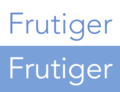
Two weights of Avenir, showing the feature of weights only slightly different in thickness—the white text is slightly bolder.
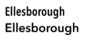
Avenir Next in condensed and regular widths.

Avenir used by the election campaign of French president François Hollande.

Avenir used in two different weights on a poster about French railway company SNCF's student transportation help program during exams.


Usage[]
- The city of Amsterdam uses Avenir as the principal typeface in its corporate identity. The font was chosen when design bureau Eden Design & Communication won a citywide competition. Eden contracted Thonik for the new design.[11]
- In 2008, Wake Forest University adopted Avenir as its primary sans-serif typeface.[12]
- The State University of New York, Plattsburgh uses Avenir as the main font in their branding guidelines.[13]
- The University of North Alabama uses Avenir as its sans-serif font for text and captions.[14][15]
- Avenir was formerly used by the Eurovision Song Contest in all its brand communication materials and was used between 2014 and 2017 for the scoreboards of the Junior Eurovision Song Contest.[16]
- A modified version of Avenir Next was created for Best Buy. This version, called "Avenir Next for Best Buy", is used in most Best Buy advertising and promotional material; the collection consists of 12 weights.[17]
- Apple used Avenir for its Maps app and some Siri screens in iOS 6.[18] OS X Mountain Lion and iWork for iCloud also come pre-loaded with various weights of Avenir and Avenir Next.
- François Hollande used Avenir on his campaign materials during the 2012 French presidential election.[19]
- French railway company SNCF uses Avenir for communication and advertising.[20]
- Since early 2016 Snapchat has used Avenir as the app's main font.[21]
- The Co-operative Group uses Avenir.[22]
- Bloomberg uses a custom-made package of Avenir Next specifically produced by Linotype as their corporate typeface.[23]
- Method Products uses Avenir as the font on all product packaging.[24]
- The Consumer Financial Protection Bureau uses Avenir Next as its primary brand typeface across all print and digital formats.[25]
- The music technology company Ableton use the font as part of their branding and as the main font in their flagship software product, Live.[citation needed]
- Disney+ uses Avenir extensively as the subscription VOD streaming service's main typeface.[citation needed]
- The National Geospatial-Intelligence Agency uses Avenir as the primary typeface for the U.S. Department of Defense Flight Information Publication (DoD FLIP).[26][27]
References[]
- ^ Jump up to: a b Frutiger, Adrian (2014). Typefaces: The Complete Works. Walter de Gruyter. p. 230. ISBN 9783038212607.
- ^ Adrian Frutiger, Typefaces. The Complete Works, (Basel: Birkhäuser Verlag, 2008), p337.
- ^ 30 Essential Typefaces for a Lifetime. Rockport Publishers. 2006. pp. 32–3. ISBN 978-1-61059-633-6.
- ^ Cees W. de Jong; Alston W. Purvis; Friedrich Friedl (2005). Creative Type: A Sourcebook of Classic and Contemporary Letterforms. Inmerc. pp. 290–5. ISBN 978-90-6611-250-6.
- ^ "Avenir Next specimen". issuu. Linotype GmbH. Retrieved 17 May 2018.
- ^ @typographica (13 August 2012). "Good catch. "@andremora: You could license Avenir Next Pro complete for $999 or get Mountain Lion for $19.99 and find the fonts installed."" (Tweet) – via Twitter.
- ^ "Fonts included with macOS Sierra". Apple Inc. Retrieved 17 May 2018.
- ^ Diaz, Jesus. "This Is Apple's New Favorite Typeface". Gizmodo. Retrieved 17 May 2018.
- ^ A new form of an old friend: Avenir Next Rounded
- ^ Neues Schriftdesign Avenir Next Rounded von Akira Kobayashi – gut lesbar, vielseitig und sympathisch – 6. Februar 2013 - Die neue Avenir Next Rounded ist die weichere Interpretation der serifenlosen Avenir Next
- ^ Avenir, the future for Amsterdam. August 7, 2003
- ^ "Section 4: Typography" (PDF). Identity Standards, Standards Guide. Wake Forest University. p. 3. Retrieved 2008-09-03.
- ^ "Branding and Style Guidelines". State University of New York (SUNY) College at Plattsburgh. Retrieved 2018-09-13.
- ^ "Typography". Retrieved 2019-01-05.
- ^ "An Illustrated Guide to Graphic Standards" (PDF). The University of North Alabama. 2017-08-23. Retrieved 2018-01-05.
- ^ "Brand Guidelines" (PDF). EBU. p. 12. Archived from the original (PDF) on 2009-05-20. Retrieved 2010-03-09.
- ^ "Archived copy". Archived from the original on 2013-08-31. Retrieved 2013-07-30.CS1 maint: archived copy as title (link)
- ^ Betters, Élyse (June 26, 2012). "Apple adds Avenir typeface to iOS 6 in Maps". 9to5Mac.com. Retrieved June 27, 2012.
- ^ François Hollande, le candidat du graphisme, retrieved November 13, 2012.
- ^ SNCF's brand identity (in French, PDF file)
- ^ Bell, Karissa. "No, you're not going crazy: Snapchat's iOS app has a new font." Mashable, 8 Mar. 2016.
- ^ https://coop-design-system.herokuapp.com/pattern-library/foundations/font.html
- ^ "Bloomberg Corporate Typeface Packages". Linotype. Linotype. Retrieved December 3, 2018.
- ^ Croft, Mia (2013-04-12). "Method Hand Wash". Fonts in Use. Retrieved 2018-12-05.
- ^ "Typography". Consumer Financial Protection Bureau. Retrieved 2019-08-08.
- ^ DoD Flight Information Publication (Enroute) - VFR Supplement United States (PDF). St. Louis, Missouri: National Geospatial-Intelligence Agency. 2008. Archived (PDF) from the original on 2021-08-30.
- ^ DoD Flight Information Publication (Enroute) - IFR Supplement United States (PDF). St. Louis, Missouri: National Geospatial-Intelligence Agency. 2018. Archived (PDF) from the original on 2021-08-31.
- Blackwell, Lewis. 20th Century Type. Yale University Press: 2004. ISBN 0-300-10073-6.
- Fiedl, Frederich, Nicholas Ott and Bernard Stein. Typography: An Encyclopedic Survey of Type Design and Techniques Through History. Black Dog & Leventhal: 1998. ISBN 1-57912-023-7.
- Macmillan, Neil. An A–Z of Type Designers. Yale University Press: 2006. ISBN 0-300-11151-7.
External links[]
| hide macOS typefaces | |
|---|---|
| Latin, Greek, Cyrillic |
|
| Non-alphabetic | |
- Linotype typefaces
- Geometric sans-serif typefaces
- Typefaces and fonts introduced in 1988
- Typefaces with text figures
- Typefaces designed by Adrian Frutiger