Futura (typeface)
 | |
| Category | Sans-serif |
|---|---|
| Classification | Geometric sans-serif |
| Designer(s) | Paul Renner Edwin W. Shaar (Extra Bold, Extra Bold Italic) |
| Foundry | Bauer Type Foundry |
| Date created | 1927 |
| Re-issuing foundries | Intertype |
| Shown here | Futura LT |
Futura is a geometric sans-serif typeface designed by Paul Renner and released in 1927.[1] It was designed as a contribution on the New Frankfurt-project. It is based on geometric shapes, especially the circle, similar in spirit to the Bauhaus design style of the period.[2][3] It was developed as a typeface by the Bauer Type Foundry, in competition with Ludwig & Mayer's seminal Erbar typeface of 1926.[4][5]
Futura has an appearance of efficiency and forwardness. Although Renner was not associated with the Bauhaus, he shared many of its idioms and believed that a modern typeface should express modern models, rather than be a revival of a previous design. Renner's design rejected the approach of most previous sans-serif designs (now often called grotesques), which were based on the models of signpainting, condensed lettering and nineteenth-century serif typefaces, in favour of simple geometric forms: near-perfect circles, triangles and squares. It is based on strokes of near-even weight, which are low in contrast. The lowercase has tall ascenders, which rise above the cap line, and uses nearly-circular, single-story forms for the "a" and "g", the former previously more common in handwriting than in printed text.[a] The uppercase characters present proportions similar to those of classical Roman capitals.[7] The original metal type showed extensive adaptation of the design to individual sizes, and several divergent digitisations have been released by different companies.[8][9]
Futura was extensively marketed by Bauer and its American distribution arm by brochure as capturing the spirit of modernity, using the German slogan "die Schrift unserer Zeit" ("the typeface of our time") and in English "the typeface of today and tomorrow".[10][11] It has remained popular since then.[5][12]
Release[]


Paul Renner began sketching his letters that would become Futura in 1924; the typeface was available for use three years later.[13] Matrices for machine composition were made by Intertype.
Futura was developed as a contribution to the New Frankfurt project, a radical affordable housing project in Frankfurt, Germany that many renowned modernist architects at the time were involved in. Described as “the typeface of our time” and “a face representing the new typography of the European avant-garde”, Futura was released to stand out against the sans-serif and more elaborate, handwritten-style typefaces that were popular at the time in order to promote simplicity, modernism and industrialization.[14]
Despite its clean geometric appearance, some of Futura's design choices recalled classic serif typefaces. Unlike many sans-serif designs intended for display purposes, Futura has quite a low x-height, reducing its stridency and increasing its suitability for body text.[c] The original Futura design concept included small capitals and old-style figures. These were dropped from the original metal issue of the type and first offered digitally by Neufville Digital under the Futura ND family;[citation needed] small caps are also available in the URW++ digitisation.
The design of Futura avoids the decorative, eliminating nonessential elements, but makes subtle departures from pure geometric designs that allow the letterforms to seem balanced.[16] This is visible in the apparently almost perfectly round stroke of the o, which is nonetheless slightly ovoid, and in how the circular strokes of letters like b gently thin as they merge with the verticals. Renner's biographer Christopher Burke has noted the important role of the Bauer Foundry's manufacturing team in adapting the design for different sizes of text, a feature not seen in digital releases.[8] However, Renner expressed some disappointment with the slow design and release process, as it allowed Erbar (1926) to precede his design and other typefaces of similar design to appear in the same year as its release.[1]
Renner's original plan was for two versions: a more conventional version suitable for general use, and a more eccentric, geometric lower case based on the circle and triangle.[17] This plan was scrapped, although the characters did appear on an early specimen and more recently on at least one digitisation.[18]
Futura was immediately very successful, due to its combination of classicism and modernity. It spawned a range of derivative geometric sans-serif typefaces from competing foundries, particularly in the United States.
In the UK Futura, while sometimes used, was overshadowed by Gill Sans, which became popular for similar reasons in the UK and came to define 1930s and 1940s printing. While more humanist, it also has geometric leanings which are particularly visible in the capitals.
At a time when Hitler and Nazi Germany ideologies were on the rise, typefaces were a strong indicator of culture and national identity. Roman typefaces were rising in popularity, and they were becoming the standard text for printed documents when previously, German Blackletter was the default style. As a way to hold on to German identity, the Germans pushed for the use of Blackletter typefaces over Roman.
When the Nazi regime rose into power in 1933, they utilized Blackletter typefaces to further promote German national identity. They determined Fraktur to be the true German type. They rejected modern type styles like Futura, which went on to become popular throughout the world, influenced by the Bauhaus and the English Arts and Crafts Movements.[19]
Futura made appearances on Nazi documentation, such as the "Organisationsbuch der NSDAP”, an informational handbook about membership to the Nazi Party and posters promoting “Entartete Kunst” (Degenerate Art), the exhibition that was created by the Nazis to shame modern art. In 1941, the Nazi regime deemed blackletter typefaces to have Jewish heritage due to the Nazi's perception of the typeface looking too similar to Hebrew, and therefore banned Fraktur and any other traditional German handwriting. Roman typography, which included Futura, became the new standard due to its superior legibility over blackletter typography.[20]
Usage[]


Futura remains an important typeface family and is used on a daily basis for print and digital purposes as both a headline and body font. The font is also used extensively in advertisements and logos, notably by IKEA (until 2010), Supreme, Party City, Volkswagen, Royal Dutch Shell, Crayola, Swissair, FremantleMedia (until 2018), Absolut and HP in their print ads.[citation needed] Particularly until the 1950s it was used extensively by the publishing industry as a general-purpose font.
Beginning in the late 1970s, Futura was also the iconic typeface used by American Conceptual artist Barbara Kruger. She layers white text, set in Futura Bold Oblique, on a red background against black and white found photography from mass media sources. Her text challenges the viewer to reflect on gender, stereotypes and consumerism. Some of her notable works where Futura is featured are “Untitled (Your body is a battleground)", "You Are Not Yourself" and "I shop, Therefore I Am".[21]


A Cyrillic variant of the Futura Medium typography was made by Anatoli Muzanov for the 1980 Summer Olympics held in Moscow.[22]
Futura is also employed by Fox News Channel, the RAI (the Italian public broadcasting agency) for its logo and is used in the Italian railway system for signs.
Futura has been used extensively in film and video. It is used for the title logo of the 1999 film American Beauty. It was also used in various TV shows including Doug, Lost, Warehouse 13, the American version of Sesame Street, which had the capital "I", lowercase "j", and numbers "1" and "4" in simplified forms, etc. Futura is featured ubiquitously throughout the film adaptation of V for Vendetta, for everything from the title logo and ending credits, to signs, newspapers, computer screens and other props. Wes Anderson is fond of the font and used it in some of his films. Futura was also Stanley Kubrick's favorite typeface.[23]
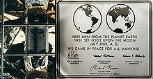
Transport is another important area where Futura has been used extensively due to its ability to be read quickly from a distance; it can be found extensively in the instrument panel graphics within automobiles — Mercedes-Benz being one of the most prolific users of the font. Futura is used extensively in aviation for instruments and control legends — most Boeing airliners use Futura within their cockpit controls, for example. NASA used Futura frequently during the Apollo space program, with charts, technical documents, and spacecraft instrumentation labels all making use of the typeface.
Crockett Johnson used Futura for the lettering of his Barnaby comic strip, which started running in April 1942 in the newspaper PM. Where many cartoonists lettered their dialogues by hand, Johnson collaborated with the PM typesetters who would set his dialogues in italicized Futura medium and return them to him so that they could be integrated to his drawings.[24]
NBC used a modified version of Futura for its original 1986 version of the current logo and its wordmarks.[25] A bold version of the font was used for NBC Sports on-screen graphics from 1989 to 1991, and by CBS Sports from 1992 to 1996.
In 1997, the Pittsburgh Steelers (an American football team) switched to rounded numbers on the jersey to match the number font (Futura Condensed) on their helmets. In 2012 the newly formed Western Sydney Wanderers Football Club use Futura on their logo and club documentation. The Minnesota Timberwolves adopted Futura during their 2017 rebranding.[26]
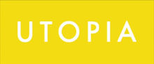
Futura is used on the current TV5 (Philippines) logo, the "Rainbow" logo of GMA Network in Extra Heavy style, and Kapuso logo in Heavy style, and is also Animax Asia's main typeface. All four of Vampire Weekend's albums use Futura on the covers, with the first two being exclusively Futura. The Boston Celtics' championship banners are also in Futura Condensed. 2008 science fiction-fantasy film City of Ember features Futura Medium in many prints through the story. The condensed version was used by videogame developer Bethesda Softworks for several of their games, including Fallout 3, Fallout: New Vegas, The Elder Scrolls V: Skyrim and Fallout 4 as well as being used extensively throughout the Watchmen graphic novel as well as the movie based on it. The Medium version is a font used predominantly alongside the Stratum 2 font in the 2014 racing video game Driveclub. In season 2 of Stargate Universe, episode "Common Descent – Part 1" the ancestors of the crew state that one of the two continents was named "Futura". There are several references to the name being a font in the episode. Futura also served as the typeface for UK television series Utopia's title cards, coloured white upon a neon yellow background (neon green in season two).
University of Wisconsin-Milwaukee signage uses Futura.
More recently, Futura has seen widespread use in many films and video games; Destiny and Wolfenstein: The New Order both use Futura on their covers, with Wolfenstein using the font throughout the in-game menus also. The 2013 film Gravity and 2014 films Interstellar and Gone Girl also use Futura on their theatrical release posters. Futura is used in the 2016 film Captain America: Civil War Location Cards. The first person shooter game Battlefield 1 (released in 2016 by Electronic Arts and DICE) uses Futura as its main font both in-game and for promotional purposes. It is also used on the "Disney Junior" logo.
Later metal type versions[]
Futura Condensed[]
Futura Condensed is a condensed version of the original Futura font family. Bold and bold oblique fonts were released in 1930. Medium, medium oblique, extra bold, and extra bold oblique fonts were released in 1936. Light and light oblique fonts were released in 1950.
Futura Demibold[]
Futura Demibold is a variation of the original Futura.[27][28][29][30]
Futura Display (Futura Schlagzeile)[]

Released in 1932, Futura Display uses more angular strokes, resulting in rectangular letter forms.
This is also the font used on the covers of the classic Region 2 Doctor Who DVD covers, and was used on the covers of most Star Trek novels published by Pocket Books during the 1980s. A slimmer variant seems to have been used by the Canadian Tire Corporation in their wordmark and logo. Futura Display is also used in the logo for the manga/anime series My Hero Academia.
Futura Black[]

First released in 1929, Futura Black is an alternative design that uses stencil letter forms.[31] Example uses of the font include the public safety departments of the city of Boston, the "R" logo of the National Association of Realtors, title sequences of television programs such as The Love Boat and Prisoner: Cell Block H, and as the wordmark for the National Football League's Minnesota Vikings from 1982 to 2003. The movie logo for the 2020 James Bond film No Time to Die also uses Futura Black.
Steile Futura[]
Steile Futura was Paul Renner's attempt to create a typeface that would be closer to the nineteenth century sans serifs than to the geometric model. During the course of development, Renner developed several intermediate versions. Some of the early design could be found in the experimental font called Renner-Grotesk, which appeared as a trial type casting from the Stempel type foundry in 1936. Renner kursiv, a true italic companion to the regular version, was made after Stempel had been taken over by Bauer in 1938.
The work on the type family continued in the 1940s, but Renner's poor health had slowed down the development. Renner started to work again on this project in 1951 under the name of Steile Futura (steil in German means "upright" or "steep").
The font family released by Bauer consist of mager (light), halbfett (medium), fett (bold), kursiv halbfett (medium italic), and kursiv fett (bold italic). The font family was released in 1952–1953. It was sold by Bauer in German, English, Spanish, and French markets as Steile Futura, Bauer Topic, Vox, Zénith respectively.[32]
The font family has rounder letters than Futura Display. For the first time, italic type features are incorporated in the italic fonts. The fonts incorporate handwriting features, especially in italic version. URW and Berthold have released digitisations, URW's under the name of "Topic", its name in original release in some non-German speaking countries.[33][34] Tasse by Font Bureau is a loose adaptation.[35]
Futura Inline[]

An "inline" version with a line drawn through each letter.
Digitisations[]

With the demise of hot metal typesetting, Futura has been redrawn in digital formats. Because of complex licensing agreements, there is no one digital version of Futura but several, each with different features. (Some releases may be re-drawings or upgraded versions of earlier digital releases.) Releases of Futura exist from Linotype, Bitstream, URW++ (several), Elsner+Flake and many others under that name, and by many other companies under others because of rights issues. For example, Fontsite's (including Futura Black and Poster) is renamed as 'Function'.[36][37][38]
As with all metal type revivals, converting Futura into a digital format poses interpretative challenges. Metal type fonts could be made differently for each text size, so a variety of metal and phototype versions of Futura exist on which a revival could potentially be based. In addition, revivals will need to add characters not present in the original Futura like the Euro sign and Cyrillic, and therefore do not all have the same character set.
Futura revivals may also decide to make design changes, like replacing Futura's straight 'j' with a more conventional substitute as URW's revival does. Scangraphic's revival notably includes optical sizes, with a tighter-spaced design (SH) created for headlines and a more spread-out version (SB) for body text sizes.[39][40] As an assessment of the decisions involved, a wide-ranging review by Stephen Coles of digitisations of Futura and its competitor geometrics noted that Bitstream's "abandons some of the strict geometry in favour of a more harmonious whole, but it may not be the Futura you were expecting," and that URW's Futura Nr. 2 was "Possibly optimized for small text: it’s wider, ascenders shorter, counters larger, and apertures more open. Conversely, round glyphs (a, g, e,) are more true to the circle. This attribute doesn’t make this a great text face, but if you want that strict geometry, No. 2 delivers."[41][9]
Architype Renner (1993)[]
Released by The Foundry in 1993, reproduces the experimental alternate characters and old style text figures of Paul Renner's 1927–29 typeface Futura. The alternate characters Renner proposed were mostly deleted from the typeface, resulting in a more conventional, and perhaps more successful typeface. The old style text figures disappeared at the end of 1920s, when the typeface was released in America. The Archetype Renner typefaces are a faithful recreation of Renner's original designs and released by The Foundry as single regular weight. Archetype Renner Bold was originally released by The Foundry in 1996 as part of the Archetype 2 series and in 2011 it was expanded as a 4 weight family: Regular, Medium, Demi and Bold.
Futura ND, Futura ND Black, Future ND Display (1999)[]

This version is based on the original sources of the Bauersche Giesserei, which had passed its typefaces to its Barcelona branch, Fundición Tipográfica Bauer SL. Released in 1999 by Neufville Digital — a joint venture of Fundición Tipográfica Bauer SL and Visualogik Technology & Design b.v — it includes small capitals and the old-style figures that had not been made in metal types. The redesign was done by Marie-Thérèse Koreman.[42]
Neufville Digital issued Futura, Futura Black, Futura Condensed, and Futura Display (Futura Schlagzeile) under the Futura ND family.[43] A limited release with some weights and features missing is bundled with macOS.
OpenType features included stylistic alternates, lining figures, proportional figures, old style figures, tabular figures, fractions, standard/discretional ligatures, superscript, small caps.
Futura ND Alternate (2015)[]
Designed by Marie-Thérèse Koreman, it is a version of Futura ND published by Bauer Types, S.L. with alternate character designs, which also includes more angular glyphs found in early versions of Futura.[44]
The family includes 50 fonts in 6 weights and 2 widths, with book and demibold missing in condensed width, with complementary oblique.
Futura Next (2016)[]
Designed by Marie-Thérèse Koreman, it is a version of Futura ND Alternate with alternate characters designed for small or low resolution displays.[45]
The family includes 20 fonts in 6 weights and 2 widths, with book and demibold missing in condensed width, with complementary oblique. Small caps and old style figures are included in 18 fonts.
ParaType version[]
The ParaType fonts added Cyrillic characters. They were developed at ParaType (ParaGraph) in 1995 by Vladimir Yefimov. They came in only Light, Book, Medium, and Demi weights.
Futura PT[]
This version is based on the previous ParaType design by Vladimir Yefimov (see above), expanded to include seven weights, with Book, Medium, Bold, Extra Bold weights for condensed fonts. Additional Cyrillic styles were developed in 2007 by Isabella Chaeva.[46]
Futura Futuris[]
Futuris is a redesign at ParaType (ParaGraph) in 1991 by Vladimir Yefimov that includes Cyrillic characters. Condensed styles were added in 1993 by Vladimir Yefimov and Alexander Tarbeev. It is available in Light, Medium, Bold, Black (without oblique) weights, while condensed fonts were made in Bold, Extra Bold, all without obliques. Also available are Cameo Extra Bold (black in reverse), Shadow Light, Shadow Extra Bold (black with shadow), Volume Light.[47]
Futura Eugenia[]
This version is based on the Futura Black, but designed at the Polygraphmash type design bureau in 1987 by Elvira Slysh.[48]
Bukra[]
Bukra is an Arabic variant designed by Pascal Zoghbi. It consists of Bukra Extra Bold, which was used as an Arabic display typeface for Ibn Battuta Mall in Dubai as a complement for Futura Extra Bold. The design was based on Kufi script, but using shortened descenders. The name Bukra itself is a phonetic representation of one way to express "tomorrow" or "in the future" in some Arabic cultures.
URW++[]
Unusually, URW has two main digitisations, Futura and Futura No. 2. Futura 1 has the larger range of weights with some unusual versions like stencil and shadowed designs, while Futura No. 2 has, amongst other differences, a conventional 'j' in all the non-condensed weights apart from demi-bold, but no italics except in some bold weights. According to URW, No. 2 is based on Letraset's version.[49] It has also released some styles as Futura 3 and 7.
Futura Classic[]
This release by Gert Wiescher is notable for presenting the original alternate characters planned by Renner.[50] They have also appeared on a digitisation of Twentieth Century, Monotype's competitor to Futura, a release which allows them to be mixed and matched with the more standard characters and small caps.[51]
FuturaRenner[]
This free and open source typeface was digitized by Bastien Sozoo in 2011 around his presence at La Cambre art school in Brussels. The metal lead type in the letterpress facility of the school were given by Renner to Henry Van de Velde, the school founder, and the original 1927 forms are, as Sozoo described it, "the first draft of Futura as we know it." While the capital letters are very similar to their modern counterparts (some visible differences include capital J's descent below the base line and a slightly higher crossbar on capital A), FuturaRenner uses text figures as opposed to the usual lining figures, and the letter forms of r (which has a distinctive dot-and-line styling), m and n (both of which are box-based and unrounded) are in particular contrast to modern Futura adaptations. FuturaRenner is available in light and regular weights, both of which are licensed under the SIL Open Font License.[52]
Futura Now[]
In October 2020, Monotype re-digitized and released as Futura Now, which is based on Paul Renner's original design with additional 102 styles.[53]
Influence on other typefaces[]
Though Erbar was the first of the new geometric sans-serif faces, the enormous success of Futura fostered the creation of many new geometric sans-serif faces by competing foundries including Kabel, Metro, Spartan by Linotype, Vogue by Intertype, Twentieth Century by Monotype and Airport by Baltotype, Semplicità by Nebiolo, American Type Founders, and Tempo by Ludlow. Some were near identical copies as in Spartan and Twentieth Century but others were uniquely different, including Nobel and Kabel. Futura was rebranded in France by Deberny & Peignot as "Europe".[54]
In Germany the designer Arno Drescher created the family Super Grotesk, which became very popular in East Germany after the war.[55][56] Stephen Coles has described FontShop International's Super Grotesk digitisation as surprisingly useful, noting that its digitisation is unusually well-hinted allowing good display on Windows computers.[41][57] It also features a conventional 'j'. Another German competitor, also recently digitised by FontFont, was Friedrich Bauer's Bauer Grotesk, issued by J. D. Trennert & Sohn and then Genzsch & Heyse.[58][59]
Volkswagen's VAG Rounded typeface borrows the same letterforms as Futura, but has rounded terminals on all strokes.
Typeface designer Adrian Frutiger acknowledges Futura as one of his inspirations for his 1988 typeface Avenir.[54] More recently Futura has been the basis of IKEA Sans and Opel Sans, fonts designed (for IKEA and Opel, respectively) by Robin Nicholas.[60][unreliable source?]
The Toronto Transit Commission developed the Toronto Subway font based on Futura for use in Toronto subway station signage since 1954.
Tasse is a revival of Steile Futura.
League Spartan and Beteckna are descendants of Futura that are licensed as Free Software (Under the SIL OFL and GNU GPL+FE licenses, respectively).
Century Gothic borrows liberally from Futura letterforms, with the glyphs adjusted to be metrically compatible with another geometric sans-serif, ITC Avant Garde.
Brandon Grotesque is inspired by Futura but with an unusually low x-height, giving it a more elegant appearance for uses such as headings and display settings.[61] Designed by Hannes von Döhren of HVD Fonts, it is the main corporate font of Comedy Central.[62] In 2014, von Döhren released Brandon Text, a tighter version intended for body text.[63]
Braggadocio is based on Futura Black.
The 2000 typeface Gotham is similarly geometric and based on 1920s signage.
Passata is a modernised version of Futura specifically designed to replace Futura as the corporate branding font of Aarhus University.
Product Sans is similar to Futura with slight differences.
American singer and rapper Frank Ocean mentions the font many times on his album Blonde, even using a variant of the font for the album cover and using the name for the song Futura Free.
Arve Båtevik designed two typefaces which are based on the Futura typeface: LL Supreme and LL Supreme Display.[64][65]
References[]
- ^ Jump up to: a b Christopher Burke (December 1998). Paul Renner: The Art of Typography. Princeton Architectural Press. p. 100. ISBN 978-1-56898-158-1.
- ^ The Bauhaus Designer Paul Renner. Creativepro.com.
- ^ Kupferschmid, Indra (6 January 2012). "True Type of the Bauhaus". Fonts In Use. Retrieved 3 October 2015.
- ^ Kupferschmid, Indra. "On Erbar and Early Geometric Sans Serifs". CJ Type. Retrieved 20 October 2016.
- ^ Jump up to: a b Paul Shaw (April 2017). Revival Type: Digital Typefaces Inspired by the Past. Yale University Press. pp. 210–3. ISBN 978-0-300-21929-6.
- ^ "Koralle". Fonts in Use. Retrieved 13 February 2017.
- ^ Ulrich, Ferdinand. "Types of their time – A short history of the geometric sans". FontShop. Retrieved 19 August 2015.
- ^ Jump up to: a b Christopher Burke (December 1998). Paul Renner: The Art of Typography. Princeton Architectural Press. pp. 88–93. ISBN 978-1-56898-158-1.
- ^ Jump up to: a b Coles, Stephen. "Comments on Quora". Quora. Retrieved 2 October 2015.
- ^ Rhatigan, Dan. "Futura: The Typeface of Today and Tomorrow". Ultrasparky. Retrieved 21 January 2018.
- ^ Aynsley, Jeremy (2000). Graphic Design in Germany: 1890-1945. Berkeley: University of California Press. pp. 102–5. ISBN 9780520227965.
- ^ Handover, Phyllis Margaret (1958). "Grotesque Letters". Monotype Newsletter, Also Printed in Motif as "Letters Without Serifs".
- ^ Ettenberg, Eugene M. "Futura, a typeface for our times". American Artist. 18: 46.
- ^ "Happy 90th Birthday to Futura, the Modernist Typeface That is Literally Everywhere". Eye on Design. 2017-10-03. Retrieved 2020-04-06.
- ^ Frere-Jones, Tobias. "MicroPlus". Frere-Jones Type. Retrieved 1 December 2015.
- ^ Moore, Ian. "Making Geometric Type Work". Typographica. Retrieved 3 October 2014.
- ^ Walters, John (2013). Fifty Typefaces That Changed the World. Hachette. ISBN 9781840916492.
- ^ Loxley, Simon (2006). Type: The Secret History of Letters. I.B.Tauris. ISBN 9780857730176.
- ^ "German design: Fraktur and the psychology of type". www.handelsblatt.com. Retrieved 2020-04-06.
- ^ "Never Use Futura". Design Observer. Retrieved 2020-04-06.
- ^ "Barbara Kruger | artnet". www.artnet.com. Retrieved 2020-04-06.
- ^ "Olympic Report" (PDF). 1981. Archived from the original (PDF) on September 12, 2016. Retrieved January 31, 2016.
- ^ Ronson, Jon (27 March 2004). "Citizen Kubrick". The Guardian.
- ^ Nel, Philip (22 April 2013). "Crockett Johnson and the Invention of Barnaby". The Comics Journal. Fantagraphics. Retrieved 10 July 2019.
- ^ "Discover | Adobe Creative Cloud". creativecloud.adobe.com.
- ^ "New Logo for Minnesota Timberwolves by Rare Design". Brand New. April 13, 2017. Retrieved December 12, 2018.
- ^ "Futura Demibold". Fonts.com.
- ^ "Futura Demibold". Abstractfonts.com.
- ^ "Futura Demibold". Type.co.uk.
- ^ "Futura Demibold". Fontshop.com.
- ^ "Futura ND Black - BauerTypes". BauerTypes. Retrieved 2018-05-12.
- ^ About Steile Futura. Mitja-m.com.
- ^ "Steile Futura BQ". Linotype. Berthold. Archived from the original on 31 March 2015. Retrieved 1 October 2015.
- ^ "URW Topic". MyFonts. URW++. Retrieved 28 June 2016.
- ^ "Tasse". Font Bureau. Retrieved 28 June 2016.
- ^ "Function Pro". Fontspring. Fontsite. Retrieved 1 October 2015.
- ^ "Function Deco". Fontspring. Fontsite. Retrieved 1 October 2015.
- ^ "Function Display". Fontspring. Fontsite. Retrieved 1 October 2015.
- ^ "Futura SH". MyFonts. Scangraphic. Retrieved 2 October 2015.
- ^ "Futura SB". MyFonts. Scangraphic. Retrieved 2 October 2015.
- ^ Jump up to: a b Coles, Stephen. "Alternatives to Futura". Fontshop. Archived from the original on March 16, 2015. Retrieved 2 October 2015.CS1 maint: unfit URL (link)
- ^ "Marie-Thérèse Koreman" (PDF).
- ^ "Futura ND". MyFonts. Neufville Digital. Retrieved 1 October 2015.
- ^ "Futura ND Alternate in use". Fonts in Use.
- ^ "Futura Next in use". Fonts in Use.
- ^ "Futura PT". MyFonts. Paratype. Retrieved 1 October 2015.
- ^ "Futura Futuris". MyFonts. Paratype. Retrieved 1 October 2015.
- ^ "PT Futura Eugenia". Fontshop. ParaType. Retrieved 1 October 2015.
- ^ "URW Futura No. 2". YWFT. 24 September 2010. Retrieved 2 October 2015.
- ^ "Futura Classic". MyFonts. Wiescher Design. Retrieved 3 October 2015.
- ^ "LTC Twentieth Century". MyFonts. Lanston Type Company. Retrieved 3 October 2015.
- ^ Sozoo, Bastien. "Futura Renner". Open Font Library. Retrieved December 24, 2017.
- ^ "Introducing Futura Now: The definitive version of an iconic family". Monotype Imaging. 5 October 2020.
- ^ Jump up to: a b Frutiger, Adrian. Typefaces: The Complete Works. pp. 26, 330–338.
- ^ "FF Super Grotesk". FontFont. Retrieved 2 October 2015.
- ^ "Typoart Super Grotesk". Elsner & Flake. Retrieved 2 October 2015.
- ^ Coles, Stephen. "Twitter post". Twitter. Retrieved 3 October 2015.
- ^ "Bauer Grotesk Reloaded". FontFont. Retrieved 3 October 2015.
- ^ "FF Bauer Grotesk". FontFont. Retrieved 3 October 2015.
- ^ Hausschriften-Liste Archived 2007-09-26 at the Wayback Machine. Typografie.info.
- ^ MyFonts (2011). "Brandon Grotesque". Retrieved 27 October 2011.
- ^ "Fonts in Use: Comedy Central". Fonts in Use. Retrieved 4 October 2014.
- ^ Rendle, Robin. "Brandon Text". Typographica. Retrieved 11 July 2015.
- ^ "LL Supreme". Lineto.com. Retrieved 17 February 2021.
- ^ "LL Supreme Display". Lineto.com. Retrieved 17 February 2021.
- ^ It was, though, not the first sans-serif with these features: Koralle, for instance, already used a single-story 'a', and the form is standard in blackletter.[6]
- ^ This illustration compares Futura Demi with Helvetica Neue Medium.
- ^ This characteristic did vary by size: unlike digital facsimiles, Futura in metal type was made differently at different sizes.[15]
Further reading[]
- Alexandre Dumas de Rauly, Michel Wlassikoff, Futura Une gloire typographique, Paris, Éditions NORMA, 2011, ISBN 978-2-915542-39-4. (in French)
- Burke, Christopher, Paul Renner: the art of typography. London: Hyphen Press, 1998. ISBN 0-907259-12-X.
- Garfield, Simon, Just My Type. Gotham Books, London; 2011. ISBN 978-1-59240-652-4.
- Haley, Allen, Type: Hot Designers Make Cool Fonts. Rockport Publishers Inc, Gloucester; 1998. ISBN 1-56496-317-9.
- Jaspert, Berry and Johnson, Encyclopaedia of Typefaces. Cassell Paperback, London; 2001. ISBN 1-84188-139-2.
- Lawson, Alexander S., Anatomy of a Typeface. Godine: 1990. ISBN 978-0-87923-333-4.
- Meggs, Philip. B and McKelvey, Roy, Revival of the Fittest: Digital Versions of Classic Typefaces. RC Publications; 2002. ISBN 1-883915-08-2.
- Ronson, Jon. "Citizen Kubrick", The Guardian, London, March 27, 2004.
| Wikimedia Commons has media related to Futura. |
| hide macOS typefaces | |
|---|---|
| Latin, Greek, Cyrillic |
|
| Non-alphabetic | |
| Authority control: National libraries |
|---|
- Typefaces and fonts introduced in 1927
- Geometric sans-serif typefaces
- Photocomposition typefaces
- Digital typefaces
- Government typefaces
- Traffic signs
- Typefaces with optical sizes
- Typefaces designed by Paul Renner
- Bauer Type Foundry typefaces