Rail Alphabet
 | |
| Category | Neo-grotesque sans-serif |
|---|---|
| Designer(s) | Margaret Calvert, Jock Kinneir |
| Foundry | Department for Transport (formerly BRB (Residuary) Limited & British Railways Board) |
| Date released | 1964 |
| Design based on | Helvetica |
Rail Alphabet is a typeface designed by Jock Kinneir and Margaret Calvert for signage on the British Rail network. First used at Liverpool Street station, it was then adopted by the Design Research Unit (DRU) as part of their comprehensive 1965 rebranding of the company.[1]
A modernised font Rail Alphabet 2 is planned to be used across the Great British Railways network,[2] whilst the double arrow logo will also be restored as the primary brand identifier for the network.
Rail Alphabet is similar to a bold weight of Helvetica, but with some differences in character shapes,[3] stroke width and x-height to aid legibility. The font also has some similarities to Akzidenz-Grotesk, which had earlier provided the same designers the broad inspiration for the Transport typeface used for road signs in the United Kingdom.
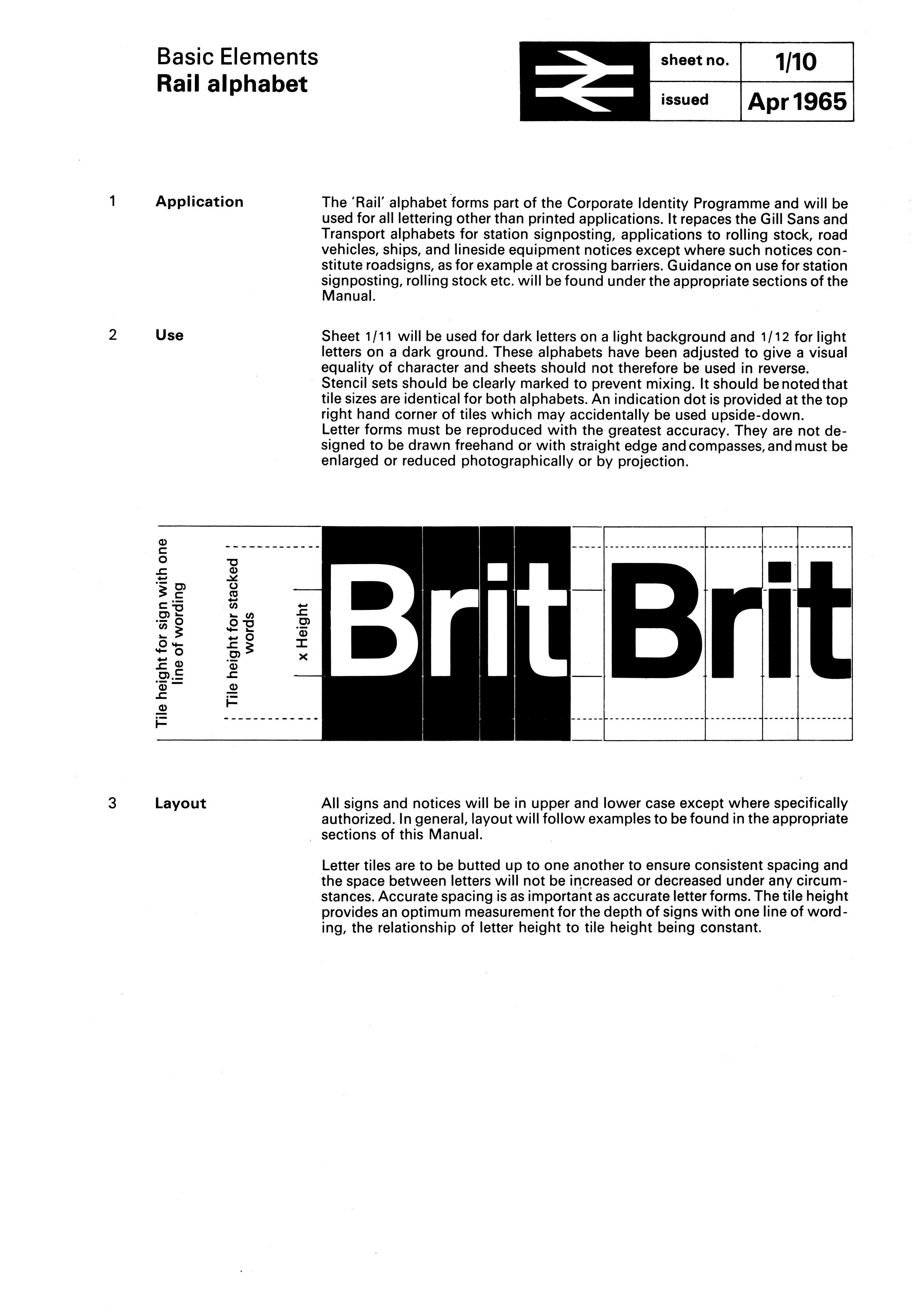
The font was designed specifically for signage and the designers included features to support this such as a bespoke letter-spacing system and two slightly different weights to provide optimum visibility on both light and dark backgrounds.[3]
British Rail[]
In 1949 the Railway Executive decided on standard types of signs to be used at all stations. Lettering was to use redrawn versions of Gill Sans lettering on a background of the regional colour.[4][5] This style persisted for nearly 15 years.
In the early 1960s, British Rail trialled new signs at Coventry station that made use of Kinneir and Calvert's recently launched Transport typeface. While Transport has since been an enduring success on road signs, it was designed around the specific needs of road users - such as visibility at speed and in all weathers. The subsequent creation of Rail Alphabet was intended to provide a style of lettering more specifically suited to stations where it would primarily be viewed indoors by pedestrians.[6]
The Design Research Unit's 1965 rebranding of British Railways included a new logo (the double arrow), a shortened name British Rail, and the total adoption of Rail Alphabet for all lettering other than printed matter[7] including station signage, trackside signs, fixed notices, signs inside trains and train liveries.
Key elements of the rebranding were still being used during much of the 1980s and Rail Alphabet was also used as part of the livery of Sealink ships until that company's privatisation in the late 1980s. However, by the end of the 1980s, British Rail's various business units were developing their own individual brands and identities with use of Rail Alphabet declining as a consequence.[8] The typeface remained in near-universal use for signs at railway stations but began to be replaced with alternatives in other areas, such as in InterCity's 1989 Mark 4 passenger carriages which made use of Frutiger for much of their interior signage.
After British Rail[]
The privatisation of British Rail from 1994 accelerated the decline in use of the typeface on the railway network with most of the privatised train operating companies who now manage individual stations choosing to use the fonts associated with their own corporate identities for station signs and publicity. More recently, the custom Brunel typeface introduced by Railtrack for signs at major stations and adapted by Network Rail as NR Brunel was recommended as a new national standard for station signs by a 2009 report commissioned by the Secretary of State for Transport,[9] and was used extensively by South West Trains and East Midlands Trains. Meanwhile, Helvetica Medium has replaced Rail Alphabet as the industry's preferred typeface for safety notices within passenger trains due to the ready availability of the former and for consistency with British Standards on general safety signs.[10]
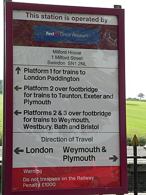
Some train operators continued use of Rail Alphabet long into the privatisation era. Arriva Trains Wales[11] used the font until the end of the franchise in 2018, with First Great Western also making extensive use of Rail Alphabet for signage until the firm's rebranding to Great Western Railway in 2015. Merseyrail[12] continues to use the typeface for station signage.
The use of the typeface is also still prescribed by standards for trackside warning signs and safety/operating notices.[13]
Other uses[]

The National Health Service in England, Scotland and Wales adopted Rail Alphabet for its signs. It is still the dominant typeface used on signs in older hospitals. It ceased to be used in new builds in the late 1990s. NHS England now uses Frutiger,[14] while NHS Scotland uses Stone Sans.[15]
Rail Alphabet was widely used on signs by the British Airports Authority and by Danish railway company DSB.[16]
Road signs in Iran used Rail Alphabet typeface for English texts.[citation needed]
Digitisation and updates[]
New Rail Alphabet[]
In 2009, a newly digitised version of the typeface was publicly released. Created by Henrik Kubel of A2/SW/HK in close collaboration with Margaret Calvert, New Rail Alphabet features six weights: off white, white, light, medium, bold and black, with non-aligning numerals, corresponding italics and a set of Eastern European characters.[17]
Rail Alphabet 2[]
 | |
| Category | Sans-serif |
|---|---|
| Classification | Neo-grotesque Mixed Humanist |
| Designer(s) | Margaret Calvert Henrik Kubel |
| Foundry | A2-TYPE |
| Date released | 2020 |
| Design based on | Rail Alphabet New Rail Alphabet |
In 2020, it was announced that Network Rail had commissioned an updated version of the typeface. Designed by Margaret Calvert and Henrik Kubel, Rail Alphabet 2 includes lighter versions of the lettering as well as italics for signage along with accompanying versions for use in printed matter and online.[18] The redesign also includes new pictograms to depict services and facilities which did not exist in the 1960s when the original font was conceived – such as gender neutral toilets and vaping areas. In October 2020, Network Rail announced that starting with London Paddington,[19] the updated Rail Alphabet 2 font will replace Brunel for all signage on all Network Rail managed major stations on the network.[20] Network Rail will also begin using the font for corporate communications.
In May 2021, as part of the Williams Rail Review, it was announced that the new government body Great British Railways will introduce Rail Alphabet 2 on the rail network, replacing the many different fonts used on railway signage since privatisation.[2]
See also[]
- Gill Sans – the basis for display lettering, including signs, used by British Railways between 1948 and 1965. Genuine Gill Sans was used for printed matter.
- Johnston – the lettering used by London Underground, designed by Edward Johnston.
- List of public signage typefaces
References[]
- ^ "Jock Kinneir and Margaret Calvert". Design Museum. Retrieved 1 July 2010.
- ^ a b "Great British Railways: The Williams-Shapps Plan for Rail" (PDF). gov.uk.
- ^ a b "British Rail Corporate Identity". Retrieved 4 August 2020.
- ^ "Railway Station Signs. Standard Lettering". Warminster & Westbury journal, and Wilts County Advertiser. England. 20 May 1949. Retrieved 13 February 2017 – via British Newspaper Archive.
- ^ "Standard Stations Signs". The Railway Magazine. No. 582. July 1949. p. 271.
- ^ "On Line Typeface (Rail Alphabet typeface, Margaret Calvert/Jock Kinneir, UK)". The Beauty of Transport. 13 May 2015. Archived from the original on 9 July 2018.
- ^ "Basic Elements: Rail alphabet". The British Rail Corporate Identity Manual. British Rail. April 1985 – via Doublearrow.co.uk.
- ^ Forsythe, Robert (13 December 2000). "Is collecting railway ephemera an archaeological task?". Institute of Railway Studies, University of York. Archived from the original on 25 January 2006.
- ^ "Better trail stations" (PDF). Department for Transport. November 2009. Archived from the original (PDF) on 22 November 2009. Retrieved 31 October 2010.
- ^ "Research Programme" (PDF). Rail Safety & Standards Board. April 2003. Archived from the original (PDF) on 17 July 2011. Retrieved 31 October 2010.
- ^ "Making Rail Accessible". Arriva Trains Wales. Retrieved 14 January 2012.
- ^ "Liverpool South Parkway". Flickr.
- ^ "Lineside Operational Safety Signs" (PDF). Rail Safety & Standards Board. October 2009. Archived from the original (PDF) on 17 July 2011. Retrieved 19 December 2009.
- ^ "NHS CFH visual identity guidelines, section 4" (PDF).
- ^ "Corporate Identity". NHS Scotland. Archived from the original on 1 May 2009. Retrieved 27 April 2009.
- ^ Walters, John L. (20 April 2009). "Rue Britanica". Eye Magazine.
- ^ "New Rail Alphabet". Newrailalphabet.co.uk.
- ^ Lawrence, David (2 May 2020). "HUB Making places for people and trains". Issuu.
- ^ "Rail Alphabet 2 launches at exhibition celebrating 1960s design icon". Network Rail. 26 October 2020.
- ^ Holden, Alan. "Margaret Calvert exhibition and Rail Alphabet 2". Rail Advent. Retrieved 27 May 2021.
External links[]
| Wikimedia Commons has media related to Rail Alphabet. |
- Commercial release (includes pdf specimen and archive photos)
- Flickr photos of Rail Alphabet in use
- British Rail
- Government typefaces
- Corporate typefaces
- Grotesque sans-serif typefaces
- Typefaces and fonts introduced in 1965
- Display typefaces