Red states and blue states


Since around the 2000 United States presidential election, red states and blue states have referred to states of the United States whose voters predominantly choose either the Republican Party (red) or Democratic Party (blue) presidential and senatorial candidates.[1] Since then, the use of the term has been expanded to differentiate between states being perceived as liberal and those perceived as conservative.[not verified in body] Examining patterns within states reveals that the reversal of the two parties' geographic bases has happened at the state level, but it is more complicated locally, with urban-rural divides associated with many of the largest changes.[2]
All states contain both liberal and conservative voters (i.e., they are "purple") and only appear blue or red on the electoral map because of the winner-take-all system used by most states in the Electoral College.[3][4] However, the perception of some states as "blue" and some as "red" was reinforced by a degree of partisan stability from election to election—from the 2000 election to the 2004 election, only three states changed "color" and as of 2020, fully 35 out of 50 states have voted for the same party in every presidential election since the red-blue terminology was popularized in 2000.
Origins of the color scheme[]
The colors red and blue are also featured on the United States flag. Traditional political mapmakers, at least throughout the 20th century, had used blue to represent the modern-day Republicans, as well as the earlier Federalist Party. This may have been a holdover from the Civil War, during which the predominantly Republican north was considered "blue".[5] However, at that time, a maker of widely-sold maps accompanied them with blue pencils in order to mark Confederate force movements, while red was for the union.[6]
Later, in the 1888 presidential election, Grover Cleveland and Benjamin Harrison used maps that coded blue for the Republicans, the color perceived to represent the Union and "Lincoln's Party", and red for the Democrats.[7] The parties themselves had no official colors, with candidates variously using either or both of the national color palette of red and blue (white being unsuitable for printed materials).
There was one historical use, associated with boss rule, of blue for Democrats and red for Republicans: in the late 19th century and early 20th century, Texas county election boards used color-coding to help Spanish-speaking and illiterate voters identify the parties;[8] however, this system was not applied consistently in Texas and was not replicated in any other state. In 1908, The New York Times printed a special color map, using blue for Democrats and yellow for Republicans, to detail Theodore Roosevelt's 1904 electoral victory.[9] That same year, a color supplement included with a July issue of the Washington Post used red for Republican-leaning states, blue for Democratic-leaning states, yellow for "doubtful" states and green for territories that had no presidential vote.[10]
Contrast with color usage in other countries[]
The recent (21st century) association of colors in American politics lies contrary to the long-standing conventions of political color in most other countries whereby red symbols (such as the red flag or red star) are associated with left-wing politics.[11] Indeed, as late as the 1990s, Democrats were often represented by red and Republicans by blue.[1] According to The Washington Post, journalist Tim Russert coined these terms during his televised coverage of the 2000 presidential election.[12] The 2000 election was not the first during which the news media used colored maps to depict voter preferences in the various states, but it was the first time a standard color scheme took hold. In previous elections, the color assignments or even the actual colors used were often different.
Contemporary use[]
The advent of color television in America in the late 1950s and early 1960s prompted television news reporters to rely on color-coded electoral maps, though sources conflict as to the conventions they followed. One source claims that in the elections prior to 2000 every state that voted for Democratic candidates but one had been coded red. It further claims that from 1976 to 2004 in an attempt to avoid favoritism in color-coding the broadcast networks standardized on the convention of alternating every four years between blue and red the color used for the incumbent president's party.[10][13]
According to another source, in 1976, John Chancellor, the anchorman for NBC Nightly News, asked his network's engineers to construct a large illuminated map of the United States. The map was placed in the network's election-night news studio. If Jimmy Carter, the Democratic candidate that year, won a state, it lit up in red whereas if Gerald Ford, the incumbent Republican president, carried a state, it was in blue.[1] The feature proved to be so popular that, four years later, all three major television networks used colors to designate the states won by the presidential candidates, though not all using the same color scheme. NBC continued its color scheme (blue for Republicans) until 1996.[1] NBC newsman David Brinkley famously referred to the 1980 election map outcome showing Republican Ronald Reagan's 44-state landslide as resembling a "suburban swimming pool".[14]
Since the 1984 election, CBS has used the opposite scheme: blue for Democrats, red for Republicans. ABC used yellow for Republicans and blue for Democrats in 1976, then red for Republicans and blue for Democrats in 1980, 1984, and 1988. In 1980, when John Anderson ran a relatively high-profile campaign as an independent candidate, at least one network provisionally indicated that they would use yellow if he were to win a state. Similarly, at least one network would have used yellow to indicate a state won by Ross Perot in 1992 and 1996, though neither of them did claim any states in any of these years.
By 1996, color schemes were relatively mixed, as CNN, CBS, ABC, and The New York Times referred to Democratic states with the color blue and Republican ones as red, while Time and The Washington Post used the opposite scheme.[15][16][17] NBC used the color blue for the incumbent party, which is why blue represented the Democrats in 2000.
In the days following the 2000 election, whose outcome was unclear for some time after election day, major media outlets began conforming to the same color scheme because the electoral map was continually in view, and conformity made for easy and instant viewer comprehension. On election night that year, there was no coordinated effort to code Democratic states blue and Republican states red; the association gradually emerged. Partly as a result of this eventual and near-universal color-coding, the terms "red states" and "blue states" entered popular use in the weeks following the 2000 presidential election. After the results were final with the Republican George W. Bush winning, journalists stuck with the color scheme, as The Atlantic's December 2001 cover story by David Brooks entitled, "One Nation, Slightly Divisible", illustrated.[18]
Thus, red and blue became fixed in the media and in many people's minds, despite the fact that the Democratic and Republican parties had not officially chosen colors.[19] Some Republicans argue the GOP should retain its historic link with blue, since most center-right parties worldwide are associated with blue. On March 14, 2014, the California Republican Party officially rejected red and adopted blue as its color. Archie Tse, The New York Times graphics editor who made the choice when the Times published its first color presidential election map in 2000, provided a nonpolitical rationale for retaining the red–Republican link, explaining that "Both 'Republican' and 'red' start with the letter 'R.'"[20]
Map interpretation[]
There are several problems in creating and interpreting election maps. Popular vote data are necessarily aggregated at several levels, such as counties and states, which are then colored to show election results. Maps of this type are called choropleth maps, which have several well-known problems that can result in interpretation bias. One problem arises when areal units differ in size and significance, as is the case with election maps. These maps give extra visual weight to larger areal units, whether by county or state. This problem is compounded in that the units are not equally significant. A large county or state in area may have fewer voters than a small one in area, for example. Some maps attempt to account for this by using cartogram methods, but the resulting distortion can make such maps difficult to read.[21][22] Another problem relates to data classification. Election maps often use a two-class color scheme (red and blue), which results in a map that is easy to read but is highly generalized. Some maps use more classes, such as shades of red and blue to indicate the degree of election victory. These maps provide a more detailed picture but themselves have various problems associated with classification of data. The cartographer must choose how many classes to use and how to break the data into those classes. While there are various techniques available, the choice is essentially arbitrary. The look of a map can vary significantly depending on the classification choices. The choices of color and shading likewise affect the map's appearance. Further, all election maps are subject to the interpretation error known as the ecological fallacy.[23]
Finally, there are problems associated with human perception.[24] Large areas of color appear more saturated than small areas of the same color.[24] A juxtaposition of differing colors and shades can result in contrast misperceptions. For example, due to the simultaneous contrast effect, the Bezold effect, and other factors, an area shaded light red surrounded by areas shaded dark red will appear even lighter. Differing shades of red and blue compound this effect.[25]
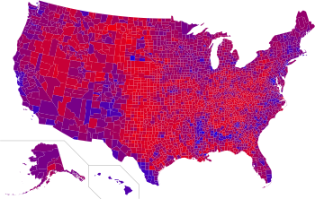
Cartographers have traditionally limited the number of classes so that it is always clear which class a color shade represents. Some election maps, however, have broken this tradition by simply coloring each areal unit with a red-blue mixture linked to voting ratio data—resulting in an "unclassified choropleth map". These "purple maps" are useful for showing the highly mixed nature of voting, but are extremely difficult to interpret in detail. The lack of clear classes make these purple maps highly prone to the problems of color perception described above. However, there are pros and cons to both classified and unclassified choropleth maps. Each tend to bring out some patterns while obscuring others.[25] All these points should be taken into account when looking at election maps.
Critiques[]
The paradigm has come under criticism on several fronts. Many argue that assigning partisanship to states is only really useful as it pertains to the Electoral College, as well as (more recently) the Senate, primarily a winner-take-all system of elections (with the exceptions of Nebraska and Maine).
The Democratic and Republican parties within a particular state may have a platform that departs—sometimes greatly—from that of the national party, sometimes leading that state to favor one party in state and local elections and the other in presidential elections. This is most evident in the Southern United States, where the state Democratic Party organizations tend to be more conservative than the national party, especially on social issues. Likewise, Republicans have elected many statewide officeholders in states that are solidly Democratic at the presidential level, such as Massachusetts, Illinois, Maryland, Vermont, and New Jersey.
The elections in Arkansas as well as West Virginia in 2004 were won by Republican President George W. Bush, but Democrats at the time held all four U.S. Senate seats and majorities of elected executive officeholders in those states, including the governorship of the latter. Similarly, Tennessee went to Bush in both 2000 and 2004, but going into 2004, its governor was a Democrat and both chambers of the state legislature were controlled by Democrats as well. The converse can also be true, as in the case of Maine, which had two Republican U.S. senators, but Democratic presidential candidate John Kerry won the state's electoral votes. Likewise, Vermont, New York, Massachusetts, Maryland, and Hawaii all voted for Democrat Kerry by wide margins, but all had Republican governors at the time.
In his address before the 2004 Democratic National Convention in Boston, Barack Obama spoke on the issue of blue states and red states, saying: "The pundits like to slice-and-dice our country into red states and blue states — red states for Republicans, and blue states for Democrats. But I've got news for them, too. We worship an awesome God in the blue states, and we don't like federal agents poking around our libraries in the red states. We coach Little League in the blue states and have gay friends in the red states. … We are one people, all of us pledging allegiance to the Stars and Stripes, all of us defending the United States of America."[26]
In April 2008, Republican presidential nominee John McCain predicted that the presidential election that November would not follow the red-state-blue-state pattern, saying, "I'm not sure that the old red state, blue state scenario that prevailed for the last several elections works. I think most of these states that we have either red or blue are going to be up for grabs."[27] Arguably, this eventually proved to be somewhat true, but not in McCain's favor as Obama won three "red" states that had not voted Democratic in many years, namely Virginia, North Carolina, and Indiana along with a part of deep red Nebraska, via the state's (much less conservative as a whole) second congressional district. Obama also came close to winning Missouri and Montana, losing both by a small margin. The only deviations from the preexisting red-blue paradigm were all in Obama's favor. In the 3 presidential elections since 2008, in those of 2012 and 2016, Nebraskans voted for Republican candidates, and in 2020, the 2nd district flipped back to the Democrat.
Purple states[]
A purple state refers to a swing state where both Democratic and Republican candidates receive strong support without an overwhelming majority of support for either party. Purple states are also often referred to as "battleground" states.
The demographic and political applications of the terms have led to a temptation to presume this arbitrary classification is a clear-cut and fundamental cultural division. Given the general nature and common perception of the two parties, "red state" implies a conservative region or a more conservative American, and "blue state" implies a more liberal region or a more liberal American. But the distinction between the two groups of states is less simplistic. The analysis that suggests political, cultural and demographic differences between the states is more accurate when applied to smaller geographical areas.

Traditionally, the practice of designating a U.S. state as red or blue is based on the first-past-the-post winner-take-all system employed for presidential elections by 48 of the 50 U.S. states and the District of Columbia. Electoral law in Maine and Nebraska makes it possible for those states to split their electoral votes: winner-take-all both by congressional district and statewide.
Despite the prevalent winner-take-all practice, the minority always gets a sizable vote. While the red-blue paradigm encourages hardening into ideological camps, political parties, candidates in those parties and individuals members of those parties have a variety of positions and outlooks—nearly every town, city and patch of farmland in the country is "purple", a mix of neighbors, friends and family, each of whose own mixed political preferences tip the scale to vote for one side or the other in a contest. Individually and collectively, they are not reducible to red or blue.[29]
Robert Vanderbei at Princeton University made the first Purple America map after the 2000 presidential election.[30] It attempts to reflect the margin of victory in each county by coloring each with a shade between true blue and true red. In light of the general absence of overwhelming victories, this technique results in mostly shades. This map was reprinted in US News & World Report a few months prior to the 2004 election.[citation needed] After the 2004 election, Vanderbei and then others made similar maps summarizing the results. Quickly thereafter, the term Purple America permeated the political blogosphere and entered the public lexicon as a way of stating that the United States is not as divided as the political pundits would have the people believe.
Cartograms developed by Gastner, Shalizi, and Newman at the University of Michigan provide another way to depict election results,[28] which change from a red-blue paradigm to one of shades of purple.[29]
Forty-seven of the 50 states were consistent in voting for George W. Bush or his Democratic opponent in the 2000 and 2004 presidential elections. The exceptions were New Mexico (Al Gore in 2000 and Bush in 2004), Iowa (Gore in 2000 and Bush in 2004), and New Hampshire (Bush in 2000 and Kerry in 2004). The 2004 election showed two of these three states to be true to the presidential preferences of their respective regions, creating a greater regional separation; thus, an argument that the country was more divided from the 2000 election. All three of those states were very close in both elections. In 2008, Obama carried Iowa and New Hampshire by more than nine percentage points, and New Mexico by double digits.
During the Bush administration, the red-blue map was criticized by some[31] for exaggerating the perceived support for President Bush. In the 2000 election, Bush received a smaller share of the popular vote than Al Gore, and four years later defeated John Kerry in this count by less than two and a half percentage points. However, because of the large geographical size of many states in the Central and Southern United States, the color-coded map appeared to show a huge tide of support for Bush and the Republicans with thin outliers of Democratic support on the coasts and near the Great Lakes.[32]
In fact, many of the Great Plains and Rocky Mountain states which voted for Bush are relatively sparsely populated (Nebraska, for instance, has a population similar to the island of Manhattan). While the blue states represented a comparatively small geographic area, they contained large populations, which ended up making President Bush's national level of support slimmer than the red–blue map would seem to indicate. Various different maps, such as ones which coded states based on the strength of their support for one candidate or another, ones which gave results based on county, or ones which displayed states according to the size of their population, were proposed as correctives to this perceived flaw.
Polarization[]

Feelings of cultural and political polarization between red and blue states, which have gained increased media attention since the 2004 election, have led to increased mutual feelings of alienation and enmity.[33] The polarization has been present for only four close elections (2000, 2004, 2016, and 2020). One trend that has been true for several election cycles is that states that vote Republican tend to be more rural and more sparsely populated (thus having fewer electoral votes) than states that vote Democratic.

Polarization is more evident on a county scale with the growing percentage of the U.S. electorate living in "landslide counties", counties where the popular vote margin between the Democratic and Republican candidate is 20 percentage points or greater.[34][35][36] In 1976, only 27 percent of U.S. voters lived in landslide counties, which increased to 39 percent by 1992.[37][38] Nearly half of U.S. voters resided in counties that voted for George W. Bush or John Kerry by 20 percentage points or more in 2004.[39] In 2008, 48 percent of U.S. voters lived in such counties, which increased further to 50 percent in 2012 and to 61 percent in 2016.[37][38] In 2020, 58 percent of U.S. voters lived in landslide counties.[40] At the same time, the 2020 U.S. presidential election marked the ninth consecutive presidential election where the victorious major party nominee did not win a popular vote majority by a double-digit margin over the losing major party nominee(s), continuing the longest sequence of such presidential elections in U.S. history that began in 1988 and in 2016 eclipsed the previous longest sequences from 1836 through 1860 and from 1876 through 1900.[41][note 1][42]
Demographics[]
Although the Electoral College determines the presidential election, a more precise measure of how the country actually voted may be better represented by either a county-by-county or a district-by-district map. By breaking the map down into smaller units (including many blue counties lying next to red counties), these maps tend to display many states with a purplish hue, thus demonstrating that an ostensibly blue or red state may, in fact, be closely divided. Note that election maps of all kinds are subject to errors of interpretation.
Urban versus rural[]
These county-by-county and district-by-district maps reveal that the true nature of the divide is between urban areas and inner suburbs and rural and exurban areas. In the 2008 elections, most voters in large cities and some adjoining suburbs voted for Democrat Barack Obama, while most voters in most rural counties voted for Republican John McCain. Minnesota, New York, and Maryland show this example, with some exceptions.
Inversely, in solidly red states, most voters in most urban counties voted for Democrat Barack Obama; good examples for this would be Dallas County, Texas and Fulton County, Georgia (the locations of major U.S. cities Dallas and Atlanta, respectively). Both provided Obama with double-digit margins of victory over McCain. An even more detailed precinct-by-precinct breakdown demonstrates that in many cases, large cities voted for Obama, and their suburbs were divided.
Socioeconomics[]
In the 2008 elections, both parties received at least 40% from all sizable socioeconomic demographics, except that McCain (Republican) received 37% from voters earning $15,000–$30,000, and 25% from voters earning under $15,000, according to exit polling. In 2008, college graduates were split equally; those with postgraduate degrees voted for Obama by an 18% margin. By household income, Obama got a majority of households with less than $50,000 in annual income.
McCain got a slight majority (52% to 47%) of households consisting of married couples; Obama led almost 2–1 (65% to 33%) among unmarried voters. McCain held the more suburban and rural areas of both the red and blue states, while Obama received the large majority of the urban city areas in all the states. Independent candidate Ralph Nader did not win any electoral votes, yet he received 2% of the vote of voters from high-income households and voters with graduate degrees.
Rate of union membership[]
Age, gender, marital status and religion[]
As a group, young adults under age 40 sided with Obama. More married men voted for McCain, but more single men voted for Obama. Generally, the same held true for married versus single women, but a higher percentage of women overall voted for Obama than for McCain. Catholic and Protestant Christians were more likely to vote for McCain than for Obama, whereas voters of other faiths, as well as secular atheist and agnostic voters, predominantly favored Obama.[citation needed] White, middle-aged, Christian, married males made up McCain's largest constituency.
2016 exit polls[]
| Demographic | Household income | |||||||
|---|---|---|---|---|---|---|---|---|
| Under $30k | $30k–$50k | $50k–$100k | $100k–$200k | $200k–$250k | $250k or more | |||
| Trump | 41% | 42% | 50% | 48% | 49% | 48% | ||
| Clinton | 53% | 51% | 46% | 47% | 48% | 46% | ||
| Demographic | Age | Marital status | Sexual orientation | |||||||
|---|---|---|---|---|---|---|---|---|---|---|
| 18–29 | 30–44 | 45–64 | 65 and over | Married | Unmarried | LGBT | Non-LGBT | |||
| Trump | 37% | 42% | 53% | 53% | 53% | 38% | 14% | 48% | ||
| Clinton | 55% | 50% | 44% | 45% | 43% | 55% | 78% | 47% | ||
| Demographic | Sex | Educational attainment | ||||||
|---|---|---|---|---|---|---|---|---|
| Male | Female | High school or less | Some College | College graduate | Postgraduate | |||
| Trump | 53% | 41% | 51% | 52% | 45% | 37% | ||
| Clinton | 42% | 54% | 45% | 43% | 49% | 58% | ||
| Demographic | Vote by race | Religion | |||||||||
|---|---|---|---|---|---|---|---|---|---|---|---|
| White | Black | Latino | Asian | Other | Protestant or other Christian |
Catholic | Jewish | Other | None | ||
| Trump | 58% | 8% | 29% | 29% | 37% | 58% | 52% | 24% | 29% | 26% | |
| Clinton | 37% | 88% | 65% | 65% | 56% | 39% | 45% | 71% | 62% | 68% | |
Source: NYT exit polls: 24,537 surveyed[43]
| Demographic | Vote by sex and marital status | |||
|---|---|---|---|---|
| Married men | Unmarried men | Married women | Unmarried women | |
| Trump | 57% | 44% | 47% | 32% |
| Clinton | 39% | 46% | 49% | 63% |
| Demographic | Vote by race and sex | ||||||
|---|---|---|---|---|---|---|---|
| White men | White women | Black men | Black women | Latino men | Latino women | Others | |
| Trump | 62% | 52% | 13% | 4% | 32% | 25% | 31% |
| Clinton | 31% | 43% | 82% | 94% | 63% | 69% | 61% |
| Demographic | Vote by race and age | ||||||||||||
|---|---|---|---|---|---|---|---|---|---|---|---|---|---|
| Whites 18–29 |
Whites 30–44 |
Whites 45–64 |
Whites 65 and older |
Blacks 18–29 |
Blacks 30–44 |
Blacks 45–64 |
Blacks 65 and older |
Hispanics 18–29 |
Hispanics 30–44 |
Hispanics 45–64 |
Hispanics 65 and older |
All others | |
| Trump | 47% | 54% | 62% | 58% | 9% | 7% | 9% | 9% | 26% | 28% | 32% | 25% | 31% |
| Clinton | 43% | 37% | 34% | 39% | 85% | 89% | 90% | 91% | 68% | 65% | 64% | 73% | 61% |
| Demographic | White born-again or evangelical Christians | Religious services attendance frequency | |||||
|---|---|---|---|---|---|---|---|
| Yes | No | Weekly or more | Monthly | Few times a year | Never | ||
| Trump | 80% | 34% | 55% | 49% | 46% | 30% | |
| Clinton | 16% | 60% | 41% | 47% | 48% | 62% | |
| Demographic | Vote by race and education | Area type | ||||||
|---|---|---|---|---|---|---|---|---|
| Whites with college degrees |
Whites without college degrees |
Nonwhites with college degrees |
Nonwhites without college degrees |
Urban area | Suburban area | Rural area | ||
| Trump | 48% | 66% | 22% | 20% | 34% | 49% | 61% | |
| Clinton | 45% | 29% | 72% | 76% | 60% | 45% | 34% | |
| Demographic | White voters by sex and education | ||||
|---|---|---|---|---|---|
| White women with college degrees |
White men with college degrees |
White women without college degrees |
White men without college degrees |
Nonwhites total | |
| Trump | 44% | 53% | 61% | 71% | 21% |
| Clinton | 51% | 39% | 34% | 23% | 74% |
Source: CNN exit polls: 24,558 surveyed[44]
Table of presidential elections by states since 1972[]
| Year | 1972 | 1976 | 1980 | 1984 | 1988 | 1992 | 1996 | 2000 | 2004 | 2008 | 2012 | 2016 | 2020 |
|---|---|---|---|---|---|---|---|---|---|---|---|---|---|
|
Democratic
Republican
| |||||||||||||
| George McGovern | Jimmy Carter | Jimmy Carter | Walter Mondale | Michael Dukakis | Bill Clinton | Bill Clinton | Al Gore | John Kerry | Barack Obama | Barack Obama | Hillary Clinton | Joe Biden | |
| Richard Nixon | Gerald Ford | Ronald Reagan | Ronald Reagan | George H. W. Bush | George H. W. Bush | Bob Dole | George W. Bush | George W. Bush | John McCain | Mitt Romney | Donald Trump | Donald Trump | |
| Nixon | Carter | Reagan | Reagan | Bush | Clinton | Clinton | Gore | Bush | Obama | Obama | Clinton | Biden | |
| Nixon | Carter | Reagan | Reagan | Bush | Bush | Dole | Bush | Bush | McCain | Romney | Trump | Trump | |
| Nixon | Ford | Reagan | Reagan | Bush | Bush | Dole | Bush | Bush | McCain | Romney | Trump | Trump | |
| Nixon | Ford | Reagan | Reagan | Bush | Bush | Clinton | Bush | Bush | McCain | Romney | Trump | Biden | |
| Nixon | Carter | Reagan | Reagan | Bush | Clinton | Clinton | Bush | Bush | McCain | Romney | Trump | Trump | |
| Nixon | Ford | Reagan | Reagan | Bush | Clinton | Clinton | Gore | Kerry | Obama | Obama | Clinton | Biden | |
| Nixon | Ford | Reagan | Reagan | Bush | Clinton | Dole | Bush | Bush | Obama | Obama | Clinton | Biden | |
| Nixon | Ford | Reagan | Reagan | Bush | Clinton | Clinton | Gore | Kerry | Obama | Obama | Clinton | Biden | |
| Nixon | Carter | Reagan | Reagan | Bush | Clinton | Clinton | Gore | Kerry | Obama | Obama | Clinton | Biden | |
| McGovern | Carter | Carter | Mondale | Dukakis | Clinton | Clinton | Gore | Kerry | Obama | Obama | Clinton | Biden | |
| Nixon | Carter | Reagan | Reagan | Bush | Bush | Clinton | Bush | Bush | Obama | Obama | Trump | Trump | |
| Nixon | Carter | Carter | Reagan | Bush | Clinton | Dole | Bush | Bush | McCain | Romney | Trump | Biden | |
| Nixon | Carter | Carter | Reagan | Dukakis | Clinton | Clinton | Gore | Kerry | Obama | Obama | Clinton | Biden | |
| Nixon | Ford | Reagan | Reagan | Bush | Bush | Dole | Bush | Bush | McCain | Romney | Trump | Trump | |
| Nixon | Ford | Reagan | Reagan | Bush | Clinton | Clinton | Gore | Kerry | Obama | Obama | Clinton | Biden | |
| Nixon | Ford | Reagan | Reagan | Bush | Bush | Dole | Bush | Bush | Obama | Romney | Trump | Trump | |
| Nixon | Ford | Reagan | Reagan | Dukakis | Clinton | Clinton | Gore | Bush | Obama | Obama | Trump | Trump | |
| Nixon | Ford | Reagan | Reagan | Bush | Bush | Dole | Bush | Bush | McCain | Romney | Trump | Trump | |
| Nixon | Carter | Reagan | Reagan | Bush | Clinton | Clinton | Bush | Bush | McCain | Romney | Trump | Trump | |
| Nixon | Carter | Reagan | Reagan | Bush | Clinton | Clinton | Bush | Bush | McCain | Romney | Trump | Trump | |
| Nixon | Ford | Reagan | Reagan | Bush | Clinton | Clinton | Gore (at-large and ME-01) | Kerry | Obama | Obama | Clinton (at-large) | Biden (at-large and ME-01) | |
| Clinton (ME-01) | |||||||||||||
| Gore (ME-02) | Trump (ME-02) | Trump (ME-02) | |||||||||||
| Nixon | Carter | Carter | Reagan | Bush | Clinton | Clinton | Gore | Kerry | Obama | Obama | Clinton | Biden | |
| McGovern | Carter | Reagan | Reagan | Dukakis | Clinton | Clinton | Gore | Kerry | Obama | Obama | Clinton | Biden | |
| Nixon | Ford | Reagan | Reagan | Bush | Clinton | Clinton | Gore | Kerry | Obama | Obama | Trump | Biden | |
| Nixon | Carter | Carter | Mondale | Dukakis | Clinton | Clinton | Gore | Kerry | Obama | Obama | Clinton | Biden | |
| Nixon | Carter | Reagan | Reagan | Bush | Bush | Dole | Bush | Bush | McCain | Romney | Trump | Trump | |
| Nixon | Carter | Reagan | Reagan | Bush | Clinton | Clinton | Bush | Bush | McCain | Romney | Trump | Trump | |
| Nixon | Ford | Reagan | Reagan | Bush | Clinton | Dole | Bush | Bush | McCain | Romney | Trump | Trump | |
| Nixon | Ford | Reagan | Reagan | Bush | Bush | Dole | Bush | Bush | McCain (at-large, NE-01, NE-03) | Romney | Trump (at-large, NE-01, NE-03) | Trump (at-large, NE-01, NE-03) | |
| Obama (NE-02) | Trump (NE-02) | Biden (NE-02) | |||||||||||
| Nixon | Ford | Reagan | Reagan | Bush | Clinton | Clinton | Bush | Bush | Obama | Obama | Clinton | Biden | |
| Nixon | Ford | Reagan | Reagan | Bush | Clinton | Clinton | Bush | Kerry | Obama | Obama | Clinton | Biden | |
| Nixon | Ford | Reagan | Reagan | Bush | Clinton | Clinton | Gore | Kerry | Obama | Obama | Clinton | Biden | |
| Nixon | Ford | Reagan | Reagan | Bush | Clinton | Clinton | Gore | Bush | Obama | Obama | Clinton | Biden | |
| Nixon | Carter | Reagan | Reagan | Dukakis | Clinton | Clinton | Gore | Kerry | Obama | Obama | Clinton | Biden | |
| Nixon | Carter | Reagan | Reagan | Bush | Bush | Dole | Bush | Bush | Obama | Romney | Trump | Trump | |
| Nixon | Ford | Reagan | Reagan | Bush | Bush | Dole | Bush | Bush | McCain | Romney | Trump | Trump | |
| Nixon | Carter | Reagan | Reagan | Bush | Clinton | Clinton | Bush | Bush | Obama | Obama | Trump | Trump | |
| Nixon | Ford | Reagan | Reagan | Bush | Bush | Dole | Bush | Bush | McCain | Romney | Trump | Trump | |
| Nixon | Ford | Reagan | Reagan | Dukakis | Clinton | Clinton | Gore | Kerry | Obama | Obama | Clinton | Biden | |
| Nixon | Carter | Reagan | Reagan | Bush | Clinton | Clinton | Gore | Kerry | Obama | Obama | Trump | Biden | |
| Nixon | Carter | Carter | Reagan | Dukakis | Clinton | Clinton | Gore | Kerry | Obama | Obama | Clinton | Biden | |
| Nixon | Carter | Reagan | Reagan | Bush | Bush | Dole | Bush | Bush | McCain | Romney | Trump | Trump | |
| Nixon | Ford | Reagan | Reagan | Bush | Bush | Dole | Bush | Bush | McCain | Romney | Trump | Trump | |
| Nixon | Carter | Reagan | Reagan | Bush | Clinton | Clinton | Bush | Bush | McCain | Romney | Trump | Trump | |
| Nixon | Carter | Reagan | Reagan | Bush | Bush | Dole | Bush | Bush | McCain | Romney | Trump | Trump | |
| Nixon | Ford | Reagan | Reagan | Bush | Bush | Dole | Bush | Bush | McCain | Romney | Trump | Trump | |
| Nixon | Ford | Reagan | Reagan | Bush | Clinton | Clinton | Gore | Kerry | Obama | Obama | Clinton | Biden | |
| Nixon | Ford | Reagan | Reagan | Bush | Bush | Dole | Bush | Bush | Obama | Obama | Clinton | Biden | |
| Nixon | Ford | Reagan | Reagan | Dukakis | Clinton | Clinton | Gore | Kerry | Obama | Obama | Clinton | Biden | |
| Nixon | Carter | Carter | Reagan | Dukakis | Clinton | Clinton | Bush | Bush | McCain | Romney | Trump | Trump | |
| Nixon | Carter | Reagan | Reagan | Dukakis | Clinton | Clinton | Gore | Kerry | Obama | Obama | Trump | Biden | |
| Nixon | Ford | Reagan | Reagan | Bush | Bush | Dole | Bush | Bush | McCain | Romney | Trump | Trump | |
^1 : Split their votes.
Reaction[]
United States[]
The "Democratic blue" and "Republican red" color scheme is now part of the lexicon of American journalism.
Neither party national committee has officially accepted these color designations, though informal use by each party is becoming common. Both parties have since adopted logos that use their respective colors (a blue "D" for Democrats[45] and a white "GOP" with a red elephant for Republicans). National conventions for both major parties increasingly feature the parties' respective colors, from the colors emphasized on convention podiums to the color conventioneers can be seen wearing on the delegate floor. The Democratic Congressional Campaign Committee also alluded the color scheme when it launched a national "Red to Blue Program" in 2006.[46]
The scheme has found acceptance and implementation from the U.S. federal government as the Federal Election Commission report for the 2004 presidential election uses the red-Republican and blue-Democratic scheme for its electoral map.[47]
International[]
The choice of colors in this divide may appear counter-intuitive to non-American observers, as in most countries, red is associated with socialist, communist, or social democratic parties, while blue is associated with conservative parties. For example, the major center-right conservative parties in the United Kingdom, Canada, Australia, New Zealand, Brazil, Italy, Spain and France all use blue or its shades (whether officially or unofficially) whereas the major socialist, communist, or social democratic parties in each country are associated with red. If the U.S. followed such a pattern, blue would be used for the Republicans and red for the Democrats. However, the current U.S. scheme has become so ingrained in the American election system that foreign sources who cover U.S. elections, such as the BBC, Der Spiegel and El Mundo follow with the red-Republican, blue-Democratic scheme for U.S. elections.[48][49][50]
See also[]
- Blue wall (U.S. politics)
- Jesusland map
- Political culture of the United States
- Political ideologies in the United States
- Cook Partisan Voting Index
- Swing state
- Southernization
- Southern strategy
- United States presidential election maps on Wikimedia Commons
References[]
- ^ Jump up to: a b c d Battaglio, Stephen (November 3, 2016). "When red meant Democratic and blue was Republican. A brief history of TV electoral maps". Los Angeles Times. Retrieved November 28, 2018.
- ^ Gelman, Andrew (2014). "The Twentieth-Century Reversal: How Did the Republican States Switch to the Democrats and Vice Versa?". Statistics and Public Policy. 1: 1–5. CiteSeerX 10.1.1.309.9174. doi:10.1080/2330443X.2013.856147.
- ^ "Most Americans live in Purple America, not Red or Blue America". Retrieved September 9, 2016.
- ^ "America really looks like this – Chris Howard's Writing & Art". Retrieved September 9, 2016.
- ^ Polidata (accessed November 25, 2008).
- ^ "news of the wired". Retrieved December 1, 2013.
- ^ "The Political Game: The Red and Blue State Phenomenon". politicalgame.blogspot.com. January 13, 2005. Retrieved November 7, 2014.
- ^ "Handbook of Texas Online – REDS AND BLUES". tshaonline.org. June 15, 2010. Retrieved November 7, 2014.
- ^ "Blogger". Retrieved September 9, 2016.
- ^ Jump up to: a b Zimmer, Ben (June 17, 2008). "Thinking about Tim Russert, Red States and Blue States". Visual Thesaurus. Retrieved November 4, 2010.
- ^ "Dave Leip's Atlas of U.S. Presidential Elections – FAQ". uselectionatlas.org. Retrieved November 7, 2014.
- ^ "NBC News About Meet the Press". Retrieved June 13, 2008.
- ^ Drum, Kevin (November 14, 2004). "Red States and Blue States .... Explained!". The Washington Monthly. Retrieved November 4, 2010.
- ^ Zeller, Tom (February 8, 2004). "Ideas & Trends; One State, Two State, Red State, Blue State". The New York Times. Retrieved May 22, 2010.
- ^ "Wayback Machine". November 22, 2006. Archived from the original on November 22, 2006. Cite uses generic title (help)
- ^ Goodman, Walter (November 6, 1996). "Those Special Election Bells, Whistles and, Yes, Some Numbers, Too". The New York Times. Retrieved May 22, 2010.
- ^ Apple, Jr., R. W. (November 7, 1996). "A Divided Government Remains, and With It the Prospect of Further Combat". The New York Times. Retrieved May 22, 2010.
- ^ Brooks, David (December 2001). "One Nation, Slightly Divisible". The Atlantic Monthly. Retrieved November 2, 2010.
- ^ Brownstein, Ron (September 3, 2001). "Learn the signs of your political colors". CNN. Archived from the original on April 3, 2013. Retrieved November 3, 2010.
- ^ Published: February 8, 2004 (February 8, 2004). "Ideas & Trends; One State, Two State, Red State, Blue StateΨ Page 2 – New York Times". Nytimes.com. Retrieved November 8, 2012.
- ^ Cromley, Ellen K.; McLafferty, Sara L. (2011). GIS and Public Health, Second Edition. Guilford Press. p. 132. ISBN 978-1-60918-750-7. Retrieved June 12, 2012.
- ^ Araya, Daniel; Breindl, Yana; Houghton, Tessa J. (2011). Nexus: New Intersections in Internet Research. Peter Lang. p. 72. ISBN 978-1-4331-0970-6. Retrieved June 12, 2012.
- ^ Martin, David (1996). Geographic Information Systems: Socioeconomic Applications. Routledge. p. 170. ISBN 978-0-415-12571-0.
- ^ Jump up to: a b Senay, Hikmet; Ignatius, Eve. "Rules and Principles of Scientific Data Visualization". Department of Electrical Engineering and Computer Science, The George Washington University. Retrieved November 21, 2010.
Saturation may be affected by the size of a colored figure, with greater exponents for smaller areas. The same color placed in a smaller area appears "denser" and hence, more saturated.
- ^ Jump up to: a b Andrienko, Natalia; Andrienko, Gennady (2006). Exploratory Analysis of Spatial and Temporal Data: A Systematic Approach. Birkhäuser. pp. 217–221. ISBN 978-3-540-25994-7. Retrieved November 21, 2010.
- ^ Obama, Barack (July 27, 2004). "Keynote Address at the 2004 Democratic National Convention". BarackObama.com. Archived from the original (text or video) on April 3, 2008. Retrieved April 4, 2008.
- ^ McCain, John (April 6, 2008). "McCain Fox News interview". Fox News Sunday (Interview). Interviewed by Chris Wallace. Washington, D.C.: Fox News.
- ^ Jump up to: a b Gastner, Michael; Shalizi, Cosma; Newman, Mark (2004). "Maps and cartograms of the 2004 U.S. presidential election results". University of Michigan. Retrieved November 3, 2010.
- ^ Jump up to: a b Rose, Phil Fox (November 7, 2012). "We Are All Purple: The Destructive Lie of Red States and Blue States". Patheos. Retrieved November 7, 2012.
- ^ "Election 2000 Results". vanderbei.princeton.edu. Retrieved February 8, 2021.
- ^ "The Urban Archipelago". The Stranger. Retrieved March 10, 2021.
- ^ Sara Irina Fabrikant (2000). "Cartographic variations on the presidential election 2000 theme". UC Santa Barbara, Department of Geography. Archived from the original on August 18, 2010. Retrieved November 3, 2010.
- ^ Finkel, David (April 26, 2004). "For a Conservative, Life Is Sweet in Sugar Land, Tex". The Washington Post. Archived from the original on August 10, 2018. Retrieved November 3, 2010.
- ^ Bishop, Bill (2009). The Big Sort: Why the Clustering of Like-Minded America Is Tearing Us Apart. Mariner Books. ISBN 978-0-54723-772-5.
- ^ DeSliver, Drew (June 30, 2016). "Electorally competitive counties have grown scarcer in recent decades". Pew Research Center. Retrieved December 28, 2017.
- ^ Aisch, Gregor; Pearce, Adam; Yourish, Karen (November 10, 2016). "The Divide Between Red and Blue America Grew Even Deeper in 2016". The New York Times. Retrieved December 28, 2017.
- ^ Jump up to: a b Haidt, Jonathan (May 2012). "Born This Way?". Reason.com. Retrieved December 28, 2017.
- ^ Jump up to: a b Wasserman, David (March 8, 2017). "Purple America Has All But Disappeared". FiveThirtyEight. Retrieved December 28, 2017.
- ^ [1] Archived June 24, 2008, at the Wayback Machine
- ^ Bishop, Bill (December 17, 2020). "For Most Americans, the Local Presidential Vote Was a Landslide". Daily Yonder. Retrieved August 3, 2021.
- ^ Chinni, Dante (December 6, 2020). "Are close presidential elections the new normal?". NBC News. Retrieved December 21, 2020.
- ^ Williams, Norman R. (2012). "Why the National Popular Vote Compact is Unconstitutional". BYU Law Review. J. Reuben Clark Law School. 2012 (5): 1539–1570. Retrieved October 14, 2020.
- ^ "Election 2016: Exit Polls". The New York Times. Retrieved November 9, 2016.
- ^ "Exit Polls 2016". CNN. Retrieved December 28, 2017.
- ^ "Democrats' new logo: Change you can sell?" The Week. September 16, 2010. Retrieved 2014-11-14.
- ^ [2] Archived October 2, 2006, at the Wayback Machine
- ^ Federal Elections 2004 from the Federal Election Commission
- ^ "BBC News". bbc.co.uk. Retrieved November 7, 2014.
- ^ "Amerika wählt – Spiegel Online – Nachrichten".
- ^ "elmundo.es – Elecciones EEUU 2004". Retrieved September 9, 2016.
Notes[]
- ^ In every presidential election from 1788–89 through 1828, multiple state legislatures selected their presidential electors by direct appointment rather than conducting a statewide poll, while the South Carolina General Assembly did so in every presidential election through 1860 and the Colorado General Assembly selected its state's electors by direct appointment in the 1876 election.
Further reading[]
- Starkey, David (2007). Living Blue in the Red States. Lincoln, NE: University of Nebraska Press. ISBN 978-0-8032-6008-5.
- "The Urban Archipelago: It's the Cities, Stupid". The Stranger. Retrieved November 3, 2010.
External links[]
| Wikimedia Commons has media related to Red State-Blue State Divide. |
- 2000 beginnings
- 2000 establishments in the United States
- 2000 neologisms
- American political neologisms
- Electoral geography of the United States
- United States presidential elections terminology
- Interstate conflicts in the United States
- Color codes
- Republican Party (United States)
- History of the Democratic Party (United States)
- Regional rivalries