Warming stripes

Warming stripes (sometimes referred to as climate stripes,[3][4][5][Note 1] climate timelines[6] or stripe graphics[7]) are data visualization graphics that use a series of coloured stripes chronologically ordered to visually portray long-term temperature trends.[2][Note 2] Warming stripes reflect a "minimalist"[2][5] style, conceived to use colour alone to avoid technical distractions and intuitively convey global warming trends to non-scientists.[8][9]
The initial concept of visualizing historical temperature data has been extended to involve animation,[10] to visualize sea level rise[11] and predictive climate data,[12] and to visually juxtapose temperature trends with other data such as atmospheric CO2 concentration,[13] global glacier retreat,[14] precipitation,[4] and progression of ocean depths.[15]
Background, publication and content[]


"I wanted to communicate temperature changes in a way that was simple and intuitive, removing all the distractions of standard climate graphics so that the long-term trends and variations in temperature are crystal clear. Our visual system will do the interpretation of the stripes without us even thinking about it."[8][9]
— Ed Hawkins, May 2018
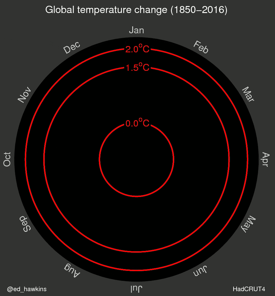
In May 2016, to make visualizing climate change easier for the general public, University of Reading climate scientist Ed Hawkins created an animated spiral graphic[18] of global temperature change as a function of time, a representation said to have gone viral.[9][19] Jason Samenow wrote in The Washington Post that the spiral graph was "the most compelling global warming visualization ever made",[20] before it was featured in the opening ceremony of the 2016 Summer Olympics.[10] Then, on 22 May 2018, Hawkins published[21] graphics constituting a chronologically ordered series of coloured vertical stripes that he called warming stripes.[9] Hawkins, a lead author for the IPCC 6th Assessment Report, received the Royal Society's 2018 Kavli Medal, in part "for actively communicating climate science and its various implications with broad audiences".[22]
As described in a BBC article, in the month the big meteorological agencies release their annual climate assessments, Hawkins experimented with different ways of rendering the global data and "chanced upon the coloured stripes idea".[23] When he tried out a banner at the Hay Festival, according to the article, Hawkins "knew he'd struck a chord".[23] The National Centre for Atmospheric Science (U.K.), with which Hawkins is affiliated, states that the stripes "paint a picture of our changing climate in a compelling way. Hawkins swapped out numerical data points for colours which we intuitively react to".[6]
Others have called Hawkins' warming stripes "climate stripes"[3][4] or "climate timelines".[6]
Warming stripe graphics are reminiscent of colour field painting, a style prominent in the mid 20th century, which strips out all distractions and uses only colour to convey meaning.[8] Colour field pioneer artist Barnett Newman said he was "creating images whose reality is self-evident", an ethos that Hawkins is said to have applied to the problem of climate change.[8]
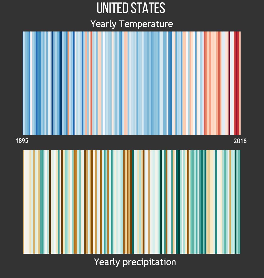
Collaborating with Berkeley Earth scientist Robert Rohde,[24] on 17 June 2019[2] Hawkins published for public use, a large set of warming stripes on ShowYourStripes.info.[25] Individualized warming stripe graphics were published for the globe, for most countries, as well as for certain smaller regions such as states in the US or parts of the UK,[26] since different parts of the world are warming more quickly than others.[27]
Data sources and data visualization[]


Warming stripe graphics are defined with various parameters, including:[21]
- source of dataset (meteorological organization)
- measurement location (global, country, state, etc.)
- time period (year range, for horizontal "axis")
- temperature range (range of anomaly (deviation) about a reference or baseline temperature)
- colour scale (assignment of colours to represent respective ranges of temperature anomaly), and
- colour choice (shades of blue and red), as well as
- temperature boundaries (temperature above which a stripe is red and below which is blue, determined by an average annual temperature over a "reference period" or "baseline" of usually 30 years).[33]
Hawkins' original graphics[Note 4] use the eight most saturated blues and reds from the ColorBrewer 9-class single hue palettes, which optimize colour palettes for maps and are noted for their colourblind-friendliness.[34] Hawkins said the specific colour choice was an aesthetic decision ("I think they look just right"), also selecting baseline periods to ensure equally dark shades of blue and red for aesthetic balance.[34]
A Republik analysis said that "this graphic explains everything in the blink of an eye", attributing its effect mainly to the chosen colors, which "have a magical effect on our brain, (letting) us recognize connections before we have even actively thought about them".[35] The analysis concluded that colors other than blue and red "don't convey the same urgency as (Hawkins') original graphic, in which the colors were used in the classic way: blue=cold, red=warm."[35]
ShowYourStripes.info cites dataset sources Berkeley Earth, NOAA, UK Met Office, MeteoSwiss, DWD (Germany),[26] specifically explaining that the data for most countries comes from the Berkeley Earth temperature dataset, except that for the US, UK, Switzerland & Germany the data comes from respective national meteorological agencies.[33]
For each country-level #ShowYourStripes graphic (Hawkins, June 2019), the average temperature in the 1971-2000 reference period is set as the boundary between blue (cooler) and red (warmer) colours, the colour scale varying +/- 2.6 standard deviations of the annual average temperatures between 1901 and 2000.[33][36] Hawkins noted that the graphic for the Arctic "broke the colour scale" since it is warming more than twice as fast as the global average.[36]
For statistical and geographic reasons, it is expected that graphics for small areas will show more year-to-year variation than those for large regions.[19] Year-to-year changes reflected in graphics for localities result from weather variability, whereas global warming over centuries reflects climate change.[32]
The NOAA website warns that the graphics "shouldn't be used to compare the rate of change at one location to another", explaining that "the highest and lowest values on the colour scale may be different at different locations".[4] Further, a certain colour in one graphic will not necessarily correspond to the same temperature in other graphics.[37][34]
A climate change denier generated a warming stripes graphic that misleadingly affixed Northern Hemisphere readings over one period to global readings over another period, and omitted readings for the most recent thirteen years, with some of the data being 29-year-smoothed—to give the false impression that recent warming is routine.[38] Calling the graphic "imposter warming stripes", meteorologist Jeff Berardelli described it in January 2020 as "a mishmash of data riddled with gaps and inconsistencies" with an apparent objective to confuse the public.[38]
Applications and influence[]


After Hawkins' first publication of warming stripe graphics in May 2018, broadcast meteorologists in multiple countries began to show stripe-decorated neckties, necklaces, pins and coffee mugs on-air, reflecting a growing acceptance of climate science among meteorologists and a willingness to communicate it to audiences.[42] In 2019, the United States House Select Committee on the Climate Crisis used warming stripes in its committee logo, showing horizontally oriented stripes behind a silhouette of the United States Capitol,[40] and three U.S. Senators wore warming stripe lapel pins at the 2020 State of the Union Address.[43]
On 17 June 2019,[2] Hawkins initiated a social media campaign with hashtag #ShowYourStripes that encourages people to download their regions' graphics from ShowYourStripes.info, and to post them.[25] The campaign was backed by U.N. Climate Change, the World Meteorological Organization and the Intergovernmental Panel on Climate Change.[44] Called "a new symbol for the climate emergency" by French magazine L'EDN,[45] warming stripes have been applied to knit-it-yourself scarves,[46] a vase[47] neckties, cufflinks, vehicles, and a music festival stage,[25] as well as on the side of Freiburg, Germany, streetcars,[48] as municipal murals in Córdoba, Spain,[49] and Anchorage, Alaska,[50] a mural at the Cottbus, Germany train station,[51] on face masks during the COVID-19 pandemic,[52] in an action logo of the German soccer club 1. FSV Mainz 05,[53] on the side of the Climate Change Observatory in Valencia,[54] on the side of a power station turbine house in Reading, Berkshire,[55] on tech-themed shirts,[56] and on designer dresses.[57] Remarking that "infiltrating popular culture is a means of triggering a change of attitude that will lead to mass action",[45] Hawkins surmised that making the graphics available for free has made them used more widely.[58] Hawkins further said that any merchandise-related profits are donated to charity.[58]
Through a campaign led by nonprofit Climate Central using hashtag #MetsUnite, more than 100 TV meteorologists—the scientists most laymen interact with more than any other[59]—featured warming stripes[25] and used the graphics to focus audience attention during broadcasts on summer solstices beginning in 2018[59][60] with the "Stripes for the Solstice" effort.[61]
On 24 June 2019, Hawkins tweeted that nearly a million stripe graphics had been downloaded by visitors from more than 180 countries[60] in the course of their first week.[62]
In 2018, the German Weather Service's meteorological training journal Promet showed a warming stripes graphic on the cover of the issue titled "Climate Communication".[63] By September 2019, the Met Office, the U.K.'s national weather service, was using both a climate spiral and a warming stripe graphic on its "What is climate change?" webpage.[64] Concurrently, the cover of the 21–27 September 2019 issue of The Economist, dedicated to "The climate issue," showed a warming stripe graphic,[45][65][66] as did the cover of The Guardian on the morning of the 20 September 2019 climate strikes.[66] The environmental initiative Scientists for Future (2019) included warming stripes in its logo.[51] The Science Information Service (Germany) noted in December 2019 that warming stripes were a "frequently used motif" in demonstrations by the School strike for the climate and Scientists for Future, and were also on the roof of the German Maritime Museum in Bremerhaven.[67] Also in December 2019, Voilà Information Design said that warming stripes "have replaced the polar bear on a melting iceberg as the icon of the climate crisis".[34] On 18 January 2020, a 20-metre-wide artistic light-show installation of warming stripes was opened at the Gendarmenmarkt in Berlin, with the Berlin-Brandenburg Academy of Sciences building being illuminated in the same way.[68] The cover of the "Climate Issue" (fall 2020) of the Space Science and Engineering Center's Through the Atmosphere journal was a warming stripes graphic,[69] and in June 2021 the WMO used warming stripes to "show climate change is here and now" in its statement that "2021 is a make-or-break year for climate action".[44]
On 27 September 2019, the Fachhochschule (University of Applied Science) Potsdam announced that warming stripes graphics had won in the science category of an international competition recognising innovative and understandable visualisations of climate change,[48] the jury stating that the graphics make an "impact through their innovative, minimalist design".[5]
Extensions of warming stripes[]


In 2018, University of Reading post-doctoral research assistant Emanuele Bevacqua juxtaposed vertical-stripe graphics for CO2 concentration and for average global temperature (August), and "circular warming stripes" depicting average global temperature with concentric coloured rings (November).[13]
In March 2019, German engineer Alexander Radtke extended Hawkins' historical graphics to show predictions of future warming through the year 2200, a graphic that one commentator described as making the future "a lot more visceral".[12] Radtke bifurcated the graphic to show diverging predictions for different degrees of human action in reducing greenhouse gas emissions.[12]
On or before 30 May 2019, U.K.-based software engineer Kevin Pluck designed animated warming stripes that portray the unfolding of the temperature increase, allowing viewers to experience the change from an earlier stable climate to recent rapid warming.[10]
By June 2019, Hawkins vertically stacked hundreds of warming stripe graphics from corresponding world locations and grouped them by continent to form a comprehensive, composite graphic, "Temperature Changes Around the World (1901-2018)".[23][27]
On 1 July 2019, Durham University geography research fellow Richard Selwyn Jones published a Global Glacier Change graphic, modeled after and credited as being inspired by Hawkins' #ShowYourStripes graphics, allowing global warming and global glacier retreat to be visually juxtaposed.[14] Jones followed on 8 July 2019 with a stripe graphic portraying global sea level change using only shades of blue.[11] Separately, NOAA displayed a graphic juxtaposing annual temperatures and precipitation,[4] and researchers from the Netherlands used stripe graphics to represent progression of ocean depths.[15]
Critical response[]
Some warned that warming stripes of individual countries or states, taken out of context, could advance the idea that global temperatures are not rising,[25] though research meteorologist J. Marshall Shepherd said that "geographic variations in the graphics offer an outstanding science communication opportunity".[72] Meteorologist and #MetsUnite coordinator Jeff Berardelli said that "local stripe visuals help us tell a nuanced story—the climate is not changing uniformly everywhere".[73]
Others say the charts should include axes or legends,[25] though the website FAQ page explains the graphics were "specifically designed to be as simple as possible, and to start conversations... (to) fill a gap and enable communication with minimal scientific knowledge required to understand their meaning".[33] J. Marshall Shepherd, former president of the American Meteorological Society, lauded Hawkins' approach, writing that "it is important not to miss the bigger picture. Science communication to the public has to be different"[72] and commending Hawkins for his "innovative" approach and "outstanding science communication" effort.[25]
In The Washington Post, Matthew Cappucci wrote that the "simple graphics ... leave a striking visual impression" and are "an easily accessible way to convey an alarming trend", adding that "warming tendencies are plain as day".[3] Greenpeace spokesman Graham Thompson remarked that the graphics are "like a really well-designed logo while still being an accurate representation of very important data".[62]
CBS News contributor Jeff Berardelli noted that the graphics "aren't based on future projections or model assumptions" in the context of stating that "science is not left or right. It's simply factual."[3]
A September 2019 editorial in The Economist hypothesized that "to represent this span of human history (1850-2018) as a set of simple stripes may seem reductive"—noting those years "saw world wars, technological innovation, trade on an unprecedented scale and a staggering creation of wealth"—but concluded that "those complex histories and the simplifying stripes share a common cause," namely, fossil fuel combustion.[65]
Informally, warming stripes have been said to resemble "tie-died bar codes"[3] and a "work of art in a gallery".[74]
See also[]
- Climate change
- Climate change art
- Climate spiral
- Craftivism
- Environmental communication
- Scientific consensus on climate change
- The Tempestry Project
Technical notes[]
- ^ In his "Climate stripes for the U.K." Climate Lab Book entry (17 Sept 2018), Ed Hawkins implicitly applied the generic term "climate stripes" to both temperature and rainfall graphics, reserving the more specific term "warming stripes" to the temperature graphic.
- ^ More precisely: a warming stripes graphic generally portrays temperature anomalies, which are deviations below or above a chosen reference or baseline temperature.
- ^ a b c d Typically, warming stripe graphics portray temperature anomalies—usually, deviations from an average temperature over a chosen reference period (baseline)—and not absolute temperatures. Also, different graphics' colours may cover different-size temperature ranges (e.g., 0.10° C per colour vs. 0.15° C per colour). Accordingly, a particular colour in one graphic does not necessarily represent the same absolute temperature or temperature anomaly as the same colour in another graphic.
- ^ In this Wikipedia article, most figures do not follow Hawkins' exact colour choice, as those figures were generated before the nature of Hawkins' chosen colour palette was widely publicized.
References[]
- ^ Hawkins, Ed (4 December 2018). "2018 visualisation update / Warming stripes for 1850-2018 using the WMO annual global temperature dataset". Climate Lab Book. Archived from the original on 17 April 2019. (Direct link to image).
- ^ a b c d e Kahn, Brian (17 June 2019). "This Striking Climate Change Visualization Is Now Customizable for Any Place on Earth". Gizmodo. Archived from the original on 26 June 2019.
- ^ a b c d e Cappucci, Matthew (21 June 2019). "Show your stripes: These striking graphics that portray a warming climate are available for countries and regions". The Washington Post. Archived from the original on 23 June 2019.
- ^ a b c d e Lindsey, Rebecca (28 June 2019). ""Climate stripes" graphics show U.S. trends by state and county". climate.gov. NOAA. Archived from the original on 29 June 2019. ● Includes Jared Rennie's temperature-precipitation graphic (archive).
- ^ a b c "Visualisierungswettbewerb "Vis for Future" – das sind die Gewinner*innen (Visualization Competition "Vis for Future" - these are the winners)". Fachhochschule Potsdam (University of Applied Sciences, Potsdam) (in German). 27 September 2019. Archived from the original on 27 September 2019.
(Google translate:) Whether global or local - the climatic stripes have managed to make an impact through their innovative, minimalist design and convey a message that is still urgent.
- ^ a b c "Ed Hawkins' warming stripes add colour to climate communication". National Centre for Atmospheric Science. U.K. 2018. Archived from the original on 17 May 2019.
- ^ "Show Your Stripes". climaterealitychicago. Chicago: The Climate Reality Project. 21 June 2019. Archived from the original on 8 August 2019.
- ^ a b c d Kahn, Brian (25 May 2018). "This Climate Visualization Belongs in a Damn Museum". Gizmodo. Archived from the original on 19 June 2019.
- ^ a b c d Staff, Science AF (25 May 2018). "This Has Got to Be One of The Most Beautiful And Powerful Climate Change Visuals We've Ever Seen". Science Alert. Archived from the original on 28 June 2019.
- ^ a b c d Irfan, Umair (30 May 2019). "Why this climate change data is on flip-flops, leggings, and cars / Warming stripes keep showing up on clothes and crafts". Vox. Archived from the original on 24 June 2019.
- ^ a b c Jones, Richard Selwyn (8 July 2019). "One of the most striking trends – over a century of global-average sea level change". twitter.com/selwynox. Richard Selwyn Jones. Archived from the original on 30 July 2019. (link to image). For sea level change data, Jones cites Church, J. A.; White, N. J. (September 2011). "Sea-Level Rise from the Late 19th to the Early 21st Century". Surv Geophys. Springer Netherlands. 32 (4–5): 585–602. Bibcode:2011SGeo...32..585C. doi:10.1007/s10712-011-9119-1. S2CID 129765935.
- ^ a b c Kahn, Brian (20 March 2019). "New Climate Change Visualization Presents Two Stark Choices For Our Future". Gizmodo. Archived from the original on 13 June 2019.
- ^ a b c Bevacqua, Emanuele (University of Reading) (November 2018). "Climate Change Visualizations". emanuele.bevacqua.eu. Archived from the original on 29 July 2019. (University of Reading affiliate).
- ^ a b Jones, Richard Selwyn (1 July 2019). "Inspired by @ed_hawkins #ShowYourStripes, here's 50 years of global glacier change!". twitter.com/selwynox. Richard Selwyn Jones. Archived from the original on 1 July 2019. (link to image). For temperature graphic Jones cites Morice, C.P.; Kennedy, J.J.; Rayner, N.A.; Jones, P.D. (17 April 2012). "Quantifying uncertainties in global and regional temperature change using an ensemble of observational estimates: The HadCRUT4 dataset". J. Geophys. Res. 117 (D8): n/a. Bibcode:2012JGRD..117.8101M. doi:10.1029/2011JD017187. For global glacier retreat graphic, Jones cites Zemp, M. (8 April 2019). "Global glacier mass changes and their contributions to sea-level rise from 1961 to 2016" (PDF). Nature. 568 (7752): 382–386. Bibcode:2019Natur.568..382Z. doi:10.1038/s41586-019-1071-0. PMID 30962533. S2CID 102353522.
- ^ a b Timmerman, Anouk; Haasnoot, Marjolijn; Middelkoop, Hans; Bouma, Tjeerd; McEvoy, Sadie (23 May 2021). "Ecological consequences of sea level rise and flood protection strategies in shallow coastal systems: A quick-scan barcoding approach". Ocean & Coastal Management. 210: 105674. doi:10.1016/j.ocecoaman.2021.105674.
- ^ a b c "Land + Ocean (1850 – Recent) / Monthly Global Average Temperature (annual summary)". berkeleyearth.lbl.gov. Berkeley Earth. 2019. Archived from the original on 29 June 2019. Retrieved 4 July 2019. Data is based an average of "Annual Anomaly" from under "Land + Ocean anomaly using air temperature above sea ice" and from under "Land + Ocean using water temperature below sea ice", and adjusted to have a reference period (baseline) of 1961-1990 for comparison purposes.
- ^ Evertz, Gabriele (1999–2000). "Double". gabrieleevertz.com. Archived from the original on 12 August 2019. (Wikimedia file page)
- ^ "Global Temperature Change (1850-2016)". Climate Lab Book (files). University of Reading. May 2016. Archived from the original on 5 April 2019. (Animated GIF.)
- ^ a b c Meduna, Veronika (17 September 2018). "The climate visualisations that leave no room for doubt or denial". The Spinoff. New Zealand. Archived from the original on 17 May 2019.
- ^ Samenow, Jason (10 May 2016). "Unraveling spiral: The most compelling global warming visualization ever made". The Washington Post. Archived from the original on 22 February 2019.
- ^ a b Hawkins, Ed (22 May 2018). "Warming stripes". Climate Lab Book. U.K. Archived from the original on 26 May 2018.
- ^ "Our changing climate: learning from the past to inform future choices / Prize lecture". royalsociety.org. London: Royal Society. 30 April 2019. Archived from the original on 14 May 2019. Hawkins described his climate spiral and warming stripes graphics in his Kavli prize lecture (video embedded in reference).
- ^ a b c Amos, Jonathan (21 June 2019). "The chart that defines our warming world / Is this the simplest way to show what is meant by global warming? The chart below organises all the countries of the world by region, time and temperature. The trend is unmistakeable". BBC. Archived from the original on 29 June 2019. (Link to png image)
- ^ Vetter, David (21 June 2021). "From Dresses To Electric Cars, Why Are These Stripes All Over Social Media?". Forbes. Archived from the original on 22 June 2021.
- ^ a b c d e f g Kintisch, Eli (26 June 2019). "New climate 'stripes' reveal how much hotter your hometown has gotten in the past century". Science. Archived from the original on 27 June 2019.
- ^ a b "#ShowYourStripes (main web page)". ShowYourStripes.info. Retrieved 27 June 2019.
- ^ a b Peters, Adele (21 June 2019). "This is one of the simplest and best climate change graphics we've ever seen". Fast Company. Archived from the original on 8 July 2019.
- ^ "Climate at a Glance / Global Time Series". ncdc.noaa.gov. NOAA (National Centers for Environmental Information; National Climatic Data Center). December 2018. Archived from the original on 26 July 2019. Retrieved 26 July 2019. Choose 12-Month timescale, December 1880-2019, Northern Hemisphere, Land and Ocean, Plot.
- ^ "Climate at a Glance / Global Time Series". ncdc.noaa.gov. NOAA (National Centers for Environmental Information; National Climatic Data Center). December 2018. Archived from the original on 26 July 2019. Retrieved 26 July 2019. Choose 12-Month timescale, December 1880-2019, Southern Hemisphere, Land and Ocean, Plot.
- ^ "Climate at a Glance / Global Time Series". ncdc.noaa.gov. NOAA (National Centers for Environmental Information; National Climatic Data Center). December 2018. Archived from the original on 26 July 2019. Retrieved 27 July 2019. Choose 12-Month timescale, December 1880-2019, Global, Land and Ocean, Plot.
- ^ "Climate at a Glance / Global Time Series". ncdc.noaa.gov. NOAA (National Centers for Environmental Information; National Climatic Data Center). December 2018. Archived from the original on 27 July 2019. Retrieved 27 July 2019. Choose 12-Month timescale, December 1880-2019, Caribbean Islands, Land and Ocean, Plot.
- ^ a b "Warming Stripes: Global". sos.noaa.gov. NOAA (Science on a Sphere). Archived from the original on 29 July 2019. Retrieved 29 July 2019.
- ^ a b c d e "#ShowYourStripes / FAQ Page". ShowYourStripes.info. Retrieved 27 June 2019.
- ^ a b c d Bugden, Erica (3 December 2019). "Do you really understand the influential warming stripes?". Voilà Information Design. Archived from the original on 5 December 2019.
- ^ a b Schmid, Simon (8 April 2019). "Die schönste Klimagrafik der Welt (The most beautiful climate graphic in the world)". Republik.ch (in German). Archived from the original on 19 September 2020.
- ^ a b "Show Your Stripes". public.wmo.int. World Meteorological Organization. 20 June 2019. Archived from the original on 30 June 2019.
- ^ Holloway, James (19 June 2019). "Global warming: Can these striking charts convince nay-sayers?". newatlas.com. New Atlas. Archived from the original on 20 June 2019.
- ^ a b Berardelli, Jeff (30 January 2020). "2,000 years of Earth's climate in one simple chart – and the copycat that isn't what it seems". CBS News. Archived from the original on 30 January 2020.
- ^ Hawkins, Ed (12 September 2019). "Atmospheric temperature trends". Climate Lab Book. Archived from the original on 12 September 2019. (Higher-altitude cooling differences attributed to ozone depletion and greenhouse gas increases; spikes occurred with volcanic eruptions of 1982-83 (El Chichón) and 1991-92 (Pinatubo).)
- ^ a b "United States House Select Committee on the Climate Crisis / About". climatecrisis.house.gov. United States House of Representatives. 2019. Archived from the original on 2 April 2019. Crediting Shawna Faison and House Creative Services.
- ^ Englart, John (6 December 2019). "Kooky the climate activist Kookaburra visits the UNFCCC pavillion". flickr.com. Archived from the original on 19 December 2019.
- ^ Samenow, Jason (21 June 2018). "Why are more than 100 television meteorologists around the world wearing this tie?". The Washington Post. Archived from the original on 24 June 2018. (subscription required)
- ^ Giles, Christopher; Acquah, Lorna (9 February 2020). "Climate change: Why are US senators wearing this symbol?". BBC. Archived from the original on 14 February 2020.
- ^ a b "Warming stripes show that climate change is here and now". WMO.int. World Meteorological Organization. 21 June 2021. Archived from the original on 22 June 2021.
- ^ a b c Dussert, Margaux (23 September 2019). "Réchauffement climatique : ce graphique scientifique fait le buzz (Global warming: this scientific graph is making a buzz)". L'EDN (in French). Archived from the original on 22 October 2019.
- ^ Mack, Markus (12 December 2019). "Dieser selbst gestrickte Schal zeigt, wie sehr sich die Erde in 138 Jahren erwärmt hat (This self-knitted scarf shows how much the earth has warmed in 138 years)". ze.tt (Zeit Online partner). Germany. Archived from the original on 14 December 2019.
- ^ "Vase Inspired by Viral Climate Change Graphic". WoolleyandWallis.co.uk. Woolley and Wallis (auctioneer). 21 November 2019. Archived from the original on 18 January 2021.
- ^ a b Wittlich, Helena (27 September 2019). "Die besten Darstellungen des Klimawandels (The best illustrations of climate change)". Tagesspiegel (in German). Archived from the original on 22 October 2019.
- ^ Reina, Carmen (7 October 2019). "El código climático o la huella del alza de las temperaturas hecha color (The climate code, or the trace of rising temperatures made of colour)". El Diario (in Spanish). Archived from the original on 22 October 2019.
- ^ Brincks, Renee (26 May 2020). "Anchorage public art depicts changing temperatures". Travel Weekly. Archived from the original on 4 June 2020.
- ^ a b Sauerbier, Michael (10 June 2020). "Warnt die Bahn in Cottbus vor dem Klimawandel? / Bahnhofs-Fassade zeigt Erderwärmung (Does the train in Cottbus warn of climate change? / Station facade shows global warming)". BZ-Berlin. Archived from the original on 11 June 2020.
- ^ Kaufman, Mark (12 May 2020). "Face masks show Earth's grim warming trend". Mashable. Archived from the original on 13 May 2020.
- ^ "05ER Klimaverteidiger-Woche: Neue Anspruch Durch Neue Berechnung (05ER Climate Defender Week: New Claim Through New Calculation / Warming Stripes as a warning symbol - Continuous further development of the commitment)". Mainz05.de (in German). 7 October 2020. Archived from the original on 18 December 2020.
- ^ "El Ayuntamiento de València refuerza el trabajo del Observatorio del Cambio Climático con más presupuesto y personal para incidir en educación, formación y concienciación (The Valencia City Council reinforces the work of the Climate Change Observatory with more budget and staff to influence education, training and awareness)". El Periodic (in Spanish). 26 January 2021. Archived from the original on 1 February 2021.
- ^ "Reading Hydro Murals". ReadingHydro.org. Reading Hydro. 2021. Archived from the original on 6 December 2021. (link to image)
- ^ "800,000 years of data, 1 clear message". FashionUnited.uk. FashionUnited. 1 June 2021. Archived from the original on 2 June 2021.
- ^ "Climate Stripes 12 Way Dress". Tammam.com. 22 June 2021. Archived from the original on 22 June 2021.
- ^ a b Wong, Henry (25 September 2019). "How a climate crisis graphic became a meme". Design Week. Archived from the original on 25 September 2019.
- ^ a b Epstein, Dave (21 June 2019). "Summer is officially here — time to show your stripes for climate change". The Boston Globe. Archived from the original on 21 June 2019.
- ^ a b Macdonald, Ted (25 June 2019). "TV meteorologists kicked off the summer by talking about climate change / #MetsUnite and #ShowYourStripes campaign highlighted the importance of climate communication". Media Matters. Archived from the original on 26 June 2019.
- ^ Shepherd, Marshall (19 June 2019). "Why TV Meteorologists Will 'Show Their Stripes' For Climate On June 21st". Forbes. Archived from the original on 30 June 2019.
- ^ a b Filmer-Court, Charlie (28 June 2019). "Musicians to TV presenters show their stripes as climate campaign goes viral". Reuters. Archived from the original on 28 June 2019.
- ^ ""Promet"-Themenheft zur Klimakommunikation ("Promet" thematic booklet on climate communication)". Deutsche Wetterdienst dwd.de (German Weather Service). 26 September 2018. Archived from the original on 24 September 2019.
- ^ "What is climate change? / How fast is the temperature rising?". Met Office. United Kingdom. September 2019. Archived from the original on 27 September 2019. Climate spiral does not appear in full in archive for some reason; it's before the caption that includes "... The temperature increases as you move away from the centre of the circle."
- ^ a b "The climate issue". The Economist. 19 September 2019. Archived from the original on 19 September 2019. (archived announcement).
- ^ a b "The climate issue – A warming world". The Carbon Brief. 20 September 2019.
- ^ Lansnicker, Colleen (2 December 2019). "Ed Hawkins Warming Stripes on the Roof of the German Maritime Museum". Germany. IDW (Informationsdienst Wissenschaft; Scientific Information Service). Archived from the original on 3 December 2019.
- ^ "Claypaky Xtylos and Warming Stripes". Light and Sound Journal. 5 March 2020. Archived from the original on 14 March 2020.
- ^ Verbeten, Eric (19 November 2020). "Through the Atmosphere Fall 2020, The Climate Issue". SSEC.wisc.edu. Space Science and Engineering Center. Archived from the original on 18 March 2021.
- ^ Hawkins, Ed (21 July 2019). "#ShowYourStripes / Temperature changes around the world (1901-2018)". Climate Lab Book. Archived from the original on 2 August 2019. (Direct link to image).
- ^ "Average World Temperature Since 1850". Reddit, "DataIsBeautiful" subreddit. 15 June 2016. Archived from the original on 15 June 2016. ● Data source: University of East Anglia Climate Research Unit (CRU) (archive).
- ^ a b Shepherd, Marshall (24 June 2019). "Why Science For The Public Has To Be Different". Forbes. Archived from the original on 25 June 2019.
- ^ Henson, Bob (20 June 2019). "Show Your Stripes: Iconic Global Warming Imagery Goes Local". wunderground.com. Weather Underground. Archived from the original on 21 June 2019.
- ^ Brook, Benedict (29 August 2018). "'Warming stripes' show how Australia's average temperatures have changed". News.com (Australia). Archived from the original on 20 May 2019.
External links[]
| Wikimedia Commons has media related to Warming stripes. |
- ShowYourStripes.info — warming stripes portraying historical data for multiple locations
- Hawkins, Ed (20 September 2019). "The story behind the viral graphic that electrified the climate movement". Fast Company. Archived from the original on 21 September 2019.
- Rennie, Jared. "Annual United States Climate Stripes: Temperature and Precipitation". ArcGIS. North Carolina State University. — clickable map of warming stripes for each county in 48 contiguous U.S. states
- Windhager, Florian; Schreder, Günther; Mayr, Eva (2019). "On Inconvenient Images: Exploring the Design Space of Engaging Climate Change Visualizations for Public Audiences". Workshop on Visualisation in Environmental Sciences (EnvirVis). The Eurographics Association: 1–8. doi:10.2312/envirvis.20191098. ISBN 9783038680864. — Survey of climate change visualizations
- Climate change in art
- Climate communication
- Climatology
- Climate and weather statistics
- Scientific visualization
- Data visualization